要运行范例从 Qt Creator ,打开 欢迎 模式,然后选择范例从 范例 。更多信息,拜访 构建和运行范例 .
Let's start by defining some data for the chart.
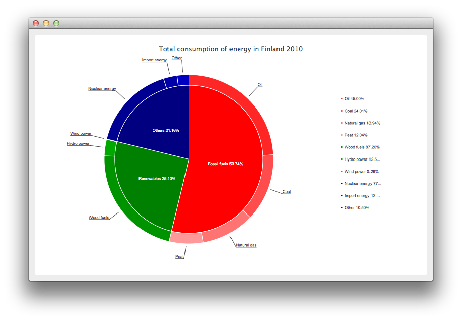
// Graph is based on data of 'Total consumption of energy increased by 10 per cent in 2010'
// Statistics Finland, 13 December 2011
// http://www.stat.fi/til/ekul/2010/ekul_2010_2011-12-13_tie_001_en.html
QPieSeries *series1 = new QPieSeries();
series1->setName("Fossil fuels");
series1->append("Oil", 353295);
series1->append("Coal", 188500);
series1->append("Natural gas", 148680);
series1->append("Peat", 94545);
QPieSeries *series2 = new QPieSeries();
series2->setName("Renewables");
series2->append("Wood fuels", 319663);
series2->append("Hydro power", 45875);
series2->append("Wind power", 1060);
QPieSeries *series3 = new QPieSeries();
series3->setName("Others");
series3->append("Nuclear energy", 238789);
series3->append("Import energy", 37802);
series3->append("Other", 32441);
Then we create a chart where we add the data. Note that this is our own chart derived from QChart .
DonutBreakdownChart *donutBreakdown = new DonutBreakdownChart();
donutBreakdown->setAnimationOptions(QChart::AllAnimations);
donutBreakdown->setTitle("Total consumption of energy in Finland 2010");
donutBreakdown->legend()->setAlignment(Qt::AlignRight);
donutBreakdown->addBreakdownSeries(series1, Qt::red);
donutBreakdown->addBreakdownSeries(series2, Qt::darkGreen);
donutBreakdown->addBreakdownSeries(series3, Qt::darkBlue);
Our own chart works in such a way that we create a main series in the constructor we create a main series, which aggregates the data provided by the breakdown series. This is the piechart in the center.
DonutBreakdownChart::DonutBreakdownChart(QGraphicsItem *parent, Qt::WindowFlags wFlags)
    : QChart(QChart::ChartTypeCartesian, parent, wFlags)
{
    // create the series for main center pie
    m_mainSeries = new QPieSeries();
    m_mainSeries->setPieSize(0.7);
    QChart::addSeries(m_mainSeries);
}
When a breakdown series is added the data is used to create a slice in the main series and the breakdown series itself is used to create a segment of a donut positioned so that it is aligned with the corresponding slice in the main series.
void DonutBreakdownChart::addBreakdownSeries(QPieSeries *breakdownSeries, QColor color)
{
    QFont font("Arial", 8);
    // add breakdown series as a slice to center pie
    MainSlice *mainSlice = new MainSlice(breakdownSeries);
    mainSlice->setName(breakdownSeries->name());
    mainSlice->setValue(breakdownSeries->sum());
    m_mainSeries->append(mainSlice);
    // customize the slice
    mainSlice->setBrush(color);
    mainSlice->setLabelVisible();
    mainSlice->setLabelColor(Qt::white);
    mainSlice->setLabelPosition(QPieSlice::LabelInsideHorizontal);
    mainSlice->setLabelFont(font);
    // position and customize the breakdown series
    breakdownSeries->setPieSize(0.8);
    breakdownSeries->setHoleSize(0.7);
    breakdownSeries->setLabelsVisible();
    const auto slices = breakdownSeries->slices();
    for (QPieSlice *slice : slices) {
        color = color.lighter(115);
        slice->setBrush(color);
        slice->setLabelFont(font);
    }
    // add the series to the chart
    QChart::addSeries(breakdownSeries);
    // recalculate breakdown donut segments
    recalculateAngles();
    // update customize legend markers
    updateLegendMarkers();
}
Here's how the start and end angles for the donut segments are calculated.
void DonutBreakdownChart::recalculateAngles()
{
    qreal angle = 0;
    const auto slices = m_mainSeries->slices();
    for (QPieSlice *slice : slices) {
        QPieSeries *breakdownSeries = qobject_cast<MainSlice *>(slice)->breakdownSeries();
        breakdownSeries->setPieStartAngle(angle);
        angle += slice->percentage() * 360.0; // full pie is 360.0
        breakdownSeries->setPieEndAngle(angle);
    }
}
The legend markers are customized to show the breakdown percentage. The markers for the main level slices are hidden.
void DonutBreakdownChart::updateLegendMarkers()
{
    // go through all markers
    const auto allseries = series();
    for (QAbstractSeries *series : allseries) {
        const auto markers = legend()->markers(series);
        for (QLegendMarker *marker : markers) {
            QPieLegendMarker *pieMarker = qobject_cast<QPieLegendMarker *>(marker);
            if (series == m_mainSeries) {
                // hide markers from main series
                pieMarker->setVisible(false);
            } else {
                // modify markers from breakdown series
                pieMarker->setLabel(QString("%1 %2%")
                                    .arg(pieMarker->slice()->label())
                                    .arg(pieMarker->slice()->percentage() * 100, 0, 'f', 2));
                pieMarker->setFont(QFont("Arial", 8));
            }
        }
    }
}
Instead the main level slices show the percentage on the label.
MainSlice::MainSlice(QPieSeries *breakdownSeries, QObject *parent)
    : QPieSlice(parent),
      m_breakdownSeries(breakdownSeries)
{
    connect(this, &MainSlice::percentageChanged, this, &MainSlice::updateLabel);
}
void MainSlice::updateLabel()
{
    this->setLabel(QString("%1 %2%").arg(m_name).arg(percentage() * 100, 0, 'f', 2));
}
Now that we have our chart defined, we can finally create a QChartView and show the chart.
QMainWindow window;
QChartView *chartView = new QChartView(donutBreakdown);
chartView->setRenderHint(QPainter::Antialiasing);
window.setCentralWidget(chartView);
window.resize(800, 500);
window.show();
文件: