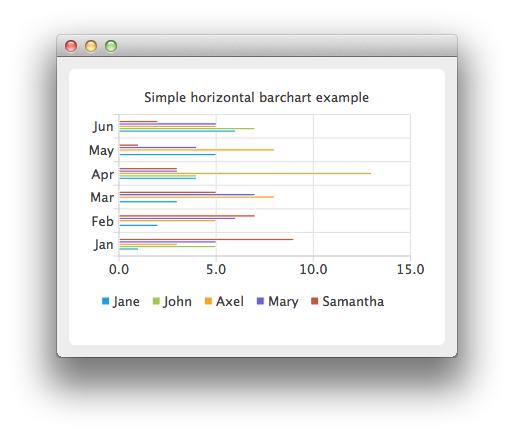
QHorizontalBarChart shows the data in sets as separate bars, which are grouped in categories. QHorizontalBarChart works just like QBarChart, except that the bars are drawn horizontally on the chart.
要运行范例从 Qt Creator ,打开 欢迎 模式,然后选择范例从 范例 。更多信息,拜访 构建和运行范例 .
The bar sets are used in the same way in all bar charts. To illustrate the difference between various bar charts, we use the same data in all examples. Data that bar chart visualizes, is defined by QBarSet instances. Here we create the sets and append data to them. The data is appended here with << operator. Alternatively, the append method could also be used.
    QBarSet *set0 = new QBarSet("Jane");
    QBarSet *set1 = new QBarSet("John");
    QBarSet *set2 = new QBarSet("Axel");
    QBarSet *set3 = new QBarSet("Mary");
    QBarSet *set4 = new QBarSet("Samantha");
    *set0 << 1 << 2 << 3 << 4 << 5 << 6;
    *set1 << 5 << 0 << 0 << 4 << 0 << 7;
    *set2 << 3 << 5 << 8 << 13 << 8 << 5;
    *set3 << 5 << 6 << 7 << 3 << 4 << 5;
    *set4 << 9 << 7 << 5 << 3 << 1 << 2;
We create the series and append the bar sets to it. The series takes ownership of the barsets. The series groups the data from sets to categories. The first values of each set are grouped together in the first category; the second values in the second category, and so on.
    QHorizontalBarSeries *series = new QHorizontalBarSeries();
    series->append(set0);
    series->append(set1);
    series->append(set2);
    series->append(set3);
    series->append(set4);
Here we create the chart object and add the series to it. We set the title for chart with setTitle and then turn on animations of the series by calling setAnimationOptions( QChart::SeriesAnimations ).
    QChart *chart = new QChart();
    chart->addSeries(series);
    chart->setTitle("Simple horizontal barchart example");
    chart->setAnimationOptions(QChart::SeriesAnimations);
To have the categories displayed on axis, we need to create a QBarCategoryAxis . Here we create a category axis with a list of categories and set it to be the y-axis of the chart. The chart takes ownership of axis. For the x-axis we use the default axis, which is created and scaled to series data by calling createDefaultAxes of the chart. Note that the call for createDefaultAxes must be done before we set the category axis. Otherwise the default axis will override the category axis.
    QStringList categories;
    categories << "Jan" << "Feb" << "Mar" << "Apr" << "May" << "Jun";
    QBarCategoryAxis *axisY = new QBarCategoryAxis();
    axisY->append(categories);
    chart->setAxisY(axisY, series);
    QValueAxis *axisX = new QValueAxis();
    chart->setAxisX(axisX, series);
    axisX->applyNiceNumbers();
We also want to show the legend. To do so, we get the legend pointer from chart and set it to visible. We also place the legend to the bottom of the chart by setting its alignment to Qt::AlignBottom .
    chart->legend()->setVisible(true);
    chart->legend()->setAlignment(Qt::AlignBottom);
Finally we add the chart onto a view. We also turn on the antialiasing for the chartView.
    QChartView *chartView = new QChartView(chart);
    chartView->setRenderHint(QPainter::Antialiasing);
The chart is ready to be shown. We set the chart to be the central widget of the window. We also set the size for the chart window and show it.
    QMainWindow window;
    window.setCentralWidget(chartView);
    window.resize(420, 300);
    window.show();
文件: