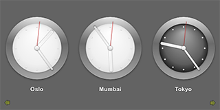
时钟 演示使用 ListView 类型来显示生成数据通过 ListModel . The delegate used by the model is specified as a custom QML type that is specified in the Clock.qml file.
JavaScript methods are used to fetch the current time in several cities in different time zones and QML types are used to display the time on a clock face with animated clock hands.
要运行范例从 Qt Creator ,打开 欢迎 模式,然后选择范例从 范例 。更多信息,拜访 构建和运行范例 .
In the clocks.qml file, we use a Rectangle type to create the application main window:
Rectangle {
    id: root
    width: 640; height: 320
    color: "#646464"
使用 ListView type to display a list of the items provided by a ListModel 类型:
    ListView {
        id: clockview
        anchors.fill: parent
        orientation: ListView.Horizontal
        cacheBuffer: 2000
        snapMode: ListView.SnapOneItem
        highlightRangeMode: ListView.ApplyRange
        delegate: Content.Clock { city: cityName; shift: timeShift }
        model: ListModel {
            ListElement { cityName: "New York"; timeShift: -4 }
            ListElement { cityName: "London"; timeShift: 0 }
            ListElement { cityName: "Oslo"; timeShift: 1 }
            ListElement { cityName: "Mumbai"; timeShift: 5.5 }
            ListElement { cityName: "Tokyo"; timeShift: 9 }
            ListElement { cityName: "Brisbane"; timeShift: 10 }
            ListElement { cityName: "Los Angeles"; timeShift: -8 }
        }
    }
List elements are defined like other QML types except that they contain a collection of role definitions instead of properties. Roles both define how the data is accessed and include the data itself.
For each list element, we use the
cityName
role to specify the name of a city and the
timeShift
role to specify a time zone as a positive or negative offset from UTC (coordinated universal time).
The Clock custom type is used as the
ListView
's
delegate
, defining the visual appearance of list items. To use the Clock type, we add an import statement that imports the folder called
content
where the type is located:
import "content" as Content
使用 Image type to display arrows that indicate whether users can flick the view to see more clocks on the left or right:
    Image {
        anchors.left: parent.left
        anchors.bottom: parent.bottom
        anchors.margins: 10
        source: "content/arrow.png"
        rotation: -90
        opacity: clockview.atXBeginning ? 0 : 0.5
        Behavior on opacity { NumberAnimation { duration: 500 } }
    }
    Image {
        anchors.right: parent.right
        anchors.bottom: parent.bottom
        anchors.margins: 10
        source: "content/arrow.png"
        rotation: 90
        opacity: clockview.atXEnd ? 0 : 0.5
        Behavior on opacity { NumberAnimation { duration: 500 } }
    }
}
使用
opacity
property to hide the arrows when the list view is located at the beginning or end of the x axis.
In Clock.qml, we define a
timeChanged()
function in which we use methods from the JavaScript
Date
object to fetch the current time in UTC and to adjust it to the correct time zone:
    function timeChanged() {
        var date = new Date;
        hours = internationalTime ? date.getUTCHours() + Math.floor(clock.shift) : date.getHours()
        night = ( hours < 7 || hours > 19 )
        minutes = internationalTime ? date.getUTCMinutes() + ((clock.shift % 1) * 60) : date.getMinutes()
        seconds = date.getUTCSeconds();
    }
使用 Timer type to update the time at intervals of 100 milliseconds:
    Timer {
        interval: 100; running: true; repeat: true;
        onTriggered: clock.timeChanged()
    }
使用 Image types within an Item type to display the time on an analog clock face. Different images are used for daytime and nighttime hours:
    Item {
        anchors.centerIn: parent
        width: 200; height: 240
        Image { id: background; source: "clock.png"; visible: clock.night == false }
        Image { source: "clock-night.png"; visible: clock.night == true }
A
Rotation
transform applied to
Image
types provides a way to rotate the clock hands. The
origin
property holds the point that stays fixed relative to the parent as the rest of the item rotates. The
angle
property determines the angle to rotate the hands in degrees clockwise.
        Image {
            x: 92.5; y: 27
            source: "hour.png"
            transform: Rotation {
                id: hourRotation
                origin.x: 7.5; origin.y: 73;
                angle: (clock.hours * 30) + (clock.minutes * 0.5)
                Behavior on angle {
                    SpringAnimation { spring: 2; damping: 0.2; modulus: 360 }
                }
            }
        }
        Image {
            x: 93.5; y: 17
            source: "minute.png"
            transform: Rotation {
                id: minuteRotation
                origin.x: 6.5; origin.y: 83;
                angle: clock.minutes * 6
                Behavior on angle {
                    SpringAnimation { spring: 2; damping: 0.2; modulus: 360 }
                }
            }
        }
        Image {
            x: 97.5; y: 20
            source: "second.png"
            transform: Rotation {
                id: secondRotation
                origin.x: 2.5; origin.y: 80;
                angle: clock.seconds * 6
                Behavior on angle {
                    SpringAnimation { spring: 2; damping: 0.2; modulus: 360 }
                }
            }
        }
        Image {
            anchors.centerIn: background; source: "center.png"
        }
使用
Behavior
type on the
angle
property to apply a
SpringAnimation
when the time changes. The
spring
and
damping
properties enable the spring-like motion of the clock hands, and a
modulus
of
360
makes the animation target values wrap around at a full circle.
使用 Text type to display the city name below the clock:
        Text {
            id: cityLabel
            y: 210; anchors.horizontalCenter: parent.horizontalCenter
            color: "white"
            font.family: "Helvetica"
            font.bold: true; font.pixelSize: 16
            style: Text.Raised; styleColor: "black"
        }
文件:
另请参阅 QML 应用程序 .