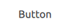
Push-button that can be clicked to perform a command or answer a question. 更多...
| import 语句: | import QtQuick.Controls 2.5 |
| Since: | Qt 5.7 |
| 继承: | AbstractButton |
| 继承者: | RoundButton and ToolButton |
Button presents a push-button control that can be pushed or clicked by the user. Buttons are normally used to perform an action, or to answer a question. Typical buttons are OK , Apply , Cancel , Close , Yes , No ,和 帮助 .
Button inherits its API from AbstractButton . For instance, you can set text , display an icon , and react to clicks 使用 AbstractButton API.
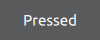
A button emits the signal clicked() when it is activated by the user. Connect to this signal to perform the button's action. Buttons also provide the signals canceled() , doubleClicked() , pressed() , released() and pressAndHold() for long presses.
See the snippet below on how to connect to the button's signals.
RowLayout {
    Button {
        text: "Ok"
        onClicked: model.submit()
    }
    Button {
        text: "Cancel"
        onClicked: model.revert()
    }
}
另请参阅 Customizing Button and 按钮控件 .
|
flat : bool |
This property holds whether the button is flat.
A flat button typically does not draw a background unless it is pressed or checked.
默认值为
false
.
|
highlighted : bool |
This property holds whether the button is highlighted.
A button can be highlighted in order to draw the user's attention towards it. It has no effect on keyboard interaction.
默认值为
false
.