Presents data in polar charts. 更多...
| import 语句: | import QtCharts 2.15 |
| 继承: |
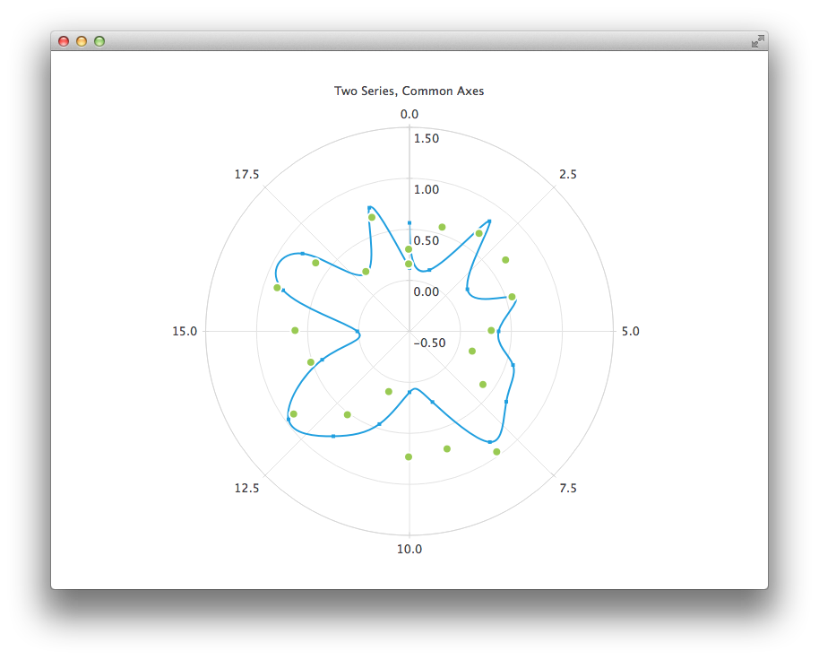
Polar charts present data in a circular graph, where the placement of data is based on the angle and distance from the center of the graph, the pole .

A polar chart is a specialization of the ChartView type. It supports line, spline, area, and scatter series, and all axis types supported by them. Each axis can be used either as a radial or an angular axis.
The first and last tick mark on an angular ValueAxis are co-located at a 0/360 degree angle.
If the angular distance between two consecutive points in a series is more than 180 degrees, any direct line connecting the two points becomes meaningless, and will not be drawn. Instead, a line will be drawn to and from the center of the chart. Therefore, the axis ranges must be chosen accordingly when displaying line, spline, or area series.
Polar charts draw all axes of the same orientation in the same position, so using multiple axes of the same orientation can be confusing, unless the extra axes are only used to customize the grid. For example, you can display a highlighted range with a secondary shaded CategoryAxis or provide unlabeled subticks with a secondary ValueAxis thas has hidden labels.
The following QML code shows how to create a polar chart with a spline and scatter series and two value axes:
PolarChartView {
    title: "Two Series, Common Axes"
    anchors.fill: parent
    legend.visible: false
    antialiasing: true
    ValueAxis {
        id: axisAngular
        min: 0
        max: 20
        tickCount: 9
    }
    ValueAxis {
        id: axisRadial
        min: -0.5
        max: 1.5
    }
    SplineSeries {
        id: series1
        axisAngular: axisAngular
        axisRadial: axisRadial
        pointsVisible: true
    }
    ScatterSeries {
        id: series2
        axisAngular: axisAngular
        axisRadial: axisRadial
        markerSize: 10
    }
}
// Add data dynamically to the series
Component.onCompleted: {
    for (var i = 0; i <= 20; i++) {
        series1.append(i, Math.random());
        series2.append(i, Math.random());
    }
}