A button box used in dialogs. 更多...
| import 语句: | import QtQuick.Controls 2.15 |
| Since: | Qt 5.8 |
| 继承: |
Dialogs and message boxes typically present buttons in an order that conforms to the interface guidelines for that platform. Invariably, different platforms have their dialog buttons in different orders. DialogButtonBox allows a developer to add buttons to it and will automatically use the appropriate order for the user's platform.
大多数对话框按钮遵循某些角色。这些角色包括:
There can also be alternate ways of dismissing the dialog which may cause destructive results.
Most dialogs have buttons that can almost be considered standard (e.g. OK and Cancel buttons). It is sometimes convenient to create these buttons in a standard way.
There are a couple ways of using DialogButtonBox. One way is to specify the standard buttons (e.g. OK , Cancel , Save ) and let the button box setup the buttons.
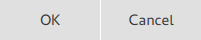
DialogButtonBox {
    standardButtons: DialogButtonBox.Ok | DialogButtonBox.Cancel
    onAccepted: console.log("Ok clicked")
    onRejected: console.log("Cancel clicked")
}
Alternatively, buttons and their roles can be specified by hand:
DialogButtonBox {
    Button {
        text: qsTr("Save")
        DialogButtonBox.buttonRole: DialogButtonBox.AcceptRole
    }
    Button {
        text: qsTr("Close")
        DialogButtonBox.buttonRole: DialogButtonBox.DestructiveRole
    }
}
You can also mix and match normal buttons and standard buttons.
When a button is clicked in the button box, the clicked() signal is emitted for the actual button that is pressed. In addition, the following signals are automatically emitted when a button with the respective role(s) is pressed:
| 角色 | 信号 |
|---|---|
AcceptRole
,
YesRole
|
accepted() |
ApplyRole
|
applied() |
DiscardRole
|
discarded() |
HelpRole
|
helpRequested() |
RejectRole
,
NoRole
|
rejected() |
ResetRole
|
reset() |
另请参阅 Dialog .
This property holds the alignment of the buttons.
可能的值:
| 常量 | 描述 |
|---|---|
undefined
|
The buttons are resized to fill the available space. |
Qt.AlignLeft
|
The buttons are aligned to the left. |
Qt.AlignHCenter
|
The buttons are horizontally centered. |
Qt.AlignRight
|
The buttons are aligned to the right. |
Qt.AlignTop
|
The buttons are aligned to the top. |
Qt.AlignVCenter
|
The buttons are vertically centered. |
Qt.AlignBottom
|
The buttons are aligned to the bottom. |
This property holds the button layout policy to be used when arranging the buttons contained in the button box. The default value is platform-specific.
Available values:
| 常量 | 描述 |
|---|---|
DialogButtonBox.WinLayout
|
Use a policy appropriate for applications on Windows. |
DialogButtonBox.MacLayout
|
Use a policy appropriate for applications on macOS. |
DialogButtonBox.KdeLayout
|
Use a policy appropriate for applications on KDE. |
DialogButtonBox.GnomeLayout
|
Use a policy appropriate for applications on GNOME. |
DialogButtonBox.AndroidLayout
|
Use a policy appropriate for applications on Android. |
该特性在 QtQuick.Controls 2.5 (Qt 5.12) 引入。
|
delegate : Component |
This property holds a delegate for creating standard buttons.
另请参阅 standardButtons .
|
position : enumeration |
This property holds the position of the button box.
注意: If the button box is assigned as a header or footer of ApplicationWindow or Page, the appropriate position is set automatically.
可能的值:
| 常量 | 描述 |
|---|---|
DialogButtonBox.Header
|
The button box is at the top, as a window or page header. |
DialogButtonBox.Footer
|
The button box is at the bottom, as a window or page header. |
默认值为
Footer
.
另请参阅 Dialog::header and Dialog::footer .
|
standardButtons : enumeration |
This property holds a combination of standard buttons that are used by the button box.
DialogButtonBox {
    standardButtons: DialogButtonBox.Ok | DialogButtonBox.Cancel
    onAccepted: console.log("Ok clicked")
    onRejected: console.log("Cancel clicked")
}
The buttons will be positioned in the appropriate order for the user's platform.
Possible flags:
| 常量 | 描述 |
|---|---|
DialogButtonBox.Ok
|
An "OK" button defined with the
AcceptRole
.
|
DialogButtonBox.Open
|
An "Open" button defined with the
AcceptRole
.
|
DialogButtonBox.Save
|
A "Save" button defined with the
AcceptRole
.
|
DialogButtonBox.Cancel
|
A "Cancel" button defined with the
RejectRole
.
|
DialogButtonBox.Close
|
A "Close" button defined with the
RejectRole
.
|
DialogButtonBox.Discard
|
A "Discard" or "Don't Save" button, depending on the platform, defined with the
DestructiveRole
.
|
DialogButtonBox.Apply
|
An "Apply" button defined with the
ApplyRole
.
|
DialogButtonBox.Reset
|
A "Reset" button defined with the
ResetRole
.
|
DialogButtonBox.RestoreDefaults
|
A "Restore Defaults" button defined with the
ResetRole
.
|
DialogButtonBox.Help
|
A "Help" button defined with the
HelpRole
.
|
DialogButtonBox.SaveAll
|
A "Save All" button defined with the
AcceptRole
.
|
DialogButtonBox.Yes
|
A "Yes" button defined with the
YesRole
.
|
DialogButtonBox.YesToAll
|
A "Yes to All" button defined with the
YesRole
.
|
DialogButtonBox.No
|
A "No" button defined with the
NoRole
.
|
DialogButtonBox.NoToAll
|
A "No to All" button defined with the
NoRole
.
|
DialogButtonBox.Abort
|
An "Abort" button defined with the
RejectRole
.
|
DialogButtonBox.Retry
|
A "Retry" button defined with the
AcceptRole
.
|
DialogButtonBox.Ignore
|
An "Ignore" button defined with the
AcceptRole
.
|
DialogButtonBox.NoButton
|
无效按钮。 |
另请参阅 standardButton() .
|
[read-only] DialogButtonBox.buttonBox : DialogButtonBox |
This attached property holds the button box that manages this button, or
null
if the button is not in a button box.
This attached property holds the role of each button in a button box.
DialogButtonBox {
    Button {
        text: qsTr("Save")
        DialogButtonBox.buttonRole: DialogButtonBox.AcceptRole
    }
    Button {
        text: qsTr("Close")
        DialogButtonBox.buttonRole: DialogButtonBox.DestructiveRole
    }
}
Available values:
| 常量 | 描述 |
|---|---|
DialogButtonBox.InvalidRole
|
按钮无效。 |
DialogButtonBox.AcceptRole
|
Clicking the button causes the dialog to be accepted (e.g. OK ). |
DialogButtonBox.RejectRole
|
Clicking the button causes the dialog to be rejected (e.g. Cancel ). |
DialogButtonBox.DestructiveRole
|
Clicking the button causes a destructive change (e.g. for discarding changes) and closes the dialog. |
DialogButtonBox.ActionRole
|
点击按钮导致对话框中元素改变。 |
DialogButtonBox.HelpRole
|
可以点击按钮以请求帮助。 |
DialogButtonBox.YesRole
|
像 Yes 按钮的按钮。 |
DialogButtonBox.NoRole
|
The button is a "No"-like button. |
DialogButtonBox.ResetRole
|
The button resets the dialog's fields to default values. |
DialogButtonBox.ApplyRole
|
The button applies current changes. |
This signal is emitted when a button defined with the
AcceptRole
or
YesRole
被点击。
注意:
相应处理程序是
onAccepted
.
另请参阅 rejected() , clicked() ,和 helpRequested() .
This signal is emitted when a button defined with the
ApplyRole
被点击。
注意:
相应处理程序是
onApplied
.
This signal was introduced in QtQuick.Controls 2.3 (Qt 5.10).
另请参阅 discarded() and reset() .
|
clicked ( AbstractButton button ) |
This signal is emitted when a button inside the button box is clicked.
注意:
相应处理程序是
onClicked
.
另请参阅 accepted() , rejected() ,和 helpRequested() .
This signal is emitted when a button defined with the
DiscardRole
被点击。
注意:
相应处理程序是
onDiscarded
.
This signal was introduced in QtQuick.Controls 2.3 (Qt 5.10).
This signal is emitted when a button defined with the
HelpRole
被点击。
注意:
相应处理程序是
onHelpRequested
.
另请参阅 accepted() , rejected() ,和 clicked() .
This signal is emitted when a button defined with the
RejectRole
or
NoRole
被点击。
注意:
相应处理程序是
onRejected
.
另请参阅 accepted() , helpRequested() ,和 clicked() .
This signal is emitted when a button defined with the
ResetRole
被点击。
注意:
相应处理程序是
onReset
.
This signal was introduced in QtQuick.Controls 2.3 (Qt 5.10).
另请参阅 discarded() and applied() .
|
AbstractButton standardButton ( StandardButton button ) |
Returns the specified standard
button
,或
null
if it does not exist.
另请参阅 standardButtons .