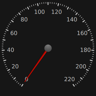
A gauge that displays a value within a range along an arc. 更多...
| import 语句: | import QtQuick.Extras 1.4 |
| Since: | Qt 5.5 |

The CircularGauge is similar to traditional mechanical gauges that use a needle to display a value from some input, such as the speed of a vehicle or air pressure, for example.
The minimum and maximum values displayable by the gauge can be set with the minimumValue and maximumValue properties. The angle at which these values are displayed can be set with the minimumValueAngle and maximumValueAngle properties of CircularGaugeStyle .
范例:
CircularGauge {
    value: accelerating ? maximumValue : 0
    anchors.centerIn: parent
    property bool accelerating: false
    Keys.onSpacePressed: accelerating = true
    Keys.onReleased: {
        if (event.key === Qt.Key_Space) {
            accelerating = false;
            event.accepted = true;
        }
    }
    Component.onCompleted: forceActiveFocus()
    Behavior on value {
        NumberAnimation {
            duration: 1000
        }
    }
}
You can create a custom appearance for a CircularGauge by assigning a CircularGaugeStyle .
|
maximumValue : real |
This property holds the largest value displayed by the gauge.
|
minimumValue : real |
This property holds the smallest value displayed by the gauge.
|
stepSize : real |
This property holds the size of the value increments that the needle displays.
For example, when stepSize is
10
and value is
0
,添加
5
to
value
will have no visible effect on the needle, although
value
will still be incremented. Adding an extra
5
to
value
will then cause the needle to point to
10
.
|
tickmarksVisible : bool |
This property determines whether or not the gauge displays tickmarks, minor tickmarks, and labels.
For more fine-grained control over what is displayed, the following style components of CircularGaugeStyle 可以被使用:
This property holds the current value displayed by the gauge, which will always be between minimumValue and maximumValue , inclusive.