Positions its children in grid formation 更多...
| import 语句: | import QtQuick 2.7 |
| 继承: | Item |
Grid is a type that positions its child items in grid formation.
A Grid creates a grid of cells that is large enough to hold all of its child items, and places these items in the cells from left to right and top to bottom. Each item is positioned at the top-left corner of its cell with position (0, 0).
A Grid defaults to four columns, and creates as many rows as are necessary to fit all of its child items. The number of rows and columns can be constrained by setting the rows and columns 特性。
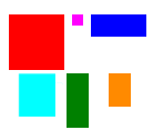
For example, below is a Grid that contains five rectangles of various sizes:
import QtQuick 2.0
Grid {
    columns: 3
    spacing: 2
    Rectangle { color: "red"; width: 50; height: 50 }
    Rectangle { color: "green"; width: 20; height: 50 }
    Rectangle { color: "blue"; width: 50; height: 20 }
    Rectangle { color: "cyan"; width: 50; height: 50 }
    Rectangle { color: "magenta"; width: 10; height: 10 }
}
The Grid automatically positions the child items in a grid formation:

If an item within a Grid is not visible , or if it has a width or height of 0, the item will not be laid out and it will not be visible within the column. Also, since a Grid automatically positions its children, a child item within a Grid should not set its x or y positions or anchor itself with any of the anchor 特性。
For more information on using Grid and other related positioner-types, see Item Positioners .
另请参阅 Flow , Row , Column , Positioner , GridLayout ,和 Qt Quick 范例 - 定位器 .
|
add : Transition |
This property holds the transition to be run for items that are added to this positioner. For a positioner, this applies to:
The transition can use the ViewTransition property to access more details about the item that is being added. See the ViewTransition documentation for more details and examples on using these transitions.
注意: This transition is not applied to the items that are already part of the positioner at the time of its creation. In this case, the populate transition is applied instead.
另请参阅 populate , ViewTransition ,和 Qt Quick 范例 - 定位器 .
These properties hold the padding around the content.
该 QML 特性在 Qt 5.6 引入。
This property holds the spacing in pixels between columns.
If this property is not set, then spacing is used for the column spacing.
By default this property is not set.
This QML property was introduced in Qt 5.0.
另请参阅 rowSpacing .
This property holds the number of columns in the grid. The default number of columns is 4.
If the grid does not have enough items to fill the specified number of columns, some columns will be of zero width.
Sets the horizontal and vertical alignment of items in the Grid. By default, the items are vertically aligned to the top. Horizontal alignment follows the layoutDirection of the Grid, for example when having a layoutDirection from LeftToRight, the items will be aligned on the left.
The valid values for
horizontalItemAlignment
are,
Grid.AlignLeft
,
Grid.AlignRight
and
Grid.AlignHCenter
.
The valid values for
verticalItemAlignment
are
Grid.AlignTop
,
Grid.AlignBottom
and
Grid.AlignVCenter
.
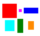
The below images show three examples of how to align items.

|
|
|
|
| Horizontal alignment | AlignLeft | AlignHCenter | AlignHCenter |
| Vertical alignment | AlignTop | AlignTop | AlignVCenter |
When mirroring the layout using either the attached property
LayoutMirroring::enabled
or by setting the
layoutDirection
, the horizontal alignment of items will be mirrored as well. However, the property
horizontalItemAlignment
will remain unchanged. To query the effective horizontal alignment of items, use the read-only property
effectiveHorizontalItemAlignment
.
另请参阅 Grid::layoutDirection and LayoutMirroring .
This property holds the effective layout direction of the grid.
When using the attached property LayoutMirroring::enabled for locale layouts, the visual layout direction of the grid positioner will be mirrored. However, the property layoutDirection will remain unchanged.
另请参阅 Grid::layoutDirection and LayoutMirroring .
This property holds the flow of the layout.
Possible values are:
Sets the horizontal and vertical alignment of items in the Grid. By default, the items are vertically aligned to the top. Horizontal alignment follows the layoutDirection of the Grid, for example when having a layoutDirection from LeftToRight, the items will be aligned on the left.
The valid values for
horizontalItemAlignment
are,
Grid.AlignLeft
,
Grid.AlignRight
and
Grid.AlignHCenter
.
The valid values for
verticalItemAlignment
are
Grid.AlignTop
,
Grid.AlignBottom
and
Grid.AlignVCenter
.
The below images show three examples of how to align items.

|

|

|
|
| Horizontal alignment | AlignLeft | AlignHCenter | AlignHCenter |
| Vertical alignment | AlignTop | AlignTop | AlignVCenter |
When mirroring the layout using either the attached property
LayoutMirroring::enabled
or by setting the
layoutDirection
, the horizontal alignment of items will be mirrored as well. However, the property
horizontalItemAlignment
will remain unchanged. To query the effective horizontal alignment of items, use the read-only property
effectiveHorizontalItemAlignment
.
另请参阅 Grid::layoutDirection and LayoutMirroring .
This property holds the layout direction of the layout.
Possible values are:
另请参阅 Flow::layoutDirection , Row::layoutDirection ,和 Qt Quick Examples - Right to Left .
These properties hold the padding around the content.
该 QML 特性在 Qt 5.6 引入。
|
move : Transition |
This property holds the transition to run for items that have moved within the positioner. For a positioner, this applies to:
The transition can use the ViewTransition property to access more details about the item that is being moved. Note, however, that for this move transition, the ViewTransition .targetIndexes and ViewTransition .targetItems lists are only set when this transition is triggered by the addition of other items in the positioner; in other cases, these lists will be empty. See the ViewTransition documentation for more details and examples on using these transitions.
注意: 在 Qt Quick 1 , this transition was applied to all items that were part of the positioner at the time of its creation. From QtQuick 2 onwards, positioners apply the populate transition to these items instead.
另请参阅 add , ViewTransition ,和 Qt Quick 范例 - 定位器 .
These properties hold the padding around the content.
该 QML 特性在 Qt 5.6 引入。
|
populate : Transition |
This property holds the transition to be run for items that are part of this positioner at the time of its creation. The transition is run when the positioner is first created.
The transition can use the ViewTransition property to access more details about the item that is being added. See the ViewTransition documentation for more details and examples on using these transitions.
另请参阅 add , ViewTransition ,和 Qt Quick 范例 - 定位器 .
These properties hold the padding around the content.
该 QML 特性在 Qt 5.6 引入。
This property holds the spacing in pixels between rows.
If this property is not set, then spacing is used for the row spacing.
By default this property is not set.
This QML property was introduced in Qt 5.0.
另请参阅 columnSpacing .
This property holds the number of rows in the grid.
If the grid does not have enough items to fill the specified number of rows, some rows will be of zero width.
The spacing is the amount in pixels left empty between adjacent items. The amount of spacing applied will be the same in the horizontal and vertical directions. The default spacing is 0.
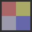
The below example places a Grid containing a red, a blue and a green rectangle on a gray background. The area the grid positioner occupies is colored white. The positioner on the left has the no spacing (the default), and the positioner on the right has a spacing of 6.

These properties hold the padding around the content.
该 QML 特性在 Qt 5.6 引入。
Sets the horizontal and vertical alignment of items in the Grid. By default, the items are vertically aligned to the top. Horizontal alignment follows the layoutDirection of the Grid, for example when having a layoutDirection from LeftToRight, the items will be aligned on the left.
The valid values for
horizontalItemAlignment
are,
Grid.AlignLeft
,
Grid.AlignRight
and
Grid.AlignHCenter
.
The valid values for
verticalItemAlignment
are
Grid.AlignTop
,
Grid.AlignBottom
and
Grid.AlignVCenter
.
The below images show three examples of how to align items.

|

|

|
|
| Horizontal alignment | AlignLeft | AlignHCenter | AlignHCenter |
| Vertical alignment | AlignTop | AlignTop | AlignVCenter |
When mirroring the layout using either the attached property
LayoutMirroring::enabled
or by setting the
layoutDirection
, the horizontal alignment of items will be mirrored as well. However, the property
horizontalItemAlignment
will remain unchanged. To query the effective horizontal alignment of items, use the read-only property
effectiveHorizontalItemAlignment
.
另请参阅 Grid::layoutDirection and LayoutMirroring .
This signal is emitted when positioning has been completed.
相应处理程序是
onPositioningComplete
.
This QML signal was introduced in Qt 5.9.
Grid typically positions its children once per frame. This means that inside script blocks it is possible for the underlying children to have changed, but the Grid to have not yet been updated accordingly.
This method forces the Grid to immediately respond to any outstanding changes in its children.
注意 : methods in general should only be called after the Component has completed.
This QML method was introduced in Qt 5.9.