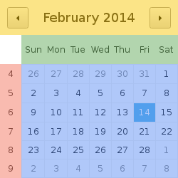
Provides custom styling for Calendar . 更多...
| import 语句: | import QtQuick.Controls.Styles 1.4 |
| Since: | Qt 5.3 |

The calendar has the following styleable components:

|
background | Fills the entire control. |

|
navigationBar | |

|
dayOfWeekDelegate | One instance per day of week. |

|
weekNumberDelegate | One instance per week. |

|
dayDelegate | One instance per day of month. |
Calendar {
    anchors.centerIn: parent
    style: CalendarStyle {
        gridVisible: false
        dayDelegate: Rectangle {
            gradient: Gradient {
                GradientStop {
                    position: 0.00
                    color: styleData.selected ? "#111" : (styleData.visibleMonth && styleData.valid ? "#444" : "#666");
                }
                GradientStop {
                    position: 1.00
                    color: styleData.selected ? "#444" : (styleData.visibleMonth && styleData.valid ? "#111" : "#666");
                }
                GradientStop {
                    position: 1.00
                    color: styleData.selected ? "#777" : (styleData.visibleMonth && styleData.valid ? "#111" : "#666");
                }
            }
            Label {
                text: styleData.date.getDate()
                anchors.centerIn: parent
                color: styleData.valid ? "white" : "grey"
            }
            Rectangle {
                width: parent.width
                height: 1
                color: "#555"
                anchors.bottom: parent.bottom
            }
            Rectangle {
                width: 1
                height: parent.height
                color: "#555"
                anchors.right: parent.right
            }
        }
    }
}
|
background : Component |
The background of the calendar.
The implicit size of the calendar is calculated based on the implicit size of the background delegate.
|
[read-only] control : Calendar |
The Calendar this style is attached to.
|
dayDelegate : Component |
The delegate that styles each date in the calendar.
The properties provided to each delegate are:
| readonly property date styleData.date | The date this delegate represents. |
| readonly property bool styleData.selected |
true
if this is the selected date.
|
| readonly property int styleData.index | The index of this delegate. |
| readonly property bool styleData.valid |
true
if this date is greater than or equal to than
minimumDate
and less than or equal to
maximumDate
.
|
| readonly property bool styleData.today |
true
if this date is equal to today's date.
|
| readonly property bool styleData.visibleMonth |
true
if the month in this date is the visible month.
|
| readonly property bool styleData.hovered |
true
if the mouse is over this cell.
注意:
此特性是
|
| readonly property bool styleData.pressed |
true
if the mouse is pressed on this cell.
注意:
此特性是
|
|
dayOfWeekDelegate : Component |
The delegate that styles each weekday.
The height of the weekday row is calculated based on the maximum implicit height of the delegates.
The properties provided to each delegate are:
| readonly property int styleData.index | The index (0-6) of the delegate. |
| readonly property int styleData.dayOfWeek |
The day of the week this delegate represents. Possible values:
|
|
gridColor : color |
The color of the grid lines.
|
gridVisible : bool |
This property determines the visibility of the grid.
默认值为
true
.
|
navigationBar : Component |
The navigation bar of the calendar.
Styles the bar at the top of the calendar that contains the next month/previous month buttons and the selected date label.
The properties provided to the delegate are:
| readonly property string styleData.title | The title of the calendar. |
|
weekNumberDelegate : Component |
The delegate that styles each week number.
The width of the week number column is calculated based on the maximum implicit width of the delegates.
The properties provided to each delegate are:
| readonly property int styleData.index | The index (0-5) of the delegate. |
| readonly property int styleData.weekNumber | The number of the week this delegate represents. |