Provides custom styling for CircularGauge . 更多...
| import 语句: | import QtQuick.Controls.Styles 1.4 |
| Since: | Qt 5.5 |
You can create a custom circular gauge by replacing the following delegates:
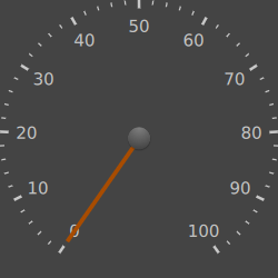
Below is an example that changes the needle to a basic orange Rectangle :
CircularGauge {
    style: CircularGaugeStyle {
        needle: Rectangle {
            y: outerRadius * 0.15
            implicitWidth: outerRadius * 0.03
            implicitHeight: outerRadius * 0.9
            antialiasing: true
            color: Qt.rgba(0.66, 0.3, 0, 1)
        }
    }
}
结果:
minimumValueAngle
and
maximumValueAngle
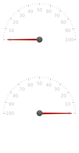
determine not only the position of the tickmarks, labels and needle, but the direction in which they are displayed around the gauge. For example, if
minimumValueAngle
大于
maximumValueAngle
, the gauge will be anti-clockwise. Below, there are two gauges: the top gauge has a
minimumValueAngle
of
-90
degrees and a
maximumValueAngle
of
90
degrees, and the bottom gauge has the opposite.
另请参阅 Styling CircularGauge .
|
[read-only] angleRange : real |
The range between minimumValueAngle and maximumValueAngle , in degrees. This value will always be positive.
|
background : Component |
The background of the gauge.
If set, the background determines the implicit size of the gauge.
By default, there is no background defined.
另请参阅 Styling CircularGauge's background .
|
[read-only] control : CircularGauge |
The CircularGauge that this style is attached to.
|
foreground : Component |
The foreground of the gauge. This component is drawn above all others.
像 background , the foreground component fills the entire gauge.
By default, the knob of the gauge is defined here.
另请参阅 Styling CircularGauge's foreground .
|
[read-only] labelCount : int |
The amount of tickmark labels displayed by the gauge, calculated from labelStepSize and the control's minimumValue and maximumValue .
另请参阅 tickmarkCount and minorTickmarkCount .
|
labelInset : real |
The distance in pixels from the outside of the gauge ( outerRadius ) at which the center of the value marker text is drawn.
|
labelStepSize : real |
The interval at which tickmark labels are displayed.
For example, if this property is set to
10
(the default), control.minimumValue to
0
, and control.maximumValue to
100
, the tickmark labels displayed will be 0, 10, 20, etc., to 100, around the gauge.
|
maximumValueAngle : real |
This property determines the angle at which the maximum value is displayed on the gauge.
The angle set affects the following components of the gauge:
The angle origin points north:
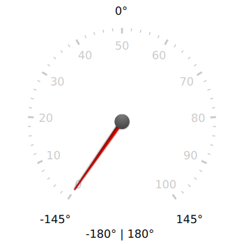
There is no minimum or maximum angle for this property, but the default style only supports angles whose absolute range is less than or equal to
360
degrees. This is because ranges higher than
360
degrees will cause the tickmarks and labels to overlap each other.
默认值为
145
.
|
minimumValueAngle : real |
This property determines the angle at which the minimum value is displayed on the gauge.
The angle set affects the following components of the gauge:
The angle origin points north:

There is no minimum or maximum angle for this property, but the default style only supports angles whose absolute range is less than or equal to
360
degrees. This is because ranges higher than
360
degrees will cause the tickmarks and labels to overlap each other.
默认值为
-145
.
|
minorTickmark : Component |
This component defines each individual minor tickmark. The position of each minor tickmark is already set; only the implicitWidth and implicitHeight need to be specified.
Each instance of this component has access to the following properties:
readonly property int
styleData.index
|
The index of this tickmark. |
readonly property real
styleData.value
|
The value that this tickmark represents. |
另请参阅 Styling CircularGauge's minorTickmark .
|
minorTickmarkCount : int |
The amount of minor tickmarks between each tickmark.
默认值为
4
.
另请参阅 tickmarkCount .
|
minorTickmarkInset : real |
The distance in pixels from the outside of the gauge ( outerRadius ) at which the outermost point of the minor tickmark line is drawn.
|
needle : Component |
The needle that points to the gauge's current value.
This component is drawn below the foreground 组件。
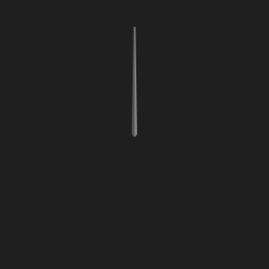
The style expects the needle to be pointing up at a rotation of
0
, in order for the rotation to be correct. For example:
When defining your own needle component, the only properties that the style requires you to set are the implicitWidth and implicitHeight .
Optionally, you can set
x
and
y
to change the needle's transform origin. Setting the
x
position can be useful for needle images where the needle is not centered exactly horizontally. Setting the
y
position allows you to make the base of the needle hang over the center of the gauge.
另请参阅 Styling CircularGauge's needle .
|
needleRotation : real |
This property holds the rotation of the needle in degrees.
|
[read-only] outerRadius : real |
The distance from the center of the gauge to the outer edge of the gauge.
This property is useful for determining the size of the various components of the style, in order to ensure that they are scaled proportionately when the gauge is resized.
|
tickmark : Component |
This component defines each individual tickmark. The position of each tickmark is already set; only the implicitWidth and implicitHeight need to be specified.
Each instance of this component has access to the following properties:
readonly property int
styleData.index
|
The index of this tickmark. |
readonly property real
styleData.value
|
The value that this tickmark represents. |
To illustrate what these properties refer to, we can use the following example:
import QtQuick 2.0
import QtQuick.Controls.Styles 1.4
import QtQuick.Extras 1.4
Rectangle {
    width: 400
    height: 400
    CircularGauge {
        id: gauge
        anchors.fill: parent
        style: CircularGaugeStyle {
            labelInset: outerRadius * 0.2
            tickmarkLabel: null
            tickmark: Text {
                text: styleData.value
                Text {
                    anchors.horizontalCenter: parent.horizontalCenter
                    anchors.top: parent.bottom
                    text: styleData.index
                    color: "blue"
                }
            }
            minorTickmark: Text {
                text: styleData.value
                font.pixelSize: 8
                Text {
                    anchors.horizontalCenter: parent.horizontalCenter
                    anchors.top: parent.bottom
                    text: styleData.index
                    font.pixelSize: 8
                    color: "blue"
                }
            }
        }
        Text {
            id: indexText
            text: "Major and minor indices"
            anchors.horizontalCenter: parent.horizontalCenter
            anchors.bottom: valueText.top
            color: "blue"
        }
        Text {
            id: valueText
            text: "Major and minor values"
            anchors.horizontalCenter: parent.horizontalCenter
            anchors.bottom: parent.bottom
        }
    }
}
We've replaced the conventional line tickmarks with Text items and have hidden the tickmarkLabel component in order to make the association clearer:
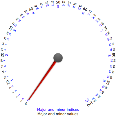
The index property can be useful if you have another model that contains images to display for each index, for example.
The value property is useful for drawing lower and upper limits around the gauge to indicate the recommended value ranges. For example, speeds above 200 kilometers an hour in a car's speedometer could be indicated as dangerous using this property.
另请参阅 Styling CircularGauge's tickmark .
|
[read-only] tickmarkCount : int |
The amount of tickmarks displayed by the gauge, calculated from tickmarkStepSize and the control's minimumValue and maximumValue .
另请参阅 minorTickmarkCount .
|
tickmarkInset : real |
The distance in pixels from the outside of the gauge ( outerRadius ) at which the outermost point of the tickmark line is drawn.
|
tickmarkLabel : Component |
This defines the text of each tickmark label on the gauge.
Each instance of this component has access to the following properties:
readonly property int
styleData.index
|
The index of this label. |
readonly property real
styleData.value
|
The value that this label represents. |
另请参阅 Styling CircularGauge's tickmarkLabel .
|
tickmarkStepSize : real |
The interval at which tickmarks are displayed.
For example, if this property is set to
10
(the default), control.minimumValue to
0
, and control.maximumValue to
100
, the tickmarks displayed will be 0, 10, 20, etc., to 100, around the gauge.
返回 value as an angle in degrees.
This function is useful for custom drawing or positioning of items in the style's components. For example, it can be used to calculate the angles at which to draw an arc around the gauge indicating the safe area for the needle to be within.
例如,若
minimumValueAngle
被设为
270
and
maximumValueAngle
被设为
90
, this function will return
270
when passed minimumValue and
90
when passed maximumValue.