现在,我们会见到一些使用 Qt 样式表的入门范例。
让我们通过将黄色设为背景色对于所有 QLineEdit 在应用程序中。可以像这样达成:
qApp->setStyleSheet("QLineEdit { background-color: yellow }");
若想要特性仅应用于 QLineEdit 的子级 (或孙辈或曾孙辈) 在特定对话框,最好这样做:
myDialog->setStyleSheet("QLineEdit { background-color: yellow }");
若想要特性仅应用于某一特定 QLineEdit ,可以赋予它名称使用 QObject::setObjectName () 并使用 ID 选择器来引用它:
myDialog->setStyleSheet("QLineEdit#nameEdit { background-color: yellow }");
另外,可以设置 background-color 特性直接在 QLineEdit ,省略选择器:
nameEdit->setStyleSheet("background-color: yellow");
为确保良好的对比度,还应该为文本指定合适颜色:
nameEdit->setStyleSheet("color: blue; background-color: yellow");
改变选中文本所用颜色,可能是好主意:
nameEdit->setStyleSheet("color: blue;"
                        "background-color: yellow;"
                        "selection-color: yellow;"
                        "selection-background-color: blue;");
在很多状况下,需要呈现拥有强制性字段的表单。为向用户指示字段是强制性的,一种有效 (尽管审美可疑) 解决方案是使用黄色作为这些字段的背景色。事实证明,使用 Qt 样式表能轻松实现。首先,将使用以下应用程序范围样式表:
*[mandatoryField="true"] { background-color: yellow }
这意味着每个 Widget 的
mandatoryField
Qt 特性被设为 true 将拥有黄色背景。
接着,对于各强制性字段 Widget,只需创建
mandatoryField
动态特性并将其设为 true。例如:
QLineEdit *nameEdit = new QLineEdit(this);
nameEdit->setProperty("mandatoryField", true);
QLineEdit *emailEdit = new QLineEdit(this);
emailEdit->setProperty("mandatoryField", true);
QSpinBox *ageSpinBox = new QSpinBox(this);
ageSpinBox->setProperty("mandatoryField", true);
这次,将展示如何创建红色 QPushButton 。此 QPushButton 大概会连接到一段极具破坏性代码。
首先,我们试图使用此样式表:
QPushButton#evilButton { background-color: red }
不管怎样,结果是没有边框的单调、扁平按钮:
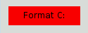
发生了什么是这样的:
none
.
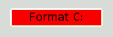
让我们通过指定边框来改善这种状况:
QPushButton#evilButton {
    background-color: red;
    border-style: outset;
    border-width: 2px;
    border-color: beige;
}
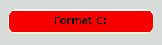
Things look already a lot better. But the button looks a bit cramped. Let's specify some spacing between the border and the text using the padding . Additionally, we will enforce a minimum width, round the corners, and specify a larger font to make the button look nicer:
QPushButton#evilButton {
    background-color: red;
    border-style: outset;
    border-width: 2px;
    border-radius: 10px;
    border-color: beige;
    font: bold 14px;
    min-width: 10em;
    padding: 6px;
}
The only issue remaining is that the button doesn't react when we press it. We can fix this by specifying a slightly different background color and use a different border style.
QPushButton#evilButton {
    background-color: red;
    border-style: outset;
    border-width: 2px;
    border-radius: 10px;
    border-color: beige;
    font: bold 14px;
    min-width: 10em;
    padding: 6px;
}
QPushButton#evilButton:pressed {
    background-color: rgb(224, 0, 0);
    border-style: inset;
}
子控件给出对 Widget 子元素的访问。例如, QPushButton 关联的菜单 (使用 QPushButton::setMenu ()) 拥有菜单指示器。让我们定制红色按钮的菜单指示器:
QPushButton#evilButton::menu-indicator {
    image: url(myindicator.png);
}
By default, the menu indicator is located at the bottom-right corner of the padding rectangle. We can change this by specifying subcontrol-position and subcontrol-origin to anchor the indicator differently. We can also use top and left to move the indicator by a few pixels. For example:
QPushButton::menu-indicator {
    image: url(myindicator.png);
    subcontrol-position: right center;
    subcontrol-origin: padding;
    left: -2px;
}
This positions the
myindicator.png
to the center right of the
QPushButton
's
padding
rectangle (see
subcontrol-origin
了解更多信息)。
Since red seems to be our favorite color, let's make the text in QLineEdit red by setting the following application-wide stylesheet:
QLineEdit { color: red }
However, we would like to give a visual indication that a QLineEdit is read-only by making it appear gray:
QLineEdit { color: red }
QLineEdit[readOnly="true"] { color: gray }
At some point, our design team comes with the requirement that all
QLineEdit
s in the registration form (with the
对象名称
registrationDialog
) to be brown:
QLineEdit { color: red }
QLineEdit[readOnly="true"] { color: gray }
#registrationDialog QLineEdit { color: brown }
A few UI design meetings later, we decide that all our QDialog s should have brown colored QLineEdit :
QLineEdit { color: red }
QLineEdit[readOnly="true"] { color: gray }
QDialog QLineEdit { color: brown }
Quiz: What happens if we have a read-only QLineEdit 在 QDialog ? [Hint: The 解决冲突 section above explains what happens in cases like this.]
此节提供使用样式表定制特定 Widget 的范例。
背景对于任何 QAbstractScrollArea (项视图, QTextEdit and QTextBrowser ) can be set using the background properties. For example, to set a background-image that scrolls with the scroll bar:
QTextEdit, QListView {
    background-color: white;
    background-image: url(draft.png);
    background-attachment: scroll;
}
若 background-image 要与视口固定:
QTextEdit, QListView {
    background-color: white;
    background-image: url(draft.png);
    background-attachment: fixed;
}
样式化的 QCheckBox 几乎等同于样式化 QRadioButton 。主要差异是三态 QCheckBox 拥有不确定状态。
QCheckBox {
    spacing: 5px;
}
QCheckBox::indicator {
    width: 13px;
    height: 13px;
}
QCheckBox::indicator:unchecked {
    image: url(:/images/checkbox_unchecked.png);
}
QCheckBox::indicator:unchecked:hover {
    image: url(:/images/checkbox_unchecked_hover.png);
}
QCheckBox::indicator:unchecked:pressed {
    image: url(:/images/checkbox_unchecked_pressed.png);
}
QCheckBox::indicator:checked {
    image: url(:/images/checkbox_checked.png);
}
QCheckBox::indicator:checked:hover {
    image: url(:/images/checkbox_checked_hover.png);
}
QCheckBox::indicator:checked:pressed {
    image: url(:/images/checkbox_checked_pressed.png);
}
QCheckBox::indicator:indeterminate:hover {
    image: url(:/images/checkbox_indeterminate_hover.png);
}
QCheckBox::indicator:indeterminate:pressed {
    image: url(:/images/checkbox_indeterminate_pressed.png);
}
查看示例,其中下拉按钮对于 QComboBox 出现同组合框框架合并。
QComboBox {
    border: 1px solid gray;
    border-radius: 3px;
    padding: 1px 18px 1px 3px;
    min-width: 6em;
}
QComboBox:editable {
    background: white;
}
QComboBox:!editable, QComboBox::drop-down:editable {
     background: qlineargradient(x1: 0, y1: 0, x2: 0, y2: 1,
                                 stop: 0 #E1E1E1, stop: 0.4 #DDDDDD,
                                 stop: 0.5 #D8D8D8, stop: 1.0 #D3D3D3);
}
/* QComboBox gets the "on" state when the popup is open */
QComboBox:!editable:on, QComboBox::drop-down:editable:on {
    background: qlineargradient(x1: 0, y1: 0, x2: 0, y2: 1,
                                stop: 0 #D3D3D3, stop: 0.4 #D8D8D8,
                                stop: 0.5 #DDDDDD, stop: 1.0 #E1E1E1);
}
QComboBox:on { /* shift the text when the popup opens */
    padding-top: 3px;
    padding-left: 4px;
}
QComboBox::drop-down {
    subcontrol-origin: padding;
    subcontrol-position: top right;
    width: 15px;
    border-left-width: 1px;
    border-left-color: darkgray;
    border-left-style: solid; /* just a single line */
    border-top-right-radius: 3px; /* same radius as the QComboBox */
    border-bottom-right-radius: 3px;
}
QComboBox::down-arrow {
    image: url(/usr/share/icons/crystalsvg/16x16/actions/1downarrow.png);
}
QComboBox::down-arrow:on { /* shift the arrow when popup is open */
    top: 1px;
    left: 1px;
}
弹出对于 QComboBox 是 QAbstractItemView 且样式化是使用后代选择器:
QComboBox QAbstractItemView {
    border: 2px solid darkgray;
    selection-background-color: lightgray;
}
标题栏和按钮对于 QDockWidget 可以按以下定制:
QDockWidget {
    border: 1px solid lightgray;
    titlebar-close-icon: url(close.png);
    titlebar-normal-icon: url(undock.png);
}
QDockWidget::title {
    text-align: left; /* align the text to the left */
    background: lightgray;
    padding-left: 5px;
}
QDockWidget::close-button, QDockWidget::float-button {
    border: 1px solid transparent;
    background: darkgray;
    padding: 0px;
}
QDockWidget::close-button:hover, QDockWidget::float-button:hover {
    background: gray;
}
QDockWidget::close-button:pressed, QDockWidget::float-button:pressed {
    padding: 1px -1px -1px 1px;
}
If one desires to move the dock widget buttons to the left, the following style sheet can be used:
QDockWidget {
    border: 1px solid lightgray;
    titlebar-close-icon: url(close.png);
    titlebar-normal-icon: url(float.png);
}
QDockWidget::title {
    text-align: left;
    background: lightgray;
    padding-left: 35px;
}
QDockWidget::close-button, QDockWidget::float-button {
    background: darkgray;
    padding: 0px;
    icon-size: 14px; /* maximum icon size */
}
QDockWidget::close-button:hover, QDockWidget::float-button:hover {
    background: gray;
}
QDockWidget::close-button:pressed, QDockWidget::float-button:pressed {
    padding: 1px -1px -1px 1px;
}
QDockWidget::close-button {
    subcontrol-position: top left;
    subcontrol-origin: margin;
    position: absolute;
    top: 0px; left: 0px; bottom: 0px;
    width: 14px;
}
QDockWidget::float-button {
    subcontrol-position: top left;
    subcontrol-origin: margin;
    position: absolute;
    top: 0px; left: 16px; bottom: 0px;
    width: 14px;
}
注意: 要定制分隔符 (重置大小手柄) 为 QDockWidget ,使用 QMainWindow::separator。
QFrame, QLabel, QToolTip {
    border: 2px solid green;
    border-radius: 4px;
    padding: 2px;
    background-image: url(images/welcome.png);
}
让我们看看范例如何移动 QGroupBox 标题到中心。
QGroupBox {
    background-color: qlineargradient(x1: 0, y1: 0, x2: 0, y2: 1,
                                      stop: 0 #E0E0E0, stop: 1 #FFFFFF);
    border: 2px solid gray;
    border-radius: 5px;
    margin-top: 1ex; /* leave space at the top for the title */
}
QGroupBox::title {
    subcontrol-origin: margin;
    subcontrol-position: top center; /* position at the top center */
    padding: 0 3px;
    background-color: qlineargradient(x1: 0, y1: 0, x2: 0, y2: 1,
                                      stop: 0 #FF0ECE, stop: 1 #FFFFFF);
}
对于可复选 QGroupBox ,使用 {#indicator-sub}{::indicator} 子控件并样式化它准确像 QCheckBox (即)
QGroupBox::indicator {
    width: 13px;
    height: 13px;
}
QGroupBox::indicator:unchecked {
    image: url(:/images/checkbox_unchecked.png);
}
/* proceed with styling just like QCheckBox */
QHeaderView 的定制如下:
QHeaderView::section {
    background-color: qlineargradient(x1:0, y1:0, x2:0, y2:1,
                                      stop:0 #616161, stop: 0.5 #505050,
                                      stop: 0.6 #434343, stop:1 #656565);
    color: white;
    padding-left: 4px;
    border: 1px solid #6c6c6c;
}
QHeaderView::section:checked
{
    background-color: red;
}
/* style the sort indicator */
QHeaderView::down-arrow {
    image: url(down_arrow.png);
}
QHeaderView::up-arrow {
    image: url(up_arrow.png);
}
框架对于 QLineEdit 的样式化是使用 Box 模型 。要创建带圆角的行编辑,可以设置:
QLineEdit {
    border: 2px solid gray;
    border-radius: 10px;
    padding: 0 8px;
    background: yellow;
    selection-background-color: darkgray;
}
口令字符行编辑拥有 QLineEdit::Password 回显模式,设置可以使用:
QLineEdit[echoMode="2"] {
    lineedit-password-character: 9679;
}
背景对于只读 QLineEdit 可以按如下修改:
QLineEdit:read-only {
    background: lightblue;
}
可以使用以下样式表定制交替行的背景色:
QListView {
    alternate-background-color: yellow;
}
为悬停项提供特殊背景,可以使用 ::item 子控件。例如,
QListView {
    show-decoration-selected: 1; /* make the selection span the entire width of the view */
}
QListView::item:alternate {
    background: #EEEEEE;
}
QListView::item:selected {
    border: 1px solid #6a6ea9;
}
QListView::item:selected:!active {
    background: qlineargradient(x1: 0, y1: 0, x2: 0, y2: 1,
                                stop: 0 #ABAFE5, stop: 1 #8588B2);
}
QListView::item:selected:active {
    background: qlineargradient(x1: 0, y1: 0, x2: 0, y2: 1,
                                stop: 0 #6a6ea9, stop: 1 #888dd9);
}
QListView::item:hover {
    background: qlineargradient(x1: 0, y1: 0, x2: 0, y2: 1,
                                stop: 0 #FAFBFE, stop: 1 #DCDEF1);
}
分隔符对于 QMainWindow 可以样式化如下:
QMainWindow::separator {
    background: yellow;
    width: 10px; /* when vertical */
    height: 10px; /* when horizontal */
}
QMainWindow::separator:hover {
    background: red;
}
单个项对于 QMenu 的样式化使用如下所示的 item 子控件:
QMenu {
    background-color: #ABABAB; /* sets background of the menu */
    border: 1px solid black;
}
QMenu::item {
    /* sets background of menu item. set this to something non-transparent
        if you want menu color and menu item color to be different */
    background-color: transparent;
}
QMenu::item:selected { /* when user selects item using mouse or keyboard */
    background-color: #654321;
}
对于更高级定制,使用如下所示样式表:
QMenu {
    background-color: white;
    margin: 2px; /* some spacing around the menu */
}
QMenu::item {
    padding: 2px 25px 2px 20px;
    border: 1px solid transparent; /* reserve space for selection border */
}
QMenu::item:selected {
    border-color: darkblue;
    background: rgba(100, 100, 100, 150);
}
QMenu::icon:checked { /* appearance of a 'checked' icon */
    background: gray;
    border: 1px inset gray;
    position: absolute;
    top: 1px;
    right: 1px;
    bottom: 1px;
    left: 1px;
}
QMenu::separator {
    height: 2px;
    background: lightblue;
    margin-left: 10px;
    margin-right: 5px;
}
QMenu::indicator {
    width: 13px;
    height: 13px;
}
/* non-exclusive indicator = check box style indicator (see QActionGroup::setExclusive) */
QMenu::indicator:non-exclusive:unchecked {
    image: url(:/images/checkbox_unchecked.png);
}
QMenu::indicator:non-exclusive:unchecked:selected {
    image: url(:/images/checkbox_unchecked_hover.png);
}
QMenu::indicator:non-exclusive:checked {
    image: url(:/images/checkbox_checked.png);
}
QMenu::indicator:non-exclusive:checked:selected {
    image: url(:/images/checkbox_checked_hover.png);
}
/* exclusive indicator = radio button style indicator (see QActionGroup::setExclusive) */
QMenu::indicator:exclusive:unchecked {
    image: url(:/images/radiobutton_unchecked.png);
}
QMenu::indicator:exclusive:unchecked:selected {
    image: url(:/images/radiobutton_unchecked_hover.png);
}
QMenu::indicator:exclusive:checked {
    image: url(:/images/radiobutton_checked.png);
}
QMenu::indicator:exclusive:checked:selected {
    image: url(:/images/radiobutton_checked_hover.png);
}
QMenuBar 样式化如下:
QMenuBar {
    background-color: qlineargradient(x1:0, y1:0, x2:0, y2:1,
                                      stop:0 lightgray, stop:1 darkgray);
}
QMenuBar::item {
    spacing: 3px; /* spacing between menu bar items */
    padding: 1px 4px;
    background: transparent;
    border-radius: 4px;
}
QMenuBar::item:selected { /* when selected using mouse or keyboard */
    background: #a8a8a8;
}
QMenuBar::item:pressed {
    background: #888888;
}
The QProgressBar 's border , chunk ,和 text-align 可以使用样式表定制。不管怎样,若定制了一个特性或子控件,则所有其它特性或子控件也必须定制。
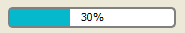
QProgressBar {
    border: 2px solid grey;
    border-radius: 5px;
}
QProgressBar::chunk {
    background-color: #05B8CC;
    width: 20px;
}
这剩 text-align ,通过使文本居中进度条进行定位定制。
QProgressBar {
    border: 2px solid grey;
    border-radius: 5px;
    text-align: center;
}
A margin 可以包括以获得更多可见组块。
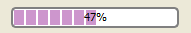
以上屏幕截图使用 margin 0.5 像素。
QProgressBar::chunk {
    background-color: #CD96CD;
    width: 10px;
    margin: 0.5px;
}
A QPushButton 样式化如下:
QPushButton {
    border: 2px solid #8f8f91;
    border-radius: 6px;
    background-color: qlineargradient(x1: 0, y1: 0, x2: 0, y2: 1,
                                      stop: 0 #f6f7fa, stop: 1 #dadbde);
    min-width: 80px;
}
QPushButton:pressed {
    background-color: qlineargradient(x1: 0, y1: 0, x2: 0, y2: 1,
                                      stop: 0 #dadbde, stop: 1 #f6f7fa);
}
QPushButton:flat {
    border: none; /* no border for a flat push button */
}
QPushButton:default {
    border-color: navy; /* make the default button prominent */
}
对于 QPushButton 具有菜单,使用 ::menu-indicator 子控件。
QPushButton:open { /* when the button has its menu open */
    background-color: qlineargradient(x1: 0, y1: 0, x2: 0, y2: 1,
                                      stop: 0 #dadbde, stop: 1 #f6f7fa);
}
QPushButton::menu-indicator {
    image: url(menu_indicator.png);
    subcontrol-origin: padding;
    subcontrol-position: bottom right;
}
QPushButton::menu-indicator:pressed, QPushButton::menu-indicator:open {
    position: relative;
    top: 2px; left: 2px; /* shift the arrow by 2 px */
}
可复选 QPushButton 拥有 :checked 伪状态设置。
指示器对于 QRadioButton 可以改变使用:
QRadioButton::indicator {
    width: 13px;
    height: 13px;
}
QRadioButton::indicator::unchecked {
    image: url(:/images/radiobutton_unchecked.png);
}
QRadioButton::indicator:unchecked:hover {
    image: url(:/images/radiobutton_unchecked_hover.png);
}
QRadioButton::indicator:unchecked:pressed {
    image: url(:/images/radiobutton_unchecked_pressed.png);
}
QRadioButton::indicator::checked {
    image: url(:/images/radiobutton_checked.png);
}
QRadioButton::indicator:checked:hover {
    image: url(:/images/radiobutton_checked_hover.png);
}
QRadioButton::indicator:checked:pressed {
    image: url(:/images/radiobutton_checked_pressed.png);
}
The QScrollBar 可以被样式化使用其子控件像 handle , add-line , sub-line , and so on. Note that if one property or sub-control is customized, all the other properties or sub-controls must be customized as well.
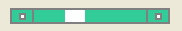
采用纯灰色边框,以碧绿色样式化以上滚动条。
QScrollBar:horizontal {
    border: 2px solid grey;
    background: #32CC99;
    height: 15px;
    margin: 0px 20px 0 20px;
}
QScrollBar::handle:horizontal {
    background: white;
    min-width: 20px;
}
QScrollBar::add-line:horizontal {
    border: 2px solid grey;
    background: #32CC99;
    width: 20px;
    subcontrol-position: right;
    subcontrol-origin: margin;
}
QScrollBar::sub-line:horizontal {
    border: 2px solid grey;
    background: #32CC99;
    width: 20px;
    subcontrol-position: left;
    subcontrol-origin: margin;
}
The left-arrow and right-arrow have a solid grey border with a white background. As an alternative, you could also embed the image of an arrow.
QScrollBar:left-arrow:horizontal, QScrollBar::right-arrow:horizontal {
    border: 2px solid grey;
    width: 3px;
    height: 3px;
    background: white;
}
QScrollBar::add-page:horizontal, QScrollBar::sub-page:horizontal {
    background: none;
}
If you want the scroll buttons of the scroll bar to be placed together (instead of the edges) like on macOS , you can use the following stylesheet:
QScrollBar:horizontal {
    border: 2px solid green;
    background: cyan;
    height: 15px;
    margin: 0px 40px 0 0px;
}
QScrollBar::handle:horizontal {
    background: gray;
    min-width: 20px;
}
QScrollBar::add-line:horizontal {
    background: blue;
    width: 16px;
    subcontrol-position: right;
    subcontrol-origin: margin;
    border: 2px solid black;
}
QScrollBar::sub-line:horizontal {
    background: magenta;
    width: 16px;
    subcontrol-position: top right;
    subcontrol-origin: margin;
    border: 2px solid black;
    position: absolute;
    right: 20px;
}
QScrollBar:left-arrow:horizontal, QScrollBar::right-arrow:horizontal {
    width: 3px;
    height: 3px;
    background: pink;
}
QScrollBar::add-page:horizontal, QScrollBar::sub-page:horizontal {
    background: none;
}
使用上述样式表的滚动条看起来像这样:

要定制垂直滚动条,使用类似以下的样式表:
 QScrollBar:vertical {
     border: 2px solid grey;
     background: #32CC99;
     width: 15px;
     margin: 22px 0 22px 0;
 }
 QScrollBar::handle:vertical {
     background: white;
     min-height: 20px;
 }
 QScrollBar::add-line:vertical {
     border: 2px solid grey;
     background: #32CC99;
     height: 20px;
     subcontrol-position: bottom;
     subcontrol-origin: margin;
 }
 QScrollBar::sub-line:vertical {
     border: 2px solid grey;
     background: #32CC99;
     height: 20px;
     subcontrol-position: top;
     subcontrol-origin: margin;
 }
 QScrollBar::up-arrow:vertical, QScrollBar::down-arrow:vertical {
     border: 2px solid grey;
     width: 3px;
     height: 3px;
     background: white;
 }
 QScrollBar::add-page:vertical, QScrollBar::sub-page:vertical {
     background: none;
 }
QSizeGrip 通常通过仅仅设置图像以样式化。
QSizeGrip {
    image: url(:/images/sizegrip.png);
    width: 16px;
    height: 16px;
}
可以按如下样式化水平滑块:
QSlider::groove:horizontal {
    border: 1px solid #999999;
    height: 8px; /* the groove expands to the size of the slider by default. by giving it a height, it has a fixed size */
    background: qlineargradient(x1:0, y1:0, x2:0, y2:1, stop:0 #B1B1B1, stop:1 #c4c4c4);
    margin: 2px 0;
}
QSlider::handle:horizontal {
    background: qlineargradient(x1:0, y1:0, x2:1, y2:1, stop:0 #b4b4b4, stop:1 #8f8f8f);
    border: 1px solid #5c5c5c;
    width: 18px;
    margin: -2px 0; /* handle is placed by default on the contents rect of the groove. Expand outside the groove */
    border-radius: 3px;
}
若想要改变手柄前后滑块部分的颜色,可以使用添加页面和子页面子控件。例如,对于垂直滑块:
QSlider::groove:vertical {
    background: red;
    position: absolute; /* absolutely position 4px from the left and right of the widget. setting margins on the widget should work too... */
    left: 4px; right: 4px;
}
QSlider::handle:vertical {
    height: 10px;
    background: green;
    margin: 0 -4px; /* expand outside the groove */
}
QSlider::add-page:vertical {
    background: white;
}
QSlider::sub-page:vertical {
    background: pink;
}
QSpinBox 可以完全定制如下 (样式表有内联解说):
QSpinBox {
    padding-right: 15px; /* make room for the arrows */
    border-image: url(:/images/frame.png) 4;
    border-width: 3;
}
QSpinBox::up-button {
    subcontrol-origin: border;
    subcontrol-position: top right; /* position at the top right corner */
    width: 16px; /* 16 + 2*1px border-width = 15px padding + 3px parent border */
    border-image: url(:/images/spinup.png) 1;
    border-width: 1px;
}
QSpinBox::up-button:hover {
    border-image: url(:/images/spinup_hover.png) 1;
}
QSpinBox::up-button:pressed {
    border-image: url(:/images/spinup_pressed.png) 1;
}
QSpinBox::up-arrow {
    image: url(:/images/up_arrow.png);
    width: 7px;
    height: 7px;
}
QSpinBox::up-arrow:disabled, QSpinBox::up-arrow:off { /* off state when value is max */
   image: url(:/images/up_arrow_disabled.png);
}
QSpinBox::down-button {
    subcontrol-origin: border;
    subcontrol-position: bottom right; /* position at bottom right corner */
    width: 16px;
    border-image: url(:/images/spindown.png) 1;
    border-width: 1px;
    border-top-width: 0;
}
QSpinBox::down-button:hover {
    border-image: url(:/images/spindown_hover.png) 1;
}
QSpinBox::down-button:pressed {
    border-image: url(:/images/spindown_pressed.png) 1;
}
QSpinBox::down-arrow {
    image: url(:/images/down_arrow.png);
    width: 7px;
    height: 7px;
}
QSpinBox::down-arrow:disabled,
QSpinBox::down-arrow:off { /* off state when value in min */
   image: url(:/images/down_arrow_disabled.png);
}
A QSplitter 派生自 QFrame 因此可以被样式化像 QFrame 。握把或手柄的定制使用 ::handle 子控件。
QSplitter::handle {
    image: url(images/splitter.png);
}
QSplitter::handle:horizontal {
    width: 2px;
}
QSplitter::handle:vertical {
    height: 2px;
}
QSplitter::handle:pressed {
    url(images/splitter_pressed.png);
}
We can provide a background for the status bar and a border for items inside the status bar as follows:
QStatusBar {
    background: brown;
}
QStatusBar::item {
    border: 1px solid red;
    border-radius: 3px;
}
Note that widgets that have been added to the QStatusBar can be styled using the descendant declaration (i.e)
QStatusBar QLabel {
    border: 3px solid white;
}
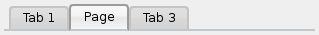
对于以上截图,需要以下样式表:
QTabWidget::pane { /* The tab widget frame */
    border-top: 2px solid #C2C7CB;
}
QTabWidget::tab-bar {
    left: 5px; /* move to the right by 5px */
}
/* Style the tab using the tab sub-control. Note that
    it reads QTabBar _not_ QTabWidget */
QTabBar::tab {
    background: qlineargradient(x1: 0, y1: 0, x2: 0, y2: 1,
                                stop: 0 #E1E1E1, stop: 0.4 #DDDDDD,
                                stop: 0.5 #D8D8D8, stop: 1.0 #D3D3D3);
    border: 2px solid #C4C4C3;
    border-bottom-color: #C2C7CB; /* same as the pane color */
    border-top-left-radius: 4px;
    border-top-right-radius: 4px;
    min-width: 8ex;
    padding: 2px;
}
QTabBar::tab:selected, QTabBar::tab:hover {
    background: qlineargradient(x1: 0, y1: 0, x2: 0, y2: 1,
                                stop: 0 #fafafa, stop: 0.4 #f4f4f4,
                                stop: 0.5 #e7e7e7, stop: 1.0 #fafafa);
}
QTabBar::tab:selected {
    border-color: #9B9B9B;
    border-bottom-color: #C2C7CB; /* same as pane color */
}
QTabBar::tab:!selected {
    margin-top: 2px; /* make non-selected tabs look smaller */
}
经常要求重叠的选项卡外观如下:
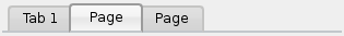
外观如上的选项卡 Widget,制作是使用 负边距 。结果样式表看起来像这样:
QTabWidget::pane { /* The tab widget frame */
    border-top: 2px solid #C2C7CB;
}
QTabWidget::tab-bar {
    left: 5px; /* move to the right by 5px */
}
/* Style the tab using the tab sub-control. Note that
    it reads QTabBar _not_ QTabWidget */
QTabBar::tab {
    background: qlineargradient(x1: 0, y1: 0, x2: 0, y2: 1,
                                stop: 0 #E1E1E1, stop: 0.4 #DDDDDD,
                                stop: 0.5 #D8D8D8, stop: 1.0 #D3D3D3);
    border: 2px solid #C4C4C3;
    border-bottom-color: #C2C7CB; /* same as the pane color */
    border-top-left-radius: 4px;
    border-top-right-radius: 4px;
    min-width: 8ex;
    padding: 2px;
}
QTabBar::tab:selected, QTabBar::tab:hover {
    background: qlineargradient(x1: 0, y1: 0, x2: 0, y2: 1,
                                stop: 0 #fafafa, stop: 0.4 #f4f4f4,
                                stop: 0.5 #e7e7e7, stop: 1.0 #fafafa);
}
QTabBar::tab:selected {
    border-color: #9B9B9B;
    border-bottom-color: #C2C7CB; /* same as pane color */
}
QTabBar::tab:!selected {
    margin-top: 2px; /* make non-selected tabs look smaller */
}
/* make use of negative margins for overlapping tabs */
QTabBar::tab:selected {
    /* expand/overlap to the left and right by 4px */
    margin-left: -4px;
    margin-right: -4px;
}
QTabBar::tab:first:selected {
    margin-left: 0; /* the first selected tab has nothing to overlap with on the left */
}
QTabBar::tab:last:selected {
    margin-right: 0; /* the last selected tab has nothing to overlap with on the right */
}
QTabBar::tab:only-one {
    margin: 0; /* if there is only one tab, we don't want overlapping margins */
}
要将选项卡栏移动到中心 (如下),要求以下样式表:

QTabWidget::pane { /* The tab widget frame */
    border-top: 2px solid #C2C7CB;
    position: absolute;
    top: -0.5em;
}
QTabWidget::tab-bar {
    alignment: center;
}
/* Style the tab using the tab sub-control. Note that
    it reads QTabBar _not_ QTabWidget */
QTabBar::tab {
    background: qlineargradient(x1: 0, y1: 0, x2: 0, y2: 1,
                                stop: 0 #E1E1E1, stop: 0.4 #DDDDDD,
                                stop: 0.5 #D8D8D8, stop: 1.0 #D3D3D3);
    border: 2px solid #C4C4C3;
    border-bottom-color: #C2C7CB; /* same as the pane color */
    border-top-left-radius: 4px;
    border-top-right-radius: 4px;
    min-width: 8ex;
    padding: 2px;
}
QTabBar::tab:selected, QTabBar::tab:hover {
    background: qlineargradient(x1: 0, y1: 0, x2: 0, y2: 1,
                                stop: 0 #fafafa, stop: 0.4 #f4f4f4,
                                stop: 0.5 #e7e7e7, stop: 1.0 #fafafa);
}
QTabBar::tab:selected {
    border-color: #9B9B9B;
    border-bottom-color: #C2C7CB; /* same as pane color */
}
The tear indicator and the scroll buttons can be further customized as follows:
QTabBar::tear {
    image: url(tear_indicator.png);
}
QTabBar::scroller { /* the width of the scroll buttons */
    width: 20px;
}
QTabBar QToolButton { /* the scroll buttons are tool buttons */
    border-image: url(scrollbutton.png) 2;
    border-width: 2px;
}
QTabBar QToolButton::right-arrow { /* the arrow mark in the tool buttons */
    image: url(rightarrow.png);
}
QTabBar QToolButton::left-arrow {
    image: url(leftarrow.png);
}
从 Qt 4.6 起,可以定制关闭按钮如下:
QTabBar::close-button {
    image: url(close.png)
    subcontrol-position: left;
}
QTabBar::close-button:hover {
    image: url(close-hover.png)
}
假设像选中项在 QTableView 将泡泡糖粉红色淡化成白色作为其背景。
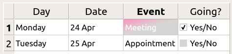
这是可能的采用 selection-background-color 特性和要求句法:
QTableView {
    selection-background-color: qlineargradient(x1: 0, y1: 0, x2: 0.5, y2: 0.5,
                                stop: 0 #FF92BB, stop: 1 white);
}
可以使用以下样式表定制角落 Widget
QTableView QTableCornerButton::section {
    background: red;
    border: 2px outset red;
}
The
QTableView
的复选框指示器也可以定制。以下片段中指示器
background-color
是按 unchecked (取消复选) 状态定制的:
QTableView::indicator:unchecked {
    background-color: #d7d6d5
}
背景和手柄对于 QToolBar 的定制如下:
QToolBar {
    background: red;
    spacing: 3px; /* spacing between items in the tool bar */
}
QToolBar::handle {
    image: url(handle.png);
}
tab 对于 QToolBox 的定制是使用 tab 子控件。
QToolBox::tab {
    background: qlineargradient(x1: 0, y1: 0, x2: 0, y2: 1,
                                stop: 0 #E1E1E1, stop: 0.4 #DDDDDD,
                                stop: 0.5 #D8D8D8, stop: 1.0 #D3D3D3);
    border-radius: 5px;
    color: darkgray;
}
QToolBox::tab:selected { /* italicize selected tabs */
    font: italic;
    color: white;
}
QToolButton 有 3 种类型。
QToolButton { /* all types of tool button */
    border: 2px solid #8f8f91;
    border-radius: 6px;
    background-color: qlineargradient(x1: 0, y1: 0, x2: 0, y2: 1,
                                      stop: 0 #f6f7fa, stop: 1 #dadbde);
}
QToolButton[popupMode="1"] { /* only for MenuButtonPopup */
    padding-right: 20px; /* make way for the popup button */
}
QToolButton:pressed {
    background-color: qlineargradient(x1: 0, y1: 0, x2: 0, y2: 1,
                                      stop: 0 #dadbde, stop: 1 #f6f7fa);
}
/* the subcontrols below are used only in the MenuButtonPopup mode */
QToolButton::menu-button {
    border: 2px solid gray;
    border-top-right-radius: 6px;
    border-bottom-right-radius: 6px;
    /* 16px width + 4px for border = 20px allocated above */
    width: 16px;
}
QToolButton::menu-arrow {
    image: url(downarrow.png);
}
QToolButton::menu-arrow:open {
    top: 1px; left: 1px; /* shift it a bit */
}
QToolTip 的定制准确像 QLabel 。此外,对于支持它的平台,可以设置 opacity 特性来调节不透明度。
例如,
QToolTip {
    border: 2px solid darkkhaki;
    padding: 5px;
    border-radius: 3px;
    opacity: 200;
}
可以使用以下样式表定制交替行的背景色:
QTreeView {
    alternate-background-color: yellow;
}
为悬停项提供特殊背景,可以使用 ::item 子控件。例如,
QTreeView {
    show-decoration-selected: 1;
}
QTreeView::item {
     border: 1px solid #d9d9d9;
    border-top-color: transparent;
    border-bottom-color: transparent;
}
QTreeView::item:hover {
    background: qlineargradient(x1: 0, y1: 0, x2: 0, y2: 1, stop: 0 #e7effd, stop: 1 #cbdaf1);
    border: 1px solid #bfcde4;
}
QTreeView::item:selected {
    border: 1px solid #567dbc;
}
QTreeView::item:selected:active{
    background: qlineargradient(x1: 0, y1: 0, x2: 0, y2: 1, stop: 0 #6ea1f1, stop: 1 #567dbc);
}
QTreeView::item:selected:!active {
    background: qlineargradient(x1: 0, y1: 0, x2: 0, y2: 1, stop: 0 #6b9be8, stop: 1 #577fbf);
}
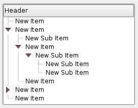
分支在 QTreeView 被样式化使用 ::branch 子控件。以下样式表按颜色编码各种状态,当绘制分支时。
QTreeView::branch {
        background: palette(base);
}
QTreeView::branch:has-siblings:!adjoins-item {
        background: cyan;
}
QTreeView::branch:has-siblings:adjoins-item {
        background: red;
}
QTreeView::branch:!has-children:!has-siblings:adjoins-item {
        background: blue;
}
QTreeView::branch:closed:has-children:has-siblings {
        background: pink;
}
QTreeView::branch:has-children:!has-siblings:closed {
        background: gray;
}
QTreeView::branch:open:has-children:has-siblings {
        background: magenta;
}
QTreeView::branch:open:has-children:!has-siblings {
        background: green;
}
虽然它色彩缤纷,但更有用的范例是使用下列图像:

|

|

|

|

|
| vline.png | branch-more.png | branch-end.png | branch-closed.png | branch-open.png |
QTreeView::branch:has-siblings:!adjoins-item {
    border-image: url(vline.png) 0;
}
QTreeView::branch:has-siblings:adjoins-item {
    border-image: url(branch-more.png) 0;
}
QTreeView::branch:!has-children:!has-siblings:adjoins-item {
    border-image: url(branch-end.png) 0;
}
QTreeView::branch:has-children:!has-siblings:closed,
QTreeView::branch:closed:has-children:has-siblings {
        border-image: none;
        image: url(branch-closed.png);
}
QTreeView::branch:open:has-children:!has-siblings,
QTreeView::branch:open:has-children:has-siblings  {
        border-image: none;
        image: url(branch-open.png);
}
结果树视图看起来像这样:
此节列出一些常见过失,当使用样式表时。
当样式化 QPushButton ,经常期望使用图像作为按钮图形。常见的是尝试 background-image 特性,但这有很多缺点:例如,背景经常隐藏在按钮装饰后面,因为不被认为是背景。此外,若调整按钮大小,整个背景将被拉伸或平铺,外观总是不好。
最好使用 border-image 特性,因为它始终显示图像,不管背景 (若有 Alpha 值,可以组合它与背景),且它有特殊设置以处理按钮大小调整。
考虑以下片段:
        QPushButton {
            color: grey;
            border-image: url(/home/kamlie/code/button.png) 3 10 3 10;
            border-top: 3px transparent;
            border-bottom: 3px transparent;
            border-right: 10px transparent;
            border-left: 10px transparent;
        }
这将产生看起来像这样的按钮:
The numbers after the url gives the top, right, bottom and left number of pixels, respectively. These numbers correspond to the border and should not stretch when the size changes. Whenever you resize the button, the middle part of the image will stretch in both directions, while the pixels specified in the stylesheet will not. This makes the borders of the button look more natural, like this:

|
| 具有边框 |

|
| 没有边框 |
另请参阅 样式表范例 , 支持的 HTML 子集 ,和 QStyle .