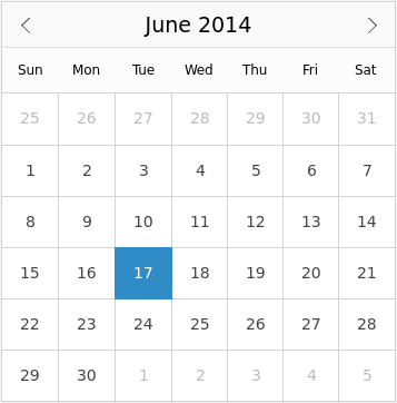
Provides a way to select dates from a calendar 更多...
| import 语句: | import QtQuick.Controls 1.4 |
| Since: | Qt 5.3 |
| 继承: | FocusScope |

Calendar allows selection of dates from a grid of days, similar to QCalendarWidget .
The dates on the calendar can be selected with the mouse, or navigated with the keyboard.
The selected date can be set through selectedDate . A minimum and maximum date can be set through minimumDate and maximumDate . The earliest minimum date that can be set is 1 January, 1 AD. The latest maximum date that can be set is 25 October, 275759 AD.
Calendar {
    minimumDate: new Date(2017, 0, 1)
    maximumDate: new Date(2018, 0, 1)
}
The selected date is displayed using the format in the application's default locale.
Week numbers can be displayed by setting the
weekNumbersVisible
特性到
true
.
Calendar {
    weekNumbersVisible: true
}
You can create a custom appearance for Calendar by assigning a CalendarStyle .
The format in which the days of the week (in the header) are displayed.
Locale.ShortFormat
is the default and recommended format, as
Locale.NarrowFormat
may not be fully supported by each locale (see
区域设置字符串格式类型
) 和
Locale.LongFormat
may not fit within the header cells.
This property determines the visibility of the frame surrounding the calendar.
默认值为
true
.
|
maximumDate : date |
The latest date that this calendar will accept.
By default, this property is set to the latest maximum date (25 October, 275759 AD).
|
minimumDate : date |
The earliest date that this calendar will accept.
By default, this property is set to the earliest minimum date (1 January, 1 AD).
This property determines the visibility of the navigation bar.
默认值为
true
.
This QML property was introduced in QtQuick.Controls 1.3.
|
selectedDate : date |
The date that has been selected by the user.
This property is subject to the following validation:
undefined
or some other invalid value is assigned.
The default value is the current date, which is equivalent to:
new Date()
|
style : Component |
The style Component for this control.
另请参阅 Qt Quick Controls Styles QML Types .
This property determines which month in visibleYear is shown on the calendar.
The month is from
0
to
11
to be consistent with the JavaScript Date object.
另请参阅 visibleYear .
This property determines which year is shown on the calendar.
另请参阅 visibleMonth .
This property determines the visibility of week numbers.
默认值为
false
.
|
clicked ( date date ) |
Emitted when the mouse is clicked on a valid date in the calendar.
date is the date that the mouse was clicked on.
相应处理程序是
onClicked
.
|
doubleClicked ( date date ) |
Emitted when the mouse is double-clicked on a valid date in the calendar.
date is the date that the mouse was double-clicked on.
相应处理程序是
onDoubleClicked
.
|
hovered ( date date ) |
Emitted when the mouse hovers over a valid date in the calendar.
date is the date that was hovered over.
相应处理程序是
onHovered
.
|
pressAndHold ( date date ) |
Emitted when the mouse is pressed and held on a valid date in the calendar.
date is the date that the mouse was pressed on.
相应处理程序是
onPressAndHold
.
This QML signal was introduced in QtQuick.Controls 1.3.
|
pressed ( date date ) |
Emitted when the mouse is pressed on a valid date in the calendar.
This is also emitted when dragging the mouse to another date while it is pressed.
date is the date that the mouse was pressed on.
相应处理程序是
onPressed
.
|
released ( date date ) |
Emitted when the mouse is released over a valid date in the calendar.
date is the date that the mouse was released over.
相应处理程序是
onReleased
.
集 visibleMonth to the next month.
集 visibleYear to the next year.
集 visibleMonth to the previous month.
集 visibleYear to the previous year.