Allows the user to switch between different views or subtasks. 更多...
| import 语句: | import QtQuick.Controls 2.2 |
| Since: | Qt 5.7 |
| 继承: | Container |
TabBar provides a tab-based navigation model.

TabBar
is populated with
TabButton
controls, and can be used together with any layout or container control that provides
currentIndex
-property, such as
StackLayout
or
SwipeView
TabBar {
    id: bar
    width: parent.width
    TabButton {
        text: qsTr("Home")
    }
    TabButton {
        text: qsTr("Discover")
    }
    TabButton {
        text: qsTr("Activity")
    }
}
StackLayout {
    width: parent.width
    currentIndex: bar.currentIndex
    Item {
        id: homeTab
    }
    Item {
        id: discoverTab
    }
    Item {
        id: activityTab
    }
}
As shown above, TabBar is typically populated with a static set of tab buttons that are defined inline as children of the tab bar. It is also possible to add , insert , move ,和 remove items dynamically at run time. The items can be accessed using itemAt() or contentChildren .
默认情况下, TabBar resizes its buttons to fit the width of the control. The available space is distributed equally to each button. The default resizing behavior can be overridden by setting an explicit width for the buttons.
The following example illustrates how to keep each tab button at their implicit size instead of being resized to fit the tabbar:
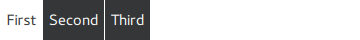
TabBar {
    width: parent.width
    TabButton {
        text: "First"
        width: implicitWidth
    }
    TabButton {
        text: "Second"
        width: implicitWidth
    }
    TabButton {
        text: "Third"
        width: implicitWidth
    }
}
If the total width of the buttons exceeds the available width of the tab bar, it automatically becomes flickable.
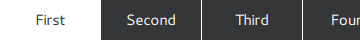
TabBar {
    id: bar
    width: parent.width
    Repeater {
        model: ["First", "Second", "Third", "Fourth", "Fifth"]
        TabButton {
            text: modelData
            width: Math.max(100, bar.width / 5)
        }
    }
}
另请参阅 TabButton , Customizing TabBar , 导航控件 ,和 容器控件 .
This property holds the content height. It is used for calculating the total implicit height of the tab bar.
Unless explicitly overridden, the content height is automatically calculated based on the maximum implicit height of the tabs.
This QML property was introduced in QtQuick.Controls 2.2 (Qt 5.9).
另请参阅 contentWidth .
This property holds the content width. It is used for calculating the total implicit width of the tab bar.
Unless explicitly overridden, the content width is automatically calculated based on the total implicit width of the tabs and the spacing of the tab bar.
This QML property was introduced in QtQuick.Controls 2.2 (Qt 5.9).
另请参阅 contentHeight .
This property holds the position of the tab bar.
注意: If the tab bar is assigned as a header or footer of ApplicationWindow or Page , the appropriate position is set automatically.
可能的值:
| 常量 | 描述 |
|---|---|
TabBar.Header
|
The tab bar is at the top, as a window or page header. |
TabBar.Footer
|
The tab bar is at the bottom, as a window or page footer. |
The default value is style-specific.
另请参阅 ApplicationWindow::header , ApplicationWindow::footer , Page::header ,和 Page::footer .