要运行范例从 Qt Creator ,打开 欢迎 模式,然后选择范例从 范例 。更多信息,拜访 构建和运行范例 .
We begin with a chart that has a line series and a scatter series with random data. Both series use the same axes.
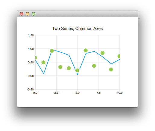
ChartView {
    title: "Two Series, Common Axes"
    anchors.fill: parent
    legend.visible: false
    antialiasing: true
    ValueAxis {
        id: axisX
        min: 0
        max: 10
        tickCount: 5
    }
    ValueAxis {
        id: axisY
        min: -0.5
        max: 1.5
    }
    LineSeries {
        id: series1
        axisX: axisX
        axisY: axisY
    }
    ScatterSeries {
        id: series2
        axisX: axisX
        axisY: axisY
    }
}
// Add data dynamically to the series
Component.onCompleted: {
    for (var i = 0; i <= 10; i++) {
        series1.append(i, Math.random());
        series2.append(i, Math.random());
    }
}
The next example shows a chart with some accurate historical data that makes us to use a DateTimeAxis .
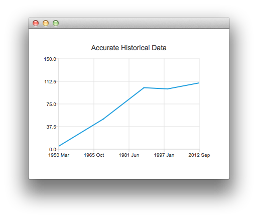
ChartView {
    title: "Accurate Historical Data"
    anchors.fill: parent
    legend.visible: false
    antialiasing: true
    LineSeries {
        axisX: DateTimeAxis {
            format: "yyyy MMM"
            tickCount: 5
        }
        axisY: ValueAxis {
            min: 0
            max: 150
        }
        // Please note that month in JavaScript months are zero based, so 2 means March
        XYPoint { x: toMsecsSinceEpoch(new Date(1950, 2, 15)); y: 5 }
        XYPoint { x: toMsecsSinceEpoch(new Date(1970, 0, 1)); y: 50 }
        XYPoint { x: toMsecsSinceEpoch(new Date(1987, 12, 31)); y: 102 }
        XYPoint { x: toMsecsSinceEpoch(new Date(1998, 7, 1)); y: 100 }
        XYPoint { x: toMsecsSinceEpoch(new Date(2012, 8, 2)); y: 110 }
    }
}
// DateTimeAxis is based on QDateTimes so we must convert our JavaScript dates to
// milliseconds since epoch to make them match the DateTimeAxis values
function toMsecsSinceEpoch(date) {
    var msecs = date.getTime();
    return msecs;
}
And the final example with a chart that uses a CategoryAxis to make the data easier to understand.
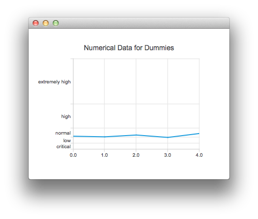
ChartView {
    title: "Numerical Data for Dummies"
    anchors.fill: parent
    legend.visible: false
    antialiasing: true
    LineSeries {
        axisY: CategoryAxis {
            min: 0
            max: 30
            CategoryRange {
                label: "critical"
                endValue: 2
            }
            CategoryRange {
                label: "low"
                endValue: 4
            }
            CategoryRange {
                label: "normal"
                endValue: 7
            }
            CategoryRange {
                label: "high"
                endValue: 15
            }
            CategoryRange {
                label: "extremely high"
                endValue: 30
            }
        }
        XYPoint { x: 0; y: 4.3 }
        XYPoint { x: 1; y: 4.1 }
        XYPoint { x: 2; y: 4.7 }
        XYPoint { x: 3; y: 3.9 }
        XYPoint { x: 4; y: 5.2 }
    }
}
文件: