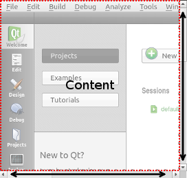
Provides a scrolling view within another Item. 更多...
| import 语句: | import QtQuick.Controls 1.4 |
| Since: | Qt 5.1 |
| 继承: | FocusScope |
| 继承者: | TextArea |

A ScrollView can be used either to replace a Flickable or decorate an existing Flickable . Depending on the platform, it will add scroll bars and a content frame.
Only one Item can be a direct child of the ScrollView and the child is implicitly anchored to fill the scroll view.
范例:
ScrollView {
    Image { source: "largeImage.png" }
}
In the previous example the Image item will implicitly get scroll behavior as if it was used within a Flickable . The width and height of the child item will be used to define the size of the content area.
范例:
ScrollView {
    ListView {
        ...
    }
}
In this case the content size of the ScrollView will simply mirror that of its contained flickableItem .
You can create a custom appearance for a ScrollView by assigning a ScrollViewStyle .
|
[default] contentItem : Item |
The contentItem of the ScrollView . This is set by the user.
Note that the definition of contentItem is somewhat different to that of a Flickable, where the contentItem is implicitly created.
|
[read-only] flickableItem : Item |
The flickableItem of the ScrollView 。若 contentItem provided to the ScrollView is a Flickable, it will be the contentItem .
|
frameVisible : bool |
This property tells the ScrollView if it should render a frame around its content.
默认值为
false
.
|
highlightOnFocus : bool |
This property controls if there should be a highlight around the frame when the ScrollView has input focus.
默认值为
false
.
注意: This property is only applicable on some platforms, such as Mac OS.
|
horizontalScrollBarPolicy : enumeration |
This property holds the policy for showing the horizontal scrollbar. It can be any of the following values:
默认策略为
Qt.ScrollBarAsNeeded
.
This property was introduced in QtQuick.Controls 1.3.
|
style : Component |
The style Component for this control.
另请参阅 Qt Quick Controls 1 Styles QML Types .
|
verticalScrollBarPolicy : enumeration |
This property holds the policy for showing the vertical scrollbar. It can be any of the following values:
默认策略为
Qt.ScrollBarAsNeeded
.
This property was introduced in QtQuick.Controls 1.3.
|
viewport : Item |
The viewport determines the current "window" on the contentItem . In other words, it clips it and the size of the viewport tells you how much of the content area is visible.