要运行范例从 Qt Creator ,打开 欢迎 模式,然后选择范例从 范例 。更多信息,拜访 构建和运行范例 .
Creating each chart type begins with the creation of a ChartView .
To create a pie, we use the PieSeries API together with a few PieSlices:
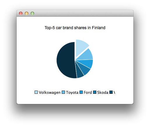
ChartView {
    id: chart
    title: "Top-5 car brand shares in Finland"
    anchors.fill: parent
    legend.alignment: Qt.AlignBottom
    antialiasing: true
    PieSeries {
        id: pieSeries
        PieSlice { label: "Volkswagen"; value: 13.5 }
        PieSlice { label: "Toyota"; value: 10.9 }
        PieSlice { label: "Ford"; value: 8.6 }
        PieSlice { label: "Skoda"; value: 8.2 }
        PieSlice { label: "Volvo"; value: 6.8 }
    }
}
Component.onCompleted: {
    // You can also manipulate slices dynamically
    othersSlice = pieSeries.append("Others", 52.0);
    pieSeries.find("Volkswagen").exploded = true;
}
To create a chart with a line series:
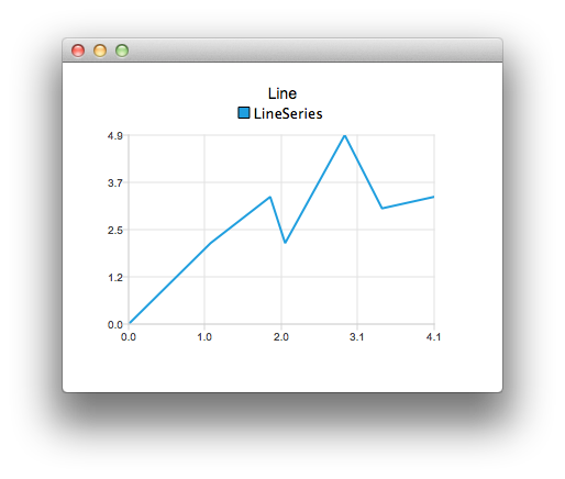
ChartView {
    title: "Line"
    anchors.fill: parent
    antialiasing: true
    LineSeries {
        name: "LineSeries"
        XYPoint { x: 0; y: 0 }
        XYPoint { x: 1.1; y: 2.1 }
        XYPoint { x: 1.9; y: 3.3 }
        XYPoint { x: 2.1; y: 2.1 }
        XYPoint { x: 2.9; y: 4.9 }
        XYPoint { x: 3.4; y: 3.0 }
        XYPoint { x: 4.1; y: 3.3 }
    }
}
And spline series:
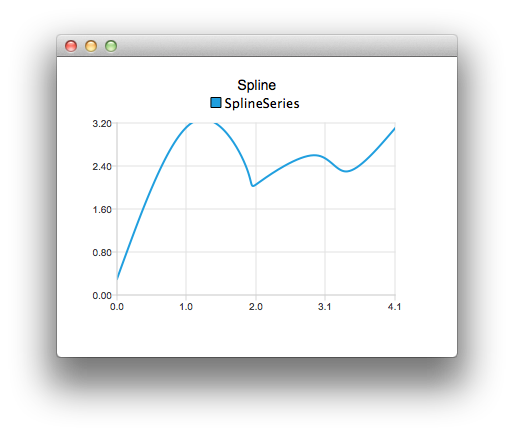
ChartView {
    title: "Spline"
    anchors.fill: parent
    antialiasing: true
    SplineSeries {
        name: "SplineSeries"
        XYPoint { x: 0; y: 0.0 }
        XYPoint { x: 1.1; y: 3.2 }
        XYPoint { x: 1.9; y: 2.4 }
        XYPoint { x: 2.1; y: 2.1 }
        XYPoint { x: 2.9; y: 2.6 }
        XYPoint { x: 3.4; y: 2.3 }
        XYPoint { x: 4.1; y: 3.1 }
    }
}
Then we create a chart that illustrates the NHL All-Star player selections by using three area series:
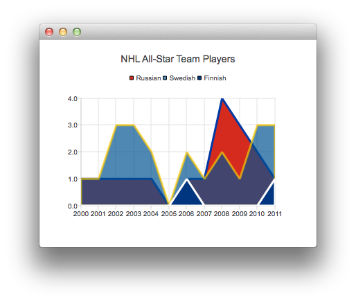
ChartView {
    title: "NHL All-Star Team Players"
    anchors.fill: parent
    antialiasing: true
    ValueAxis {
        id: valueAxis
        min: 2000
        max: 2011
        tickCount: 12
        labelFormat: "%.0f"
    }
    AreaSeries {
        name: "Russian"
        color: "#FFD52B1E"
        borderColor: "#FF0039A5"
        borderWidth: 3
        axisX: valueAxis
        upperSeries: LineSeries {
            XYPoint { x: 2000; y: 1 }
            XYPoint { x: 2001; y: 1 }
            XYPoint { x: 2002; y: 1 }
            XYPoint { x: 2003; y: 1 }
            XYPoint { x: 2004; y: 1 }
            XYPoint { x: 2005; y: 0 }
            XYPoint { x: 2006; y: 1 }
            XYPoint { x: 2007; y: 1 }
            XYPoint { x: 2008; y: 4 }
            XYPoint { x: 2009; y: 3 }
            XYPoint { x: 2010; y: 2 }
            XYPoint { x: 2011; y: 1 }
        }
    }
    ...
Then a couple of scatter series:
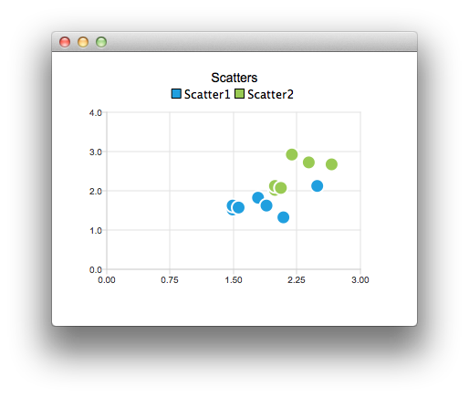
ChartView {
    title: "Scatters"
    anchors.fill: parent
    antialiasing: true
    ScatterSeries {
        id: scatter1
        name: "Scatter1"
        XYPoint { x: 1.5; y: 1.5 }
        XYPoint { x: 1.5; y: 1.6 }
        XYPoint { x: 1.57; y: 1.55 }
        XYPoint { x: 1.8; y: 1.8 }
        XYPoint { x: 1.9; y: 1.6 }
        XYPoint { x: 2.1; y: 1.3 }
        XYPoint { x: 2.5; y: 2.1 }
    }
    ScatterSeries {
        name: "Scatter2"
    ...
And a few different bar series:
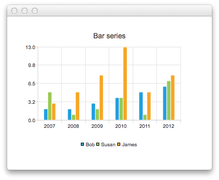
ChartView {
    title: "Bar series"
    anchors.fill: parent
    legend.alignment: Qt.AlignBottom
    antialiasing: true
    BarSeries {
        id: mySeries
        axisX: BarCategoryAxis { categories: ["2007", "2008", "2009", "2010", "2011", "2012" ] }
        BarSet { label: "Bob"; values: [2, 2, 3, 4, 5, 6] }
        BarSet { label: "Susan"; values: [5, 1, 2, 4, 1, 7] }
        BarSet { label: "James"; values: [3, 5, 8, 13, 5, 8] }
    }
}
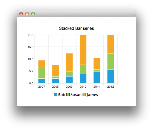
ChartView {
    title: "Stacked Bar series"
    anchors.fill: parent
    legend.alignment: Qt.AlignBottom
    antialiasing: true
    StackedBarSeries {
        id: mySeries
        axisX: BarCategoryAxis { categories: ["2007", "2008", "2009", "2010", "2011", "2012" ] }
        BarSet { label: "Bob"; values: [2, 2, 3, 4, 5, 6] }
        BarSet { label: "Susan"; values: [5, 1, 2, 4, 1, 7] }
        BarSet { label: "James"; values: [3, 5, 8, 13, 5, 8] }
    }
}
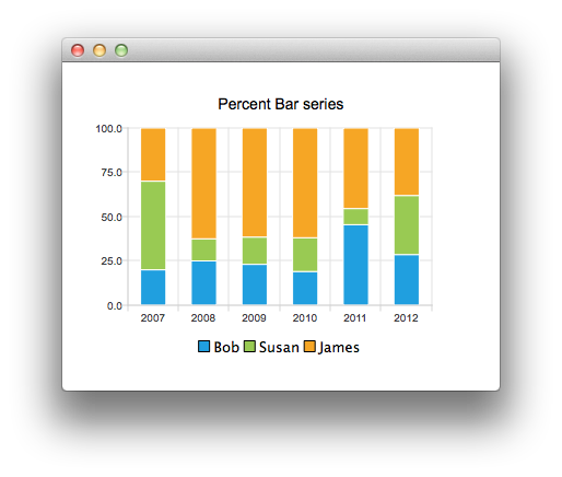
ChartView {
    title: "Percent Bar series"
    anchors.fill: parent
    legend.alignment: Qt.AlignBottom
    antialiasing: true
    PercentBarSeries {
        axisX: BarCategoryAxis { categories: ["2007", "2008", "2009", "2010", "2011", "2012" ] }
        BarSet { label: "Bob"; values: [2, 2, 3, 4, 5, 6] }
        BarSet { label: "Susan"; values: [5, 1, 2, 4, 1, 7] }
        BarSet { label: "James"; values: [3, 5, 8, 13, 5, 8] }
    }
}
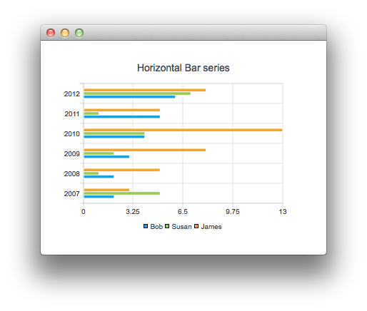
ChartView {
    title: "Horizontal Bar series"
    anchors.fill: parent
    legend.alignment: Qt.AlignBottom
    antialiasing: true
    HorizontalBarSeries {
        axisY: BarCategoryAxis { categories: ["2007", "2008", "2009", "2010", "2011", "2012" ] }
        BarSet { label: "Bob"; values: [2, 2, 3, 4, 5, 6] }
        BarSet { label: "Susan"; values: [5, 1, 2, 4, 1, 7] }
        BarSet { label: "James"; values: [3, 5, 8, 13, 5, 8] }
    }
}
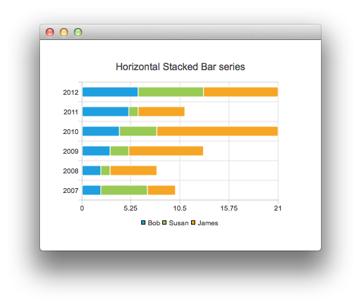
ChartView {
    title: "Horizontal Stacked Bar series"
    anchors.fill: parent
    legend.alignment: Qt.AlignBottom
    antialiasing: true
    HorizontalStackedBarSeries {
        axisY: BarCategoryAxis { categories: ["2007", "2008", "2009", "2010", "2011", "2012" ] }
        BarSet { label: "Bob"; values: [2, 2, 3, 4, 5, 6] }
        BarSet { label: "Susan"; values: [5, 1, 2, 4, 1, 7] }
        BarSet { label: "James"; values: [3, 5, 8, 13, 5, 8] }
    }
}
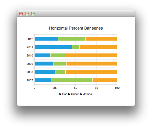
ChartView {
    title: "Horizontal Percent Bar series"
    anchors.fill: parent
    legend.alignment: Qt.AlignBottom
    antialiasing: true
    HorizontalPercentBarSeries {
        axisY: BarCategoryAxis { categories: ["2007", "2008", "2009", "2010", "2011", "2012" ] }
        BarSet { label: "Bob"; values: [2, 2, 3, 4, 5, 6] }
        BarSet { label: "Susan"; values: [5, 1, 2, 4, 1, 7] }
        BarSet { label: "James"; values: [3, 5, 8, 13, 5, 8] }
    }
}
And finally an example demonstrating how to create a donut chart with two pie series:
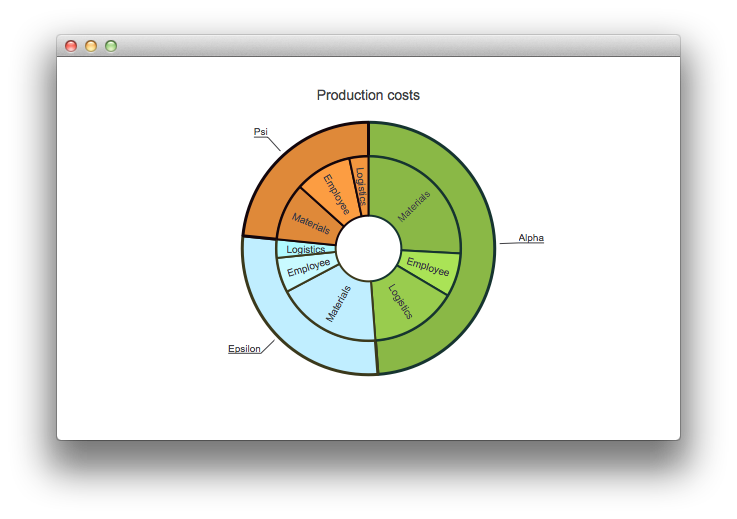
ChartView {
    id: chart
    title: "Production costs"
    anchors.fill: parent
    legend.visible: false
    antialiasing: true
    PieSeries {
        id: pieOuter
        size: 0.96
        holeSize: 0.7
        PieSlice { id: slice; label: "Alpha"; value: 19511; color: "#8AB846"; borderColor: "#163430" }
        PieSlice { label: "Epsilon"; value: 11105; color: "#C0EEFF"; borderColor: "#3B391C" }
        PieSlice { label: "Psi"; value: 9352; color: "#DF8939"; borderColor: "#13060C" }
    }
    PieSeries {
        size: 0.7
        id: pieInner
        holeSize: 0.25
        PieSlice { label: "Materials"; value: 10334; color: "#8AB846"; borderColor: "#163430" }
        PieSlice { label: "Employee"; value: 3066; color: "#AAE356"; borderColor: "#163430" }
        PieSlice { label: "Logistics"; value: 6111; color: "#99CC4E"; borderColor: "#163430" }
        PieSlice { label: "Materials"; value: 7371; color: "#C0EEFF"; borderColor: "#3B391C" }
        PieSlice { label: "Employee"; value: 2443; color: "#C9FAFF"; borderColor: "#3B391C" }
        PieSlice { label: "Logistics"; value: 1291; color: "#B0FAFF"; borderColor: "#3B391C" }
        PieSlice { label: "Materials"; value: 4022; color: "#DF8939"; borderColor: "#13060C" }
        PieSlice { label: "Employee"; value: 3998; color: "#FC9D42"; borderColor: "#13060C" }
        PieSlice { label: "Logistics"; value: 1332; color: "#F2963F"; borderColor: "#13060C" }
    }
}
Component.onCompleted: {
    // Set the common slice properties dynamically for convenience
    for (var i = 0; i < pieOuter.count; i++) {
        pieOuter.at(i).labelPosition = PieSlice.LabelOutside;
        pieOuter.at(i).labelVisible = true;
        pieOuter.at(i).borderWidth = 3;
    }
    for (var i = 0; i < pieInner.count; i++) {
        pieInner.at(i).labelPosition = PieSlice.LabelInsideNormal;
        pieInner.at(i).labelVisible = true;
        pieInner.at(i).borderWidth = 2;
    }
}
Additionally, antialiasing is set with the qml property in Qt Quick 2.
文件: