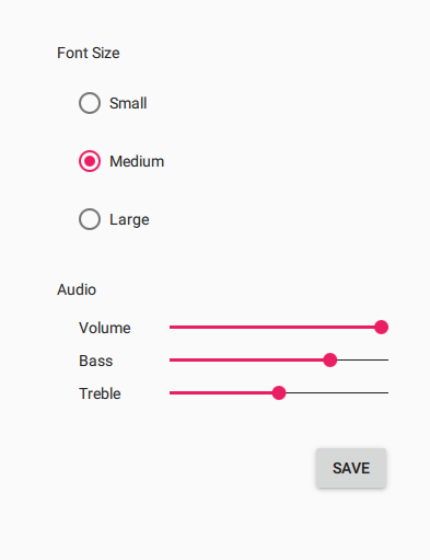
The Material Style is based on the Google Material Design Guidelines. 更多...
| import 语句: | import QtQuick.Controls.Material 2.2 |
| Since: | Qt 5.7 |
The Material style is based on the Google 材质设计指导方针 . It allows for a unified experience across platforms and device sizes.

The Material style in light theme |

The Material style in dark theme |
To run an application with the Material style, see Using Styles in Qt Quick Controls 2 .
注意: The Material style is not a native Android style. The Material style is a 100% cross-platform Qt Quick Controls 2 style implementation that follows the Google Material Design Guidelines. The style runs on any platform, and looks more or less identical everywhere. Minor differences may occur due to differences in available system fonts and font rendering engines.
The Material style allows customizing five attributes, theme , primary , accent , foreground ,和 background .

All attributes can be specified for any window or item, and they automatically propagate to children in the same manner as fonts . In the following example, the window and all three radio buttons appear in the dark theme using a purple accent color:
import QtQuick 2.0 import QtQuick.Controls 2.1 import QtQuick.Controls.Material 2.1 ApplicationWindow { visible: true Material.theme: Material.Dark Material.accent: Material.Purple Column { anchors.centerIn: parent RadioButton { text: qsTr("Small") } RadioButton { text: qsTr("Medium"); checked: true } RadioButton { text: qsTr("Large") } } } |

|
In addition to specifying the attributes in QML, it is also possible to specify them via environment variables or in a configuration file. Attributes specified in QML take precedence over all other methods.
| 变量 | 描述 |
|---|---|
Theme
|
指定默认
材质主题
. The value can be one of the available themes, for example
"Dark"
.
|
Accent
|
指定默认
Material accent color
。值可以是任何
color
, but it is recommended to use one of the
预定义材质颜色
,例如
"Teal"
.
|
Primary
|
指定默认
Material primary color
。值可以是任何
color
, but it is recommended to use one of the
预定义材质颜色
,例如
"BlueGrey"
.
|
Foreground
|
指定默认
材质前景颜色
。值可以是任何
color
,或某一
预定义材质颜色
,例如
"Brown"
.
|
Background
|
指定默认
材质背景色
。值可以是任何
color
,或某一
预定义材质颜色
,例如
"Grey"
.
|
见 Qt Quick Controls 2 Configuration File 了解有关配置文件的更多细节。
| 变量 | 描述 |
|---|---|
QT_QUICK_CONTROLS_MATERIAL_THEME
|
指定默认
材质主题
. The value can be one of the available themes, for example
"Dark"
.
|
QT_QUICK_CONTROLS_MATERIAL_ACCENT
|
指定默认
Material accent color
。值可以是任何
color
, but it is recommended to use one of the
预定义材质颜色
,例如
"Teal"
.
|
QT_QUICK_CONTROLS_MATERIAL_PRIMARY
|
指定默认
Material primary color
。值可以是任何
color
, but it is recommended to use one of the
预定义材质颜色
,例如
"BlueGrey"
.
|
QT_QUICK_CONTROLS_MATERIAL_FOREGROUND
|
指定默认
材质前景颜色
。值可以是任何
color
,或某一
预定义材质颜色
,例如
"Brown"
.
|
QT_QUICK_CONTROLS_MATERIAL_BACKGROUND
|
指定默认
材质背景色
。值可以是任何
color
,或某一
预定义材质颜色
,例如
"Grey"
.
|
见 Supported Environment Variables in Qt Quick Controls 2 for the full list of supported environment variables.
The Material style must be separately imported to gain access to the attributes that are specific to the Material style. It should be noted that regardless of the references to the Material style, the same application code runs with any other style. Material-specific attributes only have an effect when the application is run with the Material style.
If the Material style is imported in a QML file that is always loaded, the Material style must be deployed with the application in order to be able to run the application regardless of which style the application is run with. By using file selectors , style-specific tweaks can be applied without creating a hard dependency to a style.
Even though primary and accent can be any color , it is recommended to use one of the pre-defined colors that have been designed to work well with the rest of the Material style palette:
Available pre-defined colors:
| 常量 | 描述 |
|---|---|
Material.Red
|
#F44336 |
Material.Pink
|
#E91E63 (default accent) |
Material.Purple
|
#9C27B0 |
Material.DeepPurple
|
#673AB7 |
Material.Indigo
|
#3F51B5 (default primary) |
Material.Blue
|
#2196F3 |
Material.LightBlue
|
#03A9F4 |
Material.Cyan
|
#00BCD4 |
Material.Teal
|
#009688 |
Material.Green
|
#4CAF50 |
Material.LightGreen
|
#8BC34A |
Material.Lime
|
#CDDC39 |
Material.Yellow
|
#FFEB3B |
Material.Amber
|
#FFC107 |
Material.Orange
|
#FF9800 |
Material.DeepOrange
|
#FF5722 |
Material.Brown
|
#795548 |
Material.Grey
|
#9E9E9E |
Material.BlueGrey
|
#607D8B |
When the dark theme is in use, different shades of the pre-defined colors are used by default:
| 常量 | 描述 |
|---|---|
Material.Red
|
#EF9A9A |
Material.Pink
|
#F48FB1 (default accent) |
Material.Purple
|
#CE93D8 |
Material.DeepPurple
|
#B39DDB |
Material.Indigo
|
#9FA8DA (default primary) |
Material.Blue
|
#90CAF9 |
Material.LightBlue
|
#81D4FA |
Material.Cyan
|
#80DEEA |
Material.Teal
|
#80CBC4 |
Material.Green
|
#A5D6A7 |
Material.LightGreen
|
#C5E1A5 |
Material.Lime
|
#E6EE9C |
Material.Yellow
|
#FFF59D |
Material.Amber
|
#FFE082 |
Material.Orange
|
#FFCC80 |
Material.DeepOrange
|
#FFAB91 |
Material.Brown
|
#BCAAA4 |
Material.Grey
|
#EEEEEE |
Material.BlueGrey
|
#B0BEC5 |
There are several different shades of each pre-defined color that can be passed to the Material.color() 函数:
| 常量 | 值 |
|---|---|
Material.Shade50
|
|
Material.Shade100
|
|
Material.Shade200
|
|
Material.Shade300
|
|
Material.Shade400
|
|
Material.Shade500
|
|
Material.Shade600
|
|
Material.Shade700
|
|
Material.Shade800
|
|
Material.Shade900
|
|
Material.ShadeA100
|
|
Material.ShadeA200
|
|
Material.ShadeA400
|
|
Material.ShadeA700
|
|
Material.accent : color |
This attached property holds the accent color of the theme. The property can be attached to any window or item. The value is propagated to children.
默认值为
Material.Pink
.
In the following example, the accent color of the highlighted button is changed to
Material.Orange
:
Button { text: qsTr("Button") highlighted: true Material.accent: Material.Orange } |

|
注意: Even though the accent can be any color , it is recommended to use one of the 预定义材质颜色 that have been designed to work well with the rest of the Material style palette.
|
Material.background : color |
This attached property holds the background color of the theme. The property can be attached to any window or item. The value is propagated to children.
The default value is theme-specific (light or dark).
In the following example, the background color of the button is changed to
Material.Teal
:
Button { text: qsTr("Button") highlighted: true Material.background: Material.Teal } |

|
|
Material.elevation : int |
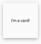
This attached property holds the elevation of the control. The higher the elevation, the deeper the shadow. The property can be attached to any control, but not all controls visualize elevation.
The default value is control-specific.
In the following example, the elevation of the pane is set to
6
in order to achieve the look of an
elevated card
:
Pane { width: 120 height: 120 Material.elevation: 6 Label { text: qsTr("I'm a card!") anchors.centerIn: parent } } |

|
|
Material.foreground : color |
This attached property holds the foreground color of the theme. The property can be attached to any window or item. The value is propagated to children.
The default value is theme-specific (light or dark).
In the following example, the foreground color of the button is set to
Material.Pink
:
Button { text: qsTr("Button") Material.foreground: Material.Pink } |

|
|
Material.primary : color |
This attached property holds the primary color of the theme. The property can be attached to any window or item. The value is propagated to children.
The primary color is used as the background color of ToolBar 在默认情况下。
默认值为
Material.Indigo
.
注意: Even though the primary can be any color , it is recommended to use one of the 预定义材质颜色 that have been designed to work well with the rest of the Material style palette.
|
Material.theme : enumeration |
This attached property holds whether the theme is light or dark. The property can be attached to any window or item. The value is propagated to children.
Available themes:
| 常量 | 描述 |
|---|---|
Material.Light
|
Light theme (default) |
Material.Dark
|
暗黑主题 |
Material.System
|
System theme |
Setting the theme to
系统
chooses either the light or dark theme based on the system theme colors. However, when reading the value of the theme property, the value is never
系统
, but the actual theme.
In the following example, the theme for both the pane and the button is set to
Material.Dark
:
Pane { Material.theme: Material.Dark Button { text: qsTr("Button") } } |

|
|
color color ( enumeration predefined , enumeration shade ) |
This attached method returns the effective color value of the specified
pre-defined Material color
combined with the given
shade
. If omitted, the shade argument defaults to
Material.Shade500
.
Rectangle {
    color: Material.color(Material.Red)
}