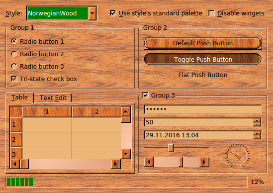
样式范例的屏幕截图
Qt 中的样式是子类化 QStyle 或其子类之一。样式代表 Widget 履行绘制。Qt 提供了一整套预定义样式,或内置在 Qt Widgets 模块中,或可以在插件中找到。通常,样式的定制是通过子类化 QProxyStyle 并重实现一些虚函数。虽然 QProxyStyle 提供定制特定样式或合适平台的默认样式的透明方式,Qt 还提供 QCommonStyle 作为完整自定义样式实现的方便基。
在此范例中,自定义样式是调用
NorwegianWoodStyle
和派生自
QProxyStyle
。它的主要特征是用于填充大多数 Widget 及其圆形按钮和组合框的木质纹理。
为实现样式,使用了一些高级特征的提供通过 QPainter ,譬如 antialiasing (以获得更平滑的按钮边缘), Alpha 融合 (以使按钮出现凸起或凹陷),和 描绘器路径 (以填充按钮并绘制轮廓)。还使用了很多特征为 QBrush and QPalette .
范例由以下类组成:
NorwegianWoodStyle
继承自
QProxyStyle
并实现挪威木质样式。
WidgetGallery
是
QDialog
子类,展示最常见 Widget 并允许用户动态切换样式。
这里是定义为
NorwegianWoodStyle
类:
class NorwegianWoodStyle : public QProxyStyle
{
    Q_OBJECT
public:
    NorwegianWoodStyle();
    void polish(QPalette &palette) override;
    void polish(QWidget *widget) override;
    void unpolish(QWidget *widget) override;
    int pixelMetric(PixelMetric metric, const QStyleOption *option,
                    const QWidget *widget) const override;
    int styleHint(StyleHint hint, const QStyleOption *option,
                  const QWidget *widget, QStyleHintReturn *returnData) const override;
    void drawPrimitive(PrimitiveElement element, const QStyleOption *option,
                       QPainter *painter, const QWidget *widget) const override;
    void drawControl(ControlElement control, const QStyleOption *option,
                     QPainter *painter, const QWidget *widget) const override;
private:
    static void setTexture(QPalette &palette, QPalette::ColorRole role,
                           const QPixmap &pixmap);
    static QPainterPath roundRectPath(const QRect &rect);
};
公共函数的所有声明在 QStyle ( QProxyStyle 的祖父级类) 并在这里重实现以覆盖窗口的外观和感觉。私有函数是帮手函数。
We will now review the implementation of the
NorwegianWoodStyle
类。
void NorwegianWoodStyle::polish(QPalette &palette)
{
    QColor brown(212, 140, 95);
    QColor beige(236, 182, 120);
    QColor slightlyOpaqueBlack(0, 0, 0, 63);
    QPixmap backgroundImage(":/images/woodbackground.png");
    QPixmap buttonImage(":/images/woodbutton.png");
    QPixmap midImage = buttonImage;
    QPainter painter;
    painter.begin(&midImage);
    painter.setPen(Qt::NoPen);
    painter.fillRect(midImage.rect(), slightlyOpaqueBlack);
    painter.end();
The
polish()
function is reimplemented from
QStyle
. It takes a
QPalette
as a reference and adapts the palette to fit the style. Most styles don't need to reimplement that function. The Norwegian Wood style reimplements it to set a "wooden" palette.
We start by defining a few
QColor
s that we'll need. Then we load two PNG images. The
:
prefix in the file path indicates that the PNG files are
embedded resources
.

|
woodbackground.png
This texture is used as the background of most widgets. The wood pattern is horizontal. |

|
woodbutton.png
This texture is used for filling push buttons and comboboxes. The wood pattern is vertical and more reddish than the texture used for the background. |
The
midImage
variable is initialized to be the same as
buttonImage
, but then we use a
QPainter
and fill it with a 25% opaque black color (a black with an
alpha channel
of 63). The result is a somewhat darker image than
buttonImage
. This image will be used for filling buttons that the user is holding down.
    palette = QPalette(brown);
    palette.setBrush(QPalette::BrightText, Qt::white);
    palette.setBrush(QPalette::Base, beige);
    palette.setBrush(QPalette::Highlight, Qt::darkGreen);
    setTexture(palette, QPalette::Button, buttonImage);
    setTexture(palette, QPalette::Mid, midImage);
    setTexture(palette, QPalette::Window, backgroundImage);
    QBrush brush = palette.background();
    brush.setColor(brush.color().dark());
    palette.setBrush(QPalette::Disabled, QPalette::WindowText, brush);
    palette.setBrush(QPalette::Disabled, QPalette::Text, brush);
    palette.setBrush(QPalette::Disabled, QPalette::ButtonText, brush);
    palette.setBrush(QPalette::Disabled, QPalette::Base, brush);
    palette.setBrush(QPalette::Disabled, QPalette::Button, brush);
    palette.setBrush(QPalette::Disabled, QPalette::Mid, brush);
}
We initialize the palette. Palettes have various color roles ,譬如 QPalette::Base (used for filling text editors, item views, etc.), QPalette::Text (used for foreground text), and QPalette::Background (used for the background of most widgets). Each role has its own QBrush , which usually is a plain color but can also be a brush pattern or even a texture (a QPixmap ).
In addition to the roles, palettes have several color groups : active, disabled, and inactive. The active color group is used for painting widgets in the active window. The disabled group is used for disabled widgets. The inactive group is used for all other widgets. Most palettes have identical active and inactive groups, while the disabled group uses darker shades.
We initialize the QPalette object with a brown color. Qt automatically derivates all color roles for all color groups from that single color. We then override some of the default values. For example, we use Qt::darkGreen instead of the default ( Qt::darkBlue ) for the QPalette::Highlight role. The QPalette::setBrush () overload that we use here sets the same color or brush for all three color groups.
The
setTexture()
function is a private function that sets the texture for a certain color role, while preserving the existing color in the
QBrush
。
QBrush
can hold both a solid color and a texture at the same time. The solid color is used for drawing text and other graphical elements where textures don't look good.
At the end, we set the brush for the disabled color group of the palette. We use
woodbackground.png
as the texture for all disabled widgets, including buttons, and use a darker color to accompany the texture.
Let's move on to the other functions reimplemented from QProxyStyle :
void NorwegianWoodStyle::polish(QWidget *widget)
{
    if (qobject_cast<QPushButton *>(widget)
            || qobject_cast<QComboBox *>(widget))
        widget->setAttribute(Qt::WA_Hover, true);
}
This QStyle::polish () overload is called once on every widget drawn using the style. We reimplement it to set the Qt::WA_Hover attribute on QPushButton s and QComboBox es. When this attribute is set, Qt generates paint events when the mouse pointer enters or leaves the widget. This makes it possible to render push buttons and comboboxes differently when the mouse pointer is over them.
void NorwegianWoodStyle::unpolish(QWidget *widget)
{
    if (qobject_cast<QPushButton *>(widget)
            || qobject_cast<QComboBox *>(widget))
        widget->setAttribute(Qt::WA_Hover, false);
}
This
QStyle::unpolish
() overload is called to undo any modification done to the widget in
polish()
. For simplicity, we assume that the flag wasn't set before
polish()
was called. In an ideal world, we would remember the original state for each widgets (e.g., using a
QMap
<
QWidget
*, bool>) and restore it in
unpolish()
.
int NorwegianWoodStyle::pixelMetric(PixelMetric metric,
                                    const QStyleOption *option,
                                    const QWidget *widget) const
{
    switch (metric) {
    case PM_ComboBoxFrameWidth:
        return 8;
    case PM_ScrollBarExtent:
        return QProxyStyle::pixelMetric(metric, option, widget) + 4;
    default:
        return QProxyStyle::pixelMetric(metric, option, widget);
    }
}
The pixelMetric() function returns the size in pixels for a certain user interface element. By reimplementing this function, we can affect the way certain widgets are drawn and their size hint. Here, we return 8 as the width around a shown in a QComboBox , ensuring that there is enough place around the text and the arrow for the Norwegian Wood round corners. The default value for this setting in the Windows style is 2.
We also change the extent of QScrollBar s, i.e., the height for a horizontal scroll bar and the width for a vertical scroll bar, to be 4 pixels more than in the Windows style. This makes the style a bit more distinctive.
对于所有其它 QStyle::PixelMetric 元素,我们使用 Windows 设定。
int NorwegianWoodStyle::styleHint(StyleHint hint, const QStyleOption *option,
                                  const QWidget *widget,
                                  QStyleHintReturn *returnData) const
{
    switch (hint) {
    case SH_DitherDisabledText:
        return int(false);
    case SH_EtchDisabledText:
        return int(true);
    default:
        return QProxyStyle::styleHint(hint, option, widget, returnData);
    }
}
The
styleHint()
function returns some hints to widgets or to the base style (in our case
QProxyStyle
) about how to draw the widgets. The Windows style returns
true
为
QStyle::SH_DitherDisabledText
hint, resulting in a most unpleasing visual effect. We override this behavior and return
false
instead. We also return
true
为
QStyle::SH_EtchDisabledText
hint, meaning that disabled text is rendered with an embossed look.
void NorwegianWoodStyle::drawPrimitive(PrimitiveElement element,
                                       const QStyleOption *option,
                                       QPainter *painter,
                                       const QWidget *widget) const
{
    switch (element) {
    case PE_PanelButtonCommand:
        {
            int delta = (option->state & State_MouseOver) ? 64 : 0;
            QColor slightlyOpaqueBlack(0, 0, 0, 63);
            QColor semiTransparentWhite(255, 255, 255, 127 + delta);
            QColor semiTransparentBlack(0, 0, 0, 127 - delta);
            int x, y, width, height;
            option->rect.getRect(&x, &y, &width, &height);
The drawPrimitive() function is called by Qt widgets to draw various fundamental graphical elements. Here we reimplement it to draw QPushButton and QComboBox with round corners. The button part of these widgets is drawn using the QStyle::PE_PanelButtonCommand primitive element.
The
option
parameter, of type
QStyleOption
, contains everything we need to know about the widget we want to draw on. In particular,
option->rect
gives the rectangle within which to draw the primitive element. The
painter
parameter is a
QPainter
object that we can use to draw on the widget.
The
widget
parameter is the widget itself. Normally, all the information we need is available in
option
and
painter
, so we don't need
widget
. We can use it to perform special effects; for example, QMacStyle uses it to animate default buttons. If you use it, be aware that the caller is allowed to pass a null pointer.
We start by defining three
QColor
s that we'll need later on. We also put the x, y, width, and height components of the widget's rectangle in local variables. The value used for the
semiTransparentWhite
and for the
semiTransparentBlack
color's alpha channel depends on whether the mouse cursor is over the widget or not. Since we set the
Qt::WA_Hover
attribute on
QPushButton
s and
QComboBox
es, we can rely on the
QStyle::State_MouseOver
flag to be set when the mouse is over the widget.
            QPainterPath roundRect = roundRectPath(option->rect);
            int radius = qMin(width, height) / 2;
The
roundRect
变量是
QPainterPath
。
QPainterPath
is is a vectorial specification of a shape. Any shape (rectangle, ellipse, spline, etc.) or combination of shapes can be expressed as a path. We will use
roundRect
both for filling the button background with a wooden texture and for drawing the outline. The
roundRectPath()
function is a private function; we will come back to it later.
            QBrush brush;
            bool darker;
            const QStyleOptionButton *buttonOption =
                    qstyleoption_cast<const QStyleOptionButton *>(option);
            if (buttonOption
                    && (buttonOption->features & QStyleOptionButton::Flat)) {
                brush = option->palette.background();
                darker = (option->state & (State_Sunken | State_On));
            } else {
                if (option->state & (State_Sunken | State_On)) {
                    brush = option->palette.mid();
                    darker = !(option->state & State_Sunken);
                } else {
                    brush = option->palette.button();
                    darker = false;
                }
            }
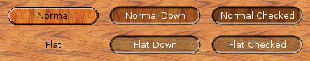
We define two variables,
brush
and
darker
, and initialize them based on the state of the button:
darker
to
true
若按钮是
down
or
checked
.
darker
to
true
若按钮是
checked
.
The screenshot below illustrates how QPushButton s are rendered based on their state:
To discover whether the button is flat or not, we need to cast the
option
parameter to
QStyleOptionButton
and check if the
features
member specifies the
QStyleOptionButton::Flat
flag. The
qstyleoption_cast
() function performs a dynamic cast; if
option
不是
QStyleOptionButton
,
qstyleoption_cast
() returns a null pointer.
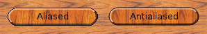
            painter->save();
            painter->setRenderHint(QPainter::Antialiasing, true);
            painter->fillPath(roundRect, brush);
            if (darker)
                painter->fillPath(roundRect, slightlyOpaqueBlack);
We turn on antialiasing on QPainter . Antialiasing is a technique that reduces the visual distortion that occurs when the edges of a shape are converted into pixels. For the Norwegian Wood style, we use it to obtain smoother edges for the round buttons.
The first call to
QPainter::fillPath
() draws the background of the button with a wooden texture. The second call to
fillPath()
paints the same area with a semi-transparent black color (a black color with an alpha channel of 63) to make the area darker if
darker
为 true。
            int penWidth;
            if (radius < 10)
                penWidth = 3;
            else if (radius < 20)
                penWidth = 5;
            else
                penWidth = 7;
            QPen topPen(semiTransparentWhite, penWidth);
            QPen bottomPen(semiTransparentBlack, penWidth);
            if (option->state & (State_Sunken | State_On))
                qSwap(topPen, bottomPen);
Next, we draw the outline. The top-left half of the outline and the bottom-right half of the outline are drawn using different QPen s to produce a 3D effect. Normally, the top-left half of the outline is drawn lighter whereas the bottom-right half is drawn darker, but if the button is down or checked , we invert the two QPen s to give a sunken look to the button.
            int x1 = x;
            int x2 = x + radius;
            int x3 = x + width - radius;
            int x4 = x + width;
            if (option->direction == Qt::RightToLeft) {
                qSwap(x1, x4);
                qSwap(x2, x3);
            }
            QPolygon topHalf;
            topHalf << QPoint(x1, y)
                    << QPoint(x4, y)
                    << QPoint(x3, y + radius)
                    << QPoint(x2, y + height - radius)
                    << QPoint(x1, y + height);
            painter->setClipPath(roundRect);
            painter->setClipRegion(topHalf, Qt::IntersectClip);
            painter->setPen(topPen);
            painter->drawPath(roundRect);
We draw the top-left part of the outline by calling
QPainter::drawPath
() with an appropriate
clip region
。若
layout direction
is right-to-left instead of left-to-right, we swap the
x1
,
x2
,
x3
,和
x4
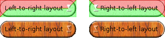
variables to obtain correct results. On right-to-left desktop, the "light" comes from the top-right corner of the screen instead of the top-left corner; raised and sunken widgets must be drawn accordingly.
The diagram below illustrates how 3D effects are drawn according to the layout direction. The area in red on the diagram corresponds to the
topHalf
polygon:
An easy way to test how a style looks in right-to-left mode is to pass the
-reverse
command-line option to the application. This option is recognized by the
QApplication
构造函数。
            QPolygon bottomHalf = topHalf;
            bottomHalf[0] = QPoint(x4, y + height);
            painter->setClipPath(roundRect);
            painter->setClipRegion(bottomHalf, Qt::IntersectClip);
            painter->setPen(bottomPen);
            painter->drawPath(roundRect);
            painter->setPen(option->palette.foreground().color());
            painter->setClipping(false);
            painter->drawPath(roundRect);
            painter->restore();
        }
        break;
    default:
        QProxyStyle::drawPrimitive(element, option, painter, widget);
    }
}
The bottom-right part of the outline is drawn in a similar fashion. Then we draw a one-pixel wide outline around the entire button, using the Foreground 组件对于 QPalette .
This completes the
QStyle::PE_PanelButtonCommand
case of the
switch
statement. Other primitive elements are handled by the base style. Let's now turn to the other
NorwegianWoodStyle
member functions:
void NorwegianWoodStyle::drawControl(ControlElement element,
                                     const QStyleOption *option,
                                     QPainter *painter,
                                     const QWidget *widget) const
{
    switch (element) {
    case CE_PushButtonLabel:
        {
            QStyleOptionButton myButtonOption;
            const QStyleOptionButton *buttonOption =
                    qstyleoption_cast<const QStyleOptionButton *>(option);
            if (buttonOption) {
                myButtonOption = *buttonOption;
                if (myButtonOption.palette.currentColorGroup()
                        != QPalette::Disabled) {
                    if (myButtonOption.state & (State_Sunken | State_On)) {
                        myButtonOption.palette.setBrush(QPalette::ButtonText,
                                myButtonOption.palette.brightText());
                    }
                }
            }
            QProxyStyle::drawControl(element, &myButtonOption, painter, widget);
        }
        break;
    default:
        QProxyStyle::drawControl(element, option, painter, widget);
    }
}
重实现 QStyle::drawControl () 以绘制文本在 QPushButton in a bright color when the button is down or checked .
若
option
parameter points to a
QStyleOptionButton
object (it normally should), we take a copy of the object and modify its
palette
member to make the
QPalette::ButtonText
be the same as the
QPalette::BrightText
component (unless the widget is disabled).
void NorwegianWoodStyle::setTexture(QPalette &palette, QPalette::ColorRole role,
                                    const QPixmap &pixmap)
{
    for (int i = 0; i < QPalette::NColorGroups; ++i) {
        QColor color = palette.brush(QPalette::ColorGroup(i), role).color();
        palette.setBrush(QPalette::ColorGroup(i), role, QBrush(color, pixmap));
    }
}
The
setTexture()
function is a private function that sets the
texture
组件对于
QBrush
es for a certain
color role
, for all three
color groups
(active, disabled, inactive). We used it to initialize the Norwegian Wood palette in
polish(QPalette &)
.
QPainterPath NorwegianWoodStyle::roundRectPath(const QRect &rect)
{
    int radius = qMin(rect.width(), rect.height()) / 2;
    int diam = 2 * radius;
    int x1, y1, x2, y2;
    rect.getCoords(&x1, &y1, &x2, &y2);
    QPainterPath path;
    path.moveTo(x2, y1 + radius);
    path.arcTo(QRect(x2 - diam, y1, diam, diam), 0.0, +90.0);
    path.lineTo(x1 + radius, y1);
    path.arcTo(QRect(x1, y1, diam, diam), 90.0, +90.0);
    path.lineTo(x1, y2 - radius);
    path.arcTo(QRect(x1, y2 - diam, diam, diam), 180.0, +90.0);
    path.lineTo(x1 + radius, y2);
    path.arcTo(QRect(x2 - diam, y2 - diam, diam, diam), 270.0, +90.0);
    path.closeSubpath();
    return path;
}
The
roundRectPath()
function is a private function that constructs a
QPainterPath
object for round buttons. The path consists of eight segments: four arc segments for the corners and four lines for the sides.
With around 250 lines of code, we have a fully functional custom style based on one of the predefined styles. Custom styles can be used to provide a distinct look to an application or family of applications.
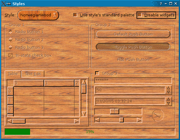
For completeness, we will quickly review the
WidgetGallery
class, which contains the most common Qt widgets and allows the user to change style dynamically. Here's the class definition:
class WidgetGallery : public QDialog
{
    Q_OBJECT
public:
    WidgetGallery(QWidget *parent = 0);
private slots:
    void changeStyle(const QString &styleName);
    void changePalette();
    void advanceProgressBar();
private:
    void createTopLeftGroupBox();
    void createTopRightGroupBox();
    void createBottomLeftTabWidget();
    void createBottomRightGroupBox();
    void createProgressBar();
    QPalette originalPalette;
    QLabel *styleLabel;
    QComboBox *styleComboBox;
    QCheckBox *useStylePaletteCheckBox;
    QCheckBox *disableWidgetsCheckBox;
    ...
};
这里是
WidgetGallery
构造函数:
WidgetGallery::WidgetGallery(QWidget *parent)
    : QDialog(parent)
{
    originalPalette = QApplication::palette();
    styleComboBox = new QComboBox;
    styleComboBox->addItem("NorwegianWood");
    styleComboBox->addItems(QStyleFactory::keys());
    styleLabel = new QLabel(tr("&Style:"));
    styleLabel->setBuddy(styleComboBox);
    useStylePaletteCheckBox = new QCheckBox(tr("&Use style's standard palette"));
    useStylePaletteCheckBox->setChecked(true);
    disableWidgetsCheckBox = new QCheckBox(tr("&Disable widgets"));
    createTopLeftGroupBox();
    createTopRightGroupBox();
    createBottomLeftTabWidget();
    createBottomRightGroupBox();
    createProgressBar();
We start by creating child widgets. The
Style
combobox is initialized with all the styles known to
QStyleFactory
, in addition to
NorwegianWood
。
create...()
functions are private functions that set up the various parts of the
WidgetGallery
.
    connect(styleComboBox, SIGNAL(activated(QString)),
            this, SLOT(changeStyle(QString)));
    connect(useStylePaletteCheckBox, SIGNAL(toggled(bool)),
            this, SLOT(changePalette()));
    connect(disableWidgetsCheckBox, SIGNAL(toggled(bool)),
            topLeftGroupBox, SLOT(setDisabled(bool)));
    connect(disableWidgetsCheckBox, SIGNAL(toggled(bool)),
            topRightGroupBox, SLOT(setDisabled(bool)));
    connect(disableWidgetsCheckBox, SIGNAL(toggled(bool)),
            bottomLeftTabWidget, SLOT(setDisabled(bool)));
    connect(disableWidgetsCheckBox, SIGNAL(toggled(bool)),
            bottomRightGroupBox, SLOT(setDisabled(bool)));
连接
Style
combobox 到
changeStyle()
private slot, the
使用样式的标准调色板
check box to the
changePalette()
slot, and the
Disable widgets
check box to the child widgets'
setDisabled()
槽。
    QHBoxLayout *topLayout = new QHBoxLayout;
    topLayout->addWidget(styleLabel);
    topLayout->addWidget(styleComboBox);
    topLayout->addStretch(1);
    topLayout->addWidget(useStylePaletteCheckBox);
    topLayout->addWidget(disableWidgetsCheckBox);
    QGridLayout *mainLayout = new QGridLayout;
    mainLayout->addLayout(topLayout, 0, 0, 1, 2);
    mainLayout->addWidget(topLeftGroupBox, 1, 0);
    mainLayout->addWidget(topRightGroupBox, 1, 1);
    mainLayout->addWidget(bottomLeftTabWidget, 2, 0);
    mainLayout->addWidget(bottomRightGroupBox, 2, 1);
    mainLayout->addWidget(progressBar, 3, 0, 1, 2);
    mainLayout->setRowStretch(1, 1);
    mainLayout->setRowStretch(2, 1);
    mainLayout->setColumnStretch(0, 1);
    mainLayout->setColumnStretch(1, 1);
    setLayout(mainLayout);
    setWindowTitle(tr("Styles"));
    changeStyle("NorwegianWood");
}
Finally, we put the child widgets in layouts.
void WidgetGallery::changeStyle(const QString &styleName)
{
    if (styleName == "NorwegianWood") {
        QApplication::setStyle(new NorwegianWoodStyle);
    } else {
        QApplication::setStyle(QStyleFactory::create(styleName));
    }
    changePalette();
}
When the user changes the style in the combobox, we call QApplication::setStyle () to dynamically change the style of the application.
void WidgetGallery::changePalette()
{
    if (useStylePaletteCheckBox->isChecked())
        QApplication::setPalette(QApplication::style()->standardPalette());
    else
        QApplication::setPalette(originalPalette);
}
If the user turns the 使用样式的标准调色板 on, the current style's standard palette is used; otherwise, the system's default palette is honored.
For the Norwegian Wood style, this makes no difference because we always override the palette with our own palette in
NorwegianWoodStyle::polish()
.
void WidgetGallery::advanceProgressBar()
{
    int curVal = progressBar->value();
    int maxVal = progressBar->maximum();
    progressBar->setValue(curVal + (maxVal - curVal) / 100);
}
The
advanceProgressBar()
slot is called at regular intervals to advance the progress bar. Since we don't know how long the user will keep the Styles application running, we use a logarithmic formula: The closer the progress bar gets to 100%, the slower it advances.
We will review
createProgressBar()
in a moment.
void WidgetGallery::createTopLeftGroupBox()
{
    topLeftGroupBox = new QGroupBox(tr("Group 1"));
    radioButton1 = new QRadioButton(tr("Radio button 1"));
    radioButton2 = new QRadioButton(tr("Radio button 2"));
    radioButton3 = new QRadioButton(tr("Radio button 3"));
    radioButton1->setChecked(true);
    checkBox = new QCheckBox(tr("Tri-state check box"));
    checkBox->setTristate(true);
    checkBox->setCheckState(Qt::PartiallyChecked);
    QVBoxLayout *layout = new QVBoxLayout;
    layout->addWidget(radioButton1);
    layout->addWidget(radioButton2);
    layout->addWidget(radioButton3);
    layout->addWidget(checkBox);
    layout->addStretch(1);
    topLeftGroupBox->setLayout(layout);
}
The
createTopLeftGroupBox()
函数创建
QGroupBox
that occupies the top-left corner of the
WidgetGallery
. We skip the
createTopRightGroupBox()
,
createBottomLeftTabWidget()
,和
createBottomRightGroupBox()
functions, which are very similar.
void WidgetGallery::createProgressBar()
{
    progressBar = new QProgressBar;
    progressBar->setRange(0, 10000);
    progressBar->setValue(0);
    QTimer *timer = new QTimer(this);
    connect(timer, SIGNAL(timeout()), this, SLOT(advanceProgressBar()));
    timer->start(1000);
}
在
createProgressBar()
,创建
QProgressBar
在底部为
WidgetGallery
和连接它的
timeout()
信号到
advanceProgressBar()
槽。
文件:
图像: