Provides a list view with scroll bars, styling and header sections. 更多...
| import 语句: | import QtQuick.Controls 1.4 |
| Since: | Qt 5.1 |
| 继承: | ScrollView |
A TableView 类似于 ListView , and adds scroll bars, selection, and resizable header sections. As with ListView , data for each row is provided through a model :
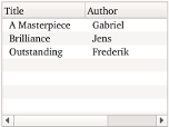
ListModel {
    id: libraryModel
    ListElement {
        title: "A Masterpiece"
        author: "Gabriel"
    }
    ListElement {
        title: "Brilliance"
        author: "Jens"
    }
    ListElement {
        title: "Outstanding"
        author: "Frederik"
    }
}
You provide title and size of a column header by adding a TableViewColumn as demonstrated below.
TableView {
    TableViewColumn {
        role: "title"
        title: "Title"
        width: 100
    }
    TableViewColumn {
        role: "author"
        title: "Author"
        width: 200
    }
    model: libraryModel
}
The header sections are attached to values in the model by defining the model role they attach to. Each property in the model will then be shown in their corresponding column.
You can customize the look by overriding the itemDelegate , rowDelegate ,或 headerDelegate 特性。
The view itself does not provide sorting. This has to be done on the model itself. However you can provide sorting on the model, and enable sort indicators on headers.
You can create a custom appearance for a TableView by assigning a TableViewStyle .
|
currentRow : int |
The current row index of the view. The default value is
-1
to indicate that no row is selected.
|
itemDelegate : Component |
This property defines a delegate to draw a specific cell.
In the item delegate you have access to the following special properties:
范例:
itemDelegate: Item {
    Text {
        anchors.verticalCenter: parent.verticalCenter
        color: styleData.textColor
        elide: styleData.elideMode
        text: styleData.value
    }
}
注意:
For performance reasons, created delegates can be recycled across multiple table rows. This implies that when you make use of implicit properties such as
styleData.row
or
model
, these values can change after the delegate has been constructed. This means that you should not assume that content is fixed when
Component.onCompleted
is called, but instead rely on bindings to such properties.
This property holds the model providing data for the table view.
The model provides the set of data that is used to create the items in the view. Models can be created directly in QML using ListModel , XmlListModel or VisualItemModel, or provided by C++ model classes.
Example model:
model: ListModel {
    ListElement {
        column1: "value 1"
        column2: "value 2"
    }
    ListElement {
        column1: "value 3"
        column2: "value 4"
    }
}
另请参阅 ListView::model and 数据模型 .
|
rowCount : int |
The current number of rows
|
section group |
|---|
|
section.property : string |
|
section.criteria : enumeration |
|
section.delegate : Component |
|
section.labelPositioning : enumeration |
These properties determine the section labels.
另请参阅 ListView.section .
This property contains the current row-selection of the TableView . The selection allows you to select, deselect or iterate over selected rows.
范例 :
tableview.selection.select(0)       // select row index 0
tableview.selection.select(1, 3)    // select row indexes 1, 2 and 3
tableview.selection.deselect(0, 1)  // deselects row index 0 and 1
tableview.selection.deselect(2)     // deselects row index 2
范例 : To iterate over selected indexes, you can pass a callback function. rowIndex is passed as an argument to the callback function.
tableview.selection.forEach( function(rowIndex) {console.log(rowIndex)} )
This property was introduced in QtQuick.Controls 1.1.
|
activated ( int row ) |
Emitted when the user activates an item by mouse or keyboard interaction. Mouse activation is triggered by single- or double-clicking, depending on the platform.
row int provides access to the activated row index.
注意: This signal is only emitted for mouse interaction that is not blocked in the row or item delegate.
相应处理程序是
onActivated
.
|
clicked ( int row ) |
Emitted when the user clicks a valid row by single clicking
row int provides access to the clicked row index.
注意: This signal is only emitted if the row or item delegate does not accept mouse events.
相应处理程序是
onClicked
.
|
doubleClicked ( int row ) |
Emitted when the user double clicks a valid row.
row int provides access to the clicked row index.
注意: This signal is only emitted if the row or item delegate does not accept mouse events.
相应处理程序是
onDoubleClicked
.
|
pressAndHold ( int row ) |
Emitted when the user presses and holds a valid row.
row int provides access to the pressed row index.
注意: This signal is only emitted if the row or item delegate does not accept mouse events.
相应处理程序是
onPressAndHold
.
This signal was introduced in QtQuick.Controls 1.3.
|
void positionViewAtRow ( int row , PositionMode mode ) |
Positions the view such that the specified row is at the position defined by mode :
If positioning the row creates an empty space at the beginning or end of the view, then the view is positioned at the boundary.
For example, to position the view at the end at startup:
Component.onCompleted: table.positionViewAtRow(rowCount -1, ListView.Contain)
Depending on how the model is populated, the model may not be ready when TableView Component.onCompleted is called. In that case you may need to delay the call to positionViewAtRow by using a Timer .
注意: This method should only be called after the component has completed.
Returns the index of the visible row at the point
x
,
y
in content coordinates. If there is no visible row at the point specified,
-1
被返回。
注意: This method should only be called after the component has completed.