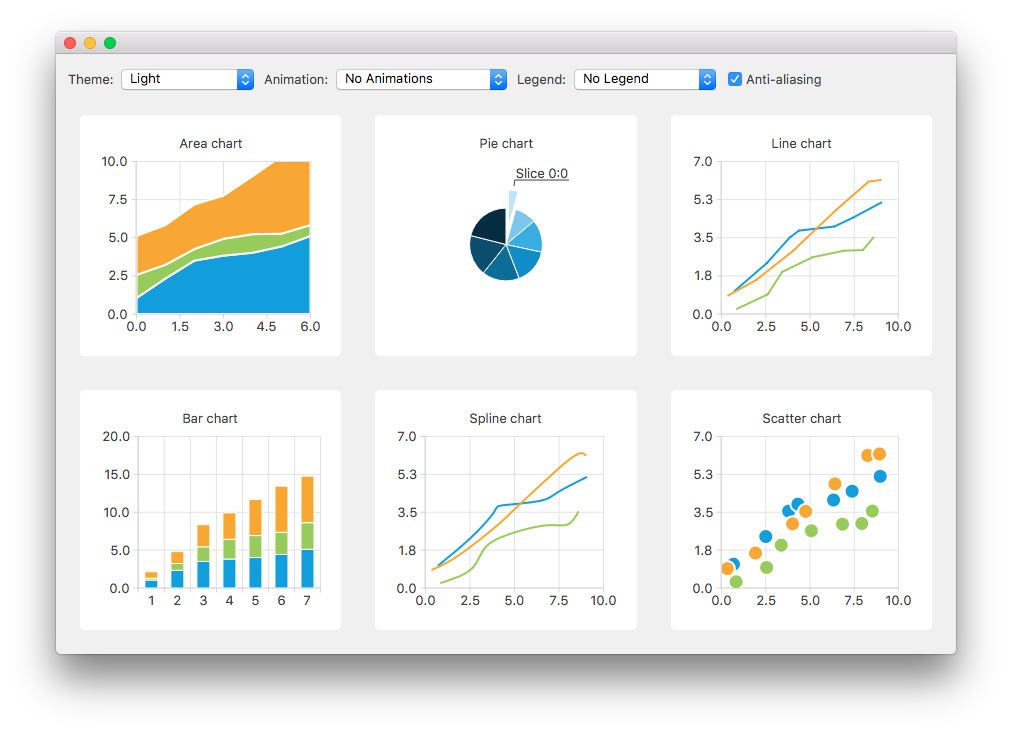
Qt Charts 使您能够创建时尚、交互式、以数据为中心的用户界面。Qt Charts 使用 图形视图框架 为易于集成。图表组件可以用作 QWidget or QGraphicsWidget 对象或 QML 类型。
The QChart 类管理不同系列类型和其它图表相关对象的图形表示,譬如:图例和轴。 QChart 是 QGraphicsWidget 可以展示在 QGraphicsScene 。在布局中显示图表的更简单解决方案,是使用方便类 QChartView 而不是 QChart 。在 QML,图表的显示是使用 ChartView 类型。
某些图表组件还可以呈现极坐标图表通过使用 QPolarChart 类,特殊化的 QChart 类或 PolarChartView QML 类型,特殊化的 ChartView 类型。
可以定制图表的外观和感觉,通过使用主题、修改颜色和特性、隐藏图表组件或动画图表。
模型映射器允许使用的数据模型派生自 QAbstractItemModel 类作为图表的数据源。模型映射器可以是水平的 (或垂直的)。
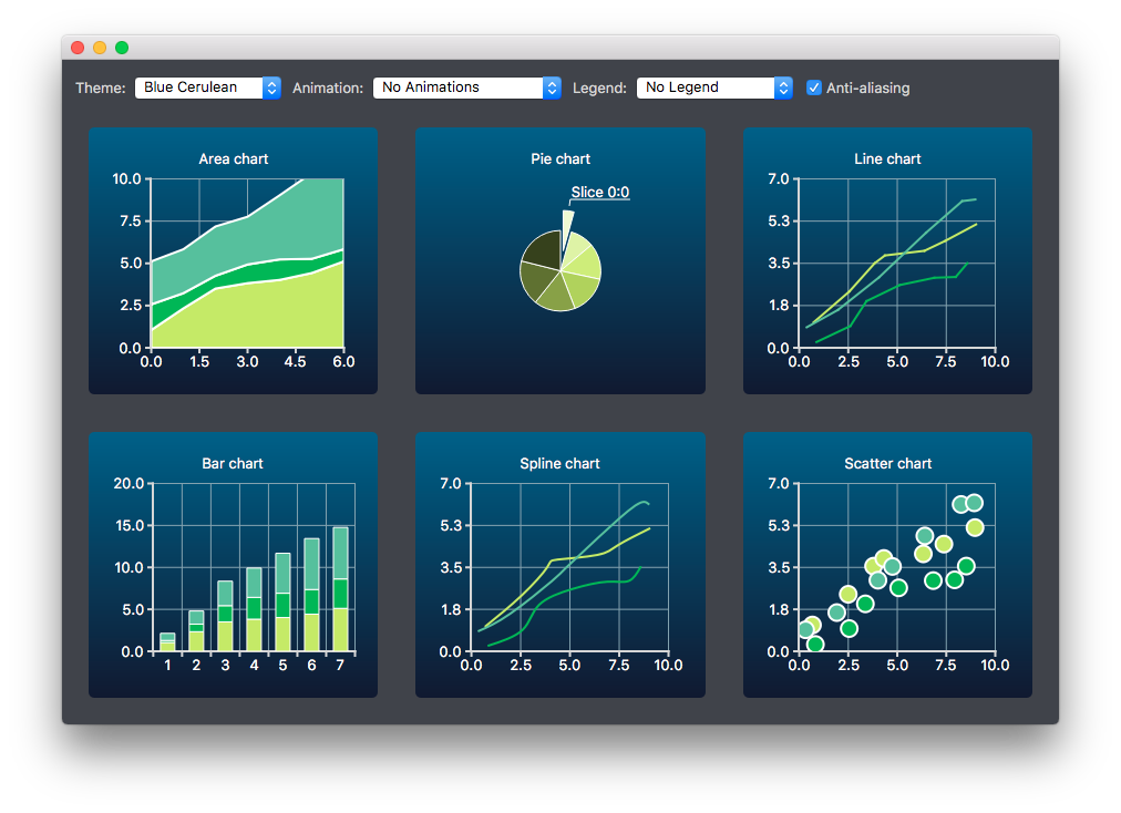
Qt Charts 模块提供下列图表类型:
每种图表类型的表示都是通过 QAbstractSeries 派生类或 AbstractSeries 派生类型在 QML。图表的创建是通过使用系列类的实例并将它添加到 QChart or ChartView 实例。
例如:
QLineSeries* series = new QLineSeries();
series->add(0, 6);
series->add(2, 4);
...
chartView->chart()->addSeries(series);
chartView->chart()->createDefaultAxes();
或,以 QML:
import QtQuick 2.0
import QtCharts 2.0
ChartView {
    width: 400
    height: 300
    theme: ChartView.ChartThemeBrownSand
    antialiasing: true
    PieSeries {
        id: pieSeries
        PieSlice { label: "eaten"; value: 94.9 }
        PieSlice { label: "not yet eaten"; value: 5.1 }
    }
}
可以在一个图表中组合不同系列类型。
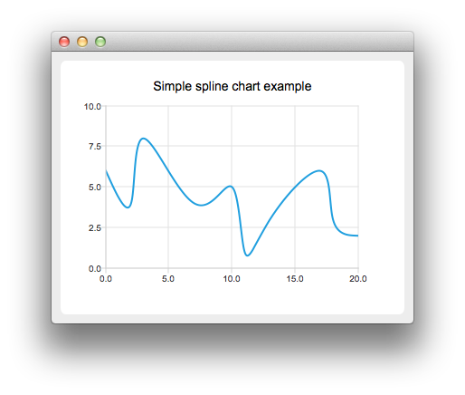
线图表和样条线图表将数据呈现为由线连接的一系列数据点。在线图表中,数据点由直线连接,而在样条线图表中,它们由样条线连接。样条线的绘制是通过使用 QPainterPath .
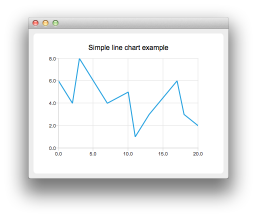
线图表的实现是通过使用 QLineSeries 类或 LineSeries QML 类型。
样条线图表的实现是通过使用 QSplineSeries 类继承 QLineSeries 或 SplineSeries 类型继承 LineSeries .
更多信息,见 线图表范例 , 样条线图表范例 ,和 动态样条线范例 。对于组合线图表与条形图表且 2 者使用公共轴的范例,见 线和条形图范例 .
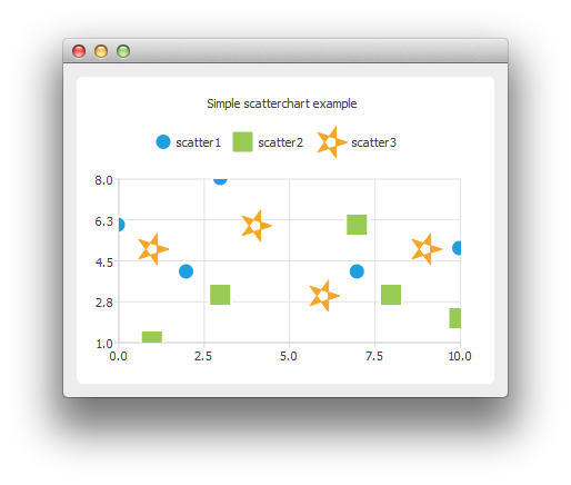
区域图表将数据呈现为由 2 条线作边界的区域,而散点图表将数据呈现为点的集合。
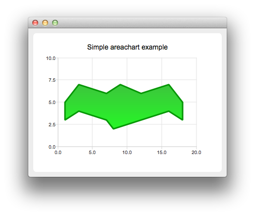
区域图表的实现是通过使用 QAreaSeries 类或 AreaSeries QML 类型。默认情况下,X 轴用作一边界而 QLineSeries or LineSeries 作为其它。不管怎样,可以使用 QLineSeries or LineSeries 作为 2 边界。
散点图表的实现是通过使用 QScatterSeries 类或 ScatterSeries QML 类型。
更多信息,见 区域图表范例 , 散点图表范例 ,和 散点交互范例 .
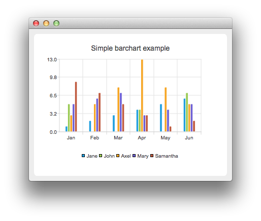
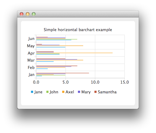
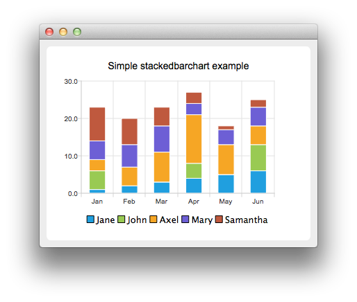
条形图表将数据呈现为按类别分组的水平 (或垂直) 条形。 QBarSet 类和 BarSet QML 类型表示条形图表中的一组条形。 QAbstractBarSeries 类是所有条形系列类的抽象父级类,而 AbstractBarSeries 类型是条形系列类型的父级类型。系列类型确定数据如何呈现。
The QBarSeries 类和 BarSeries QML type present data as vertical bars grouped by category. Similarly, the QHorizontalBarSeries 类和 HorizontalBarSeries QML type present data as horizontal bars.
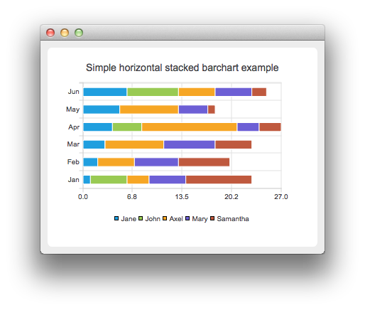
The QStackedBarSeries 类和 StackedBarSeries type present a series of data as vertically stacked bars, with one bar per category. The corresponding horizontal class and type are QHorizontalStackedBarSeries and HorizontalStackedBarSeries ,分别。
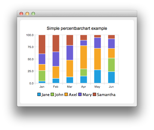
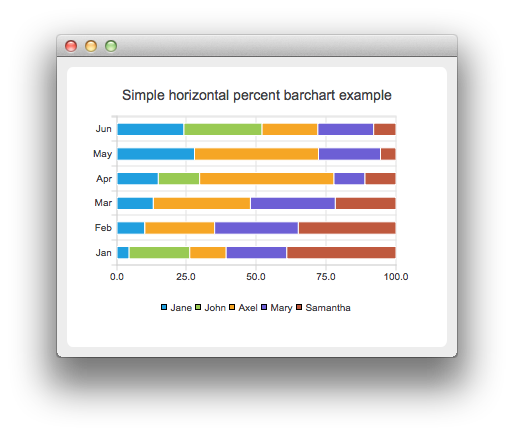
The QPercentBarSeries class and PercentBarSeries QML type present a series of categorized data as a percentage of each category. The corresponding horizontal class and type are QHorizontalPercentBarSeries and HorizontalPercentBarSeries ,分别。
更多信息,见 条形图表范例 , 水平条形图表范例 , 堆叠条形图表范例 , 水平堆叠条形图表范例 , 百分比条形图表范例 ,和 水平百分比条形图表范例 .
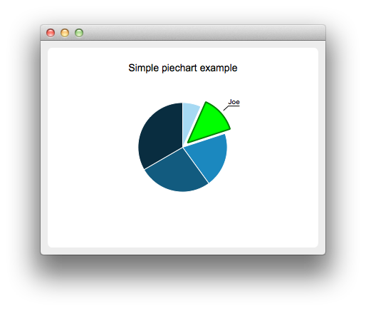
Pie charts present data as a pie that consists of pie slices. The pie is implemented using the QPieSeries 类或 PieSeries QML type and the pie slices are added using the QPieSlice 类或 PieSlice QML 类型。
The pie can be turned into a donut by specifying a hole size between 0.0 and 1.0.
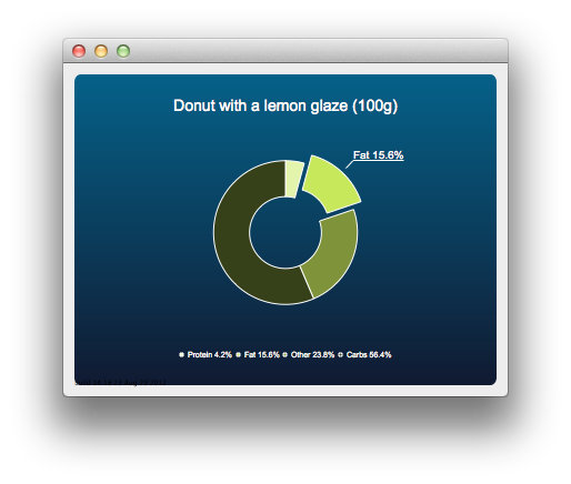
更多信息,见 PieChart Example , 饼状图表定制范例 , DonutChart Example , 圆环图表分解范例 ,和 嵌套圆环范例 .
The box-and-whiskers charts present data as quartiles extended with whiskers that show the variability of the values. The items in box plot series are grouped by category, similarly to bar sets in bar series. For each box-and-whiskers item, the lower extreme, lower quartile, median, upper quartile, and upper extreme value are specified.
A box-and-whiskers chart is implemented by using the QBoxPlotSeries and QBoxSet classes or the BoxPlotSeries and BoxSet QML types.
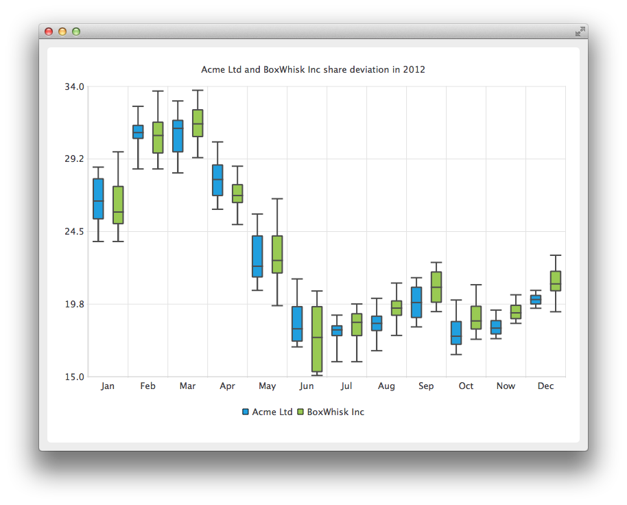
更多信息,见 方框和晶须范例 .
Candlestick charts presents a series of data shown as candlesticks.
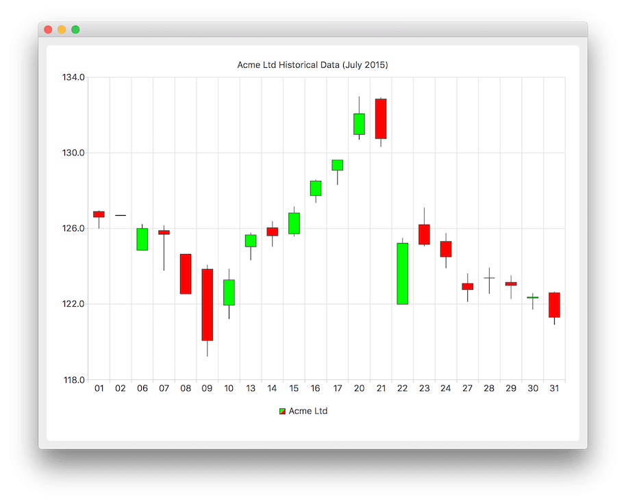
A candlestick chart is implemented by using the QCandlestickSeries and QCandlestickSet classes or the CandlestickSeries and CandlestickSet QML types.
Polar charts present data in a circular graph, where the placement of data is based on the angle and distance from the center of the graph, the pole .
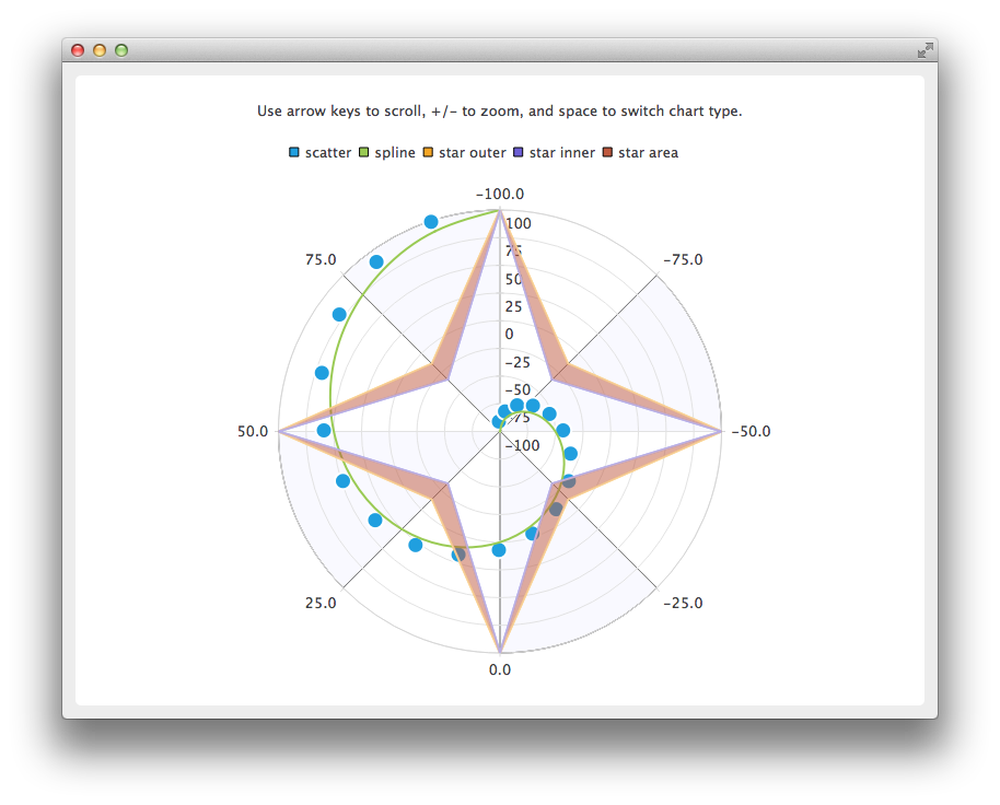
The QPolarChart class is a specialization of the QChart class. It supports line, spline, area, and scatter series, as well as all the axis types supported by them. The axis can be used either as a radial or an angular axis. In QML, the corresponding type is PolarChartView .
更多信息,见 极坐标图表范例 and QML 极坐标图表 .
Qt Charts 支持下列轴类型:
An axis can be set up to show a line with tick marks, grid lines, and shades. The values on the axis are drawn at the positions of tick marks. All axis types are specializations of the QAbstractAxis 类或 AbstractAxis QML 类型。
A value axis adds real values to a chart's axis. It is implemented using the QValueAxis 类或 ValueAxis QML 类型。
A category axis is implemented using the QCategoryAxis 类或 CategoryAxis QML type. It has named ranges and adjustable range widths.
The bar category axis is similar to a category axis, but the range width is the same for all ranges. A bar category axis is implemented using the QBarCategoryAxis 类或 BarCategoryAxis QML 类型。
A date-time axis adds dates and times to a chart's axis. It is implemented using the QDateTimeAxis 类或 DateTimeAxis QML 类型。
A logarithmic axis adds a logarithmic scale to a chart's axis. A logarithmic scale is a nonlinear scale that is based on orders of magnitude, so that each tick mark on the axis is the previous tick mark multiplied by a value. A logarithmic axis is implemented using the QLogValueAxis 类或 LogValueAxis QML 类型。
Multiple axes can be defined for one chart. The axes can be placed down, up, left, or right of the chart. Further, the axes can be of different types. However, mixing axis types that would result in different domains is not supported, such as specifying QValueAxis and QLogValueAxis on the same orientation.
更多信息,见 日期时间轴范例 , 对数轴范例 , 多轴范例 ,和 QML 轴 .
A legend is a graphical object that displays the legend of a chart. Legend objects cannot be created or deleted, but they can be referenced via the QChart 类或 ChartView QML type. The legend state is updated by QChart or ChartView when series change.
A legend can be positioned below or above the chart, as well as to the left or right of it. By default, the legend is attached to the chart view, but it can be detached to a separate graphics item that can be moved around freely.
It is possible to hide either individual markers from the legend or the whole legend.
Legend markers can be modified by using the QLegendMarker base class and the subclasses for each series type: QAreaLegendMarker , QBarLegendMarker , QBoxPlotLegendMarker , QCandlestickLegendMarker ,和 QXYLegendMarker .
In QML, legend markers can be modified by creating custom legends, as illustrated by the QML 自定义图例 范例。
End users can interact with charts by dynamically adding values to them, drilling down into data, zooming into and out of charts, scrolling charts, and clicking items in charts or hovering the mouse over them.
It is possible to add data to charts dynamically and to make the chart view scroll automatically to display the new data.
更多信息,见 动态样条线范例 .
Drilldown effects can be implemented to bar or pie charts, for example. When users select an item in the chart, a more detailed view of the item is displayed. This is implemented by deleting the first series and adding another one.
更多信息,见 堆叠条形图表深入研究范例 and 饼状图表深入研究范例 .
Users can use the keyboard for zooming and scrolling. They can scroll charts by using the arrow keys and zoom into or out of charts by using the plus and minus keys. In addition, QRubberBand can be used for selecting the area to zoom into.
On touch devices, gestures can be used for panning and zooming.
更多信息,见 缩放线范例 .
You can connect slots to signals emitted when end users click items in charts or hover the mouse over them. This enables you to add elements, such as callouts, to the charts.
更多信息,见 标注范例 .
主题是应用于图表所有视觉元素的 UI 样式相关设置的内置集合,譬如:颜色、钢笔、笔刷和系列字体,及轴、标题和图例。
Qt Charts 带有下列预定义主题:
可以通过改变颜色、钢笔、笔刷及字体,定制主题。通过修改 Qt Charts 源代码,可以添加新主题。
注意: 改变主题将覆写先前应用于系列的所有定制。
更多信息,见 图表主题范例 .