These pixmaps are generated from the set of pixmaps made available to the icon, and are used by Qt widgets to show an icon representing a particular action.
内容:
The QIcon class provides scalable icons in different modes and states. An icon's state and mode are depending on the intended use of the icon. Qt currently defines four modes:
| 模式 | 描述 |
|---|---|
| QIcon::Normal | 显示像素图当用户未与图标交互时,但由图标表示的功能是可用的。 |
| QIcon::Active | Display the pixmap when the functionality represented by the icon is available and the user is interacting with the icon, for example, moving the mouse over it or clicking it. |
| QIcon::Disabled | Display the pixmap when the functionality represented by the icon is not available. |
| QIcon::Selected | 显示像素图当图标被选中时。 |
QIcon 的状态是 QIcon::On and QIcon::Off , which will display the pixmap when the widget is in the respective state. The most common usage of QIcon 's states are when displaying checkable tool buttons or menu entries (see QAbstractButton::setCheckable () 和 QAction::setCheckable ()). When a tool button or menu entry is checked, the QIcon 的状态是 On , otherwise it's Off . You can, for example, use the QIcon 's states to display differing pixmaps depending on whether the tool button or menu entry is checked or not.
A QIcon can generate smaller, larger, active, disabled, and selected pixmaps from the set of pixmaps it is given. Such pixmaps are used by Qt widgets to show an icon representing a particular action.
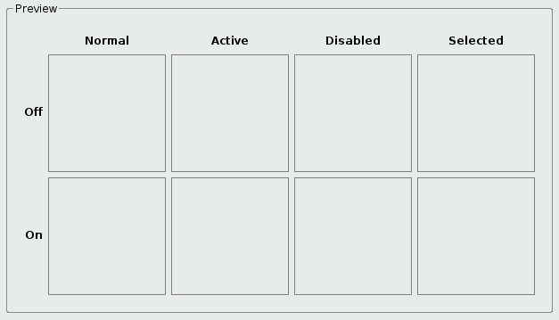
With the Icons application you get a preview of an icon's generated pixmaps reflecting its different states, modes and size.
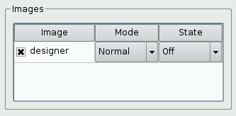
When an image is loaded into the application, it is converted into a pixmap and becomes a part of the set of pixmaps available to the icon. An image can be excluded from this set by checking off the related checkbox. The application provides a sub directory containing sets of images explicitly designed to illustrate how Qt renders an icon in different modes and states.
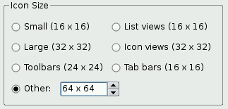
The application allows you to manipulate the icon size with some predefined sizes and a spin box. The predefined sizes are style dependent, but most of the styles have the same values. Only the macOS style differs by using 32 pixels instead of 16 pixels for toolbar buttons. You can navigate between the available styles using the View 菜单。
The View menu also provide the option to make the application guess the icon state and mode from an image's file name. The File menu provide the options of adding an image and removing all images. These last options are also available through a context menu that appears if you press the right mouse button within the table of image files. In addition, the File menu provide an Exit option, and the 帮助 menu provide information about the example and about Qt.
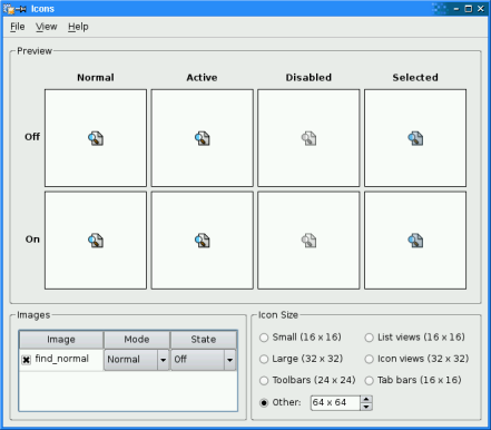
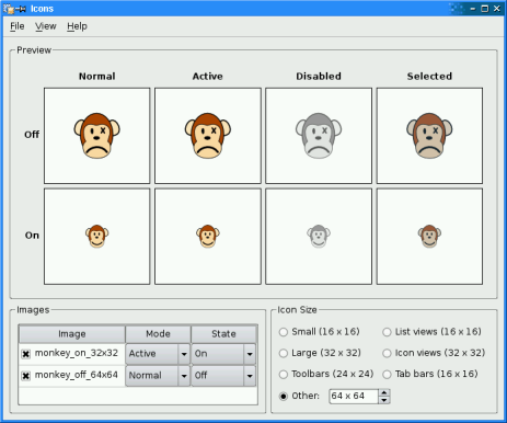
The screenshot above shows the application with one image file loaded. The Guess Image Mode/State is enabled and the style is Plastique.
当 QIcon is provided with only one available pixmap, that pixmap is used for all the states and modes. In this case the pixmap's icon mode is set to normal, and the generated pixmaps for the normal and active modes will look the same. But in disabled and selected mode, Qt will generate a slightly different pixmap.
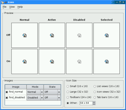
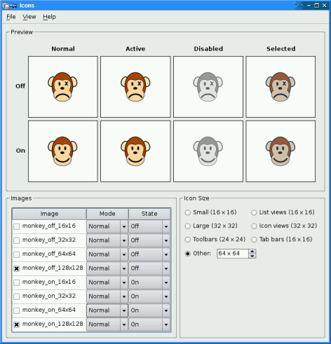
The next screenshot shows the application with an additional file loaded, providing QIcon with two available pixmaps. Note that the new image file's mode is set to disabled. When rendering the Disabled mode pixmaps, Qt will now use the new image. We can see the difference: The generated disabled pixmap in the first screenshot is slightly darker than the pixmap with the originally set disabled mode in the second screenshot.
When Qt renders the icon's pixmaps it searches through the set of available pixmaps following a particular algorithm. The algorithm is documented in QIcon , but we will describe some particular cases below.
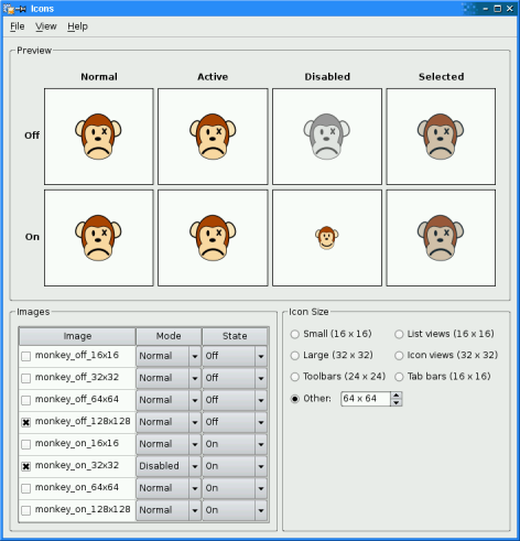
In the screenshot above, we have set
monkey_on_32x32
to be an Active/On pixmap and
monkey_off_64x64
to be Normal/Off. To render the other six mode/state combinations,
QIcon
uses the search algorithm described in the table below:
| 请求像素图 | 首选替代 (模式/状态) | ||||||||
|---|---|---|---|---|---|---|---|---|---|
| 模式 | 状态 | 1 | 2 | 3 | 4 | 5 | 6 | 7 | 8 |
| Normal | Off | N0 | A0 | N1 | A1 | D0 | S0 | D1 | S1 |
| On | N1 | A1 | N0 | A0 | D1 | S1 | D0 | S0 | |
| Active | Off | A0 | N0 | A1 | N1 | D0 | S0 | D1 | S1 |
| On | A1 | N1 | A0 | N0 | D1 | S1 | D0 | S0 | |
| Disabled | Off | D0 | N0' | A0' | D1 | N1' | A1' | S0' | S1' |
| On | D1 | N1' | A1' | D0 | N0' | A0' | S1' | S0' | |
| Selected | Off | S0 | N0'' | A0'' | S1 | N1'' | A1'' | D0'' | D1'' |
| On | S1 | N1'' | A1'' | S0 | N0'' | A0'' | D1'' | D0'' | |
In the table, "0" and "1" stand for Off" and "On", respectively. Single quotes indicates that QIcon generates a disabled ("grayed out") version of the pixmap; similarly, double quuote indicate that QIcon generates a selected ("blued out") version of the pixmap.
The alternatives used in the screenshot above are shown in bold. For example, the Disabled/Off pixmap is derived by graying out the Normal/Off pixmap (
monkey_off_64x64
).
In the next screenshots, we loaded the whole set of monkey images. By checking or unchecking file names from the image list, we get different results:
|
|
For any given mode/state combination, it is possible to specify several images at different resolutions. When rendering an icon, QIcon will automatically pick the most suitable image and scale it down if necessary. ( QIcon never scales up images, because this rarely looks good.)
The screenshots below shows what happens when we provide
QIcon
with three images (
qt_extended_16x16.png
,
qt_extended_32x32.png
,
qt_extended_48x48.png
) and try to render the
QIcon
at various resolutions:
|
|
|
|
| 8 x 8 | 16 x 16 | 17 x 17 | |
|
|
|
|
| 32 x 32 | 33 x 33 | 48 x 48 | 64 x 64 |
For sizes up to 16 x 16,
QIcon
使用
qt_extended_16x16.png
and scales it down if necessary. For sizes between 17 x 17 and 32 x 32, it uses
qt_extended_32x32.png
. For sizes above 32 x 32, it uses
qt_extended_48x48.png
.
The Icons example consists of four classes:
MainWindow
继承
QMainWindow
and is the main application window.
IconPreviewArea
is a custom widget that displays all combinations of states and modes for a given icon.
IconSizeSpinBox
是子类化的
QSpinBox
that lets the user enter icon sizes (e.g., "48 x 48").
ImageDelegate
是子类化的
QItemDelegate
that provides comboboxes for letting the user set the mode and state associated with an image.
We will start by reviewing the
IconPreviewArea
class before we take a look at the
MainWindow
class. Finally, we will review the
IconSizeSpinBox
and
ImageDelegate
类。
An
IconPreviewArea
widget consists of a group box containing a grid of
QLabel
widgets displaying headers and pixmaps.
class IconPreviewArea : public QWidget
{
    Q_OBJECT
public:
    explicit IconPreviewArea(QWidget *parent = Q_NULLPTR);
    void setIcon(const QIcon &icon);
    void setSize(const QSize &size);
    static QVector<QIcon::Mode> iconModes();
    static QVector<QIcon::State> iconStates();
    static QStringList iconModeNames();
    static QStringList iconStateNames();
private:
    QLabel *createHeaderLabel(const QString &text);
    QLabel *createPixmapLabel();
    void updatePixmapLabels();
    enum { NumModes = 4, NumStates = 2 };
    QIcon icon;
    QSize size;
    QLabel *stateLabels[NumStates];
    QLabel *modeLabels[NumModes];
    QLabel *pixmapLabels[NumModes][NumStates];
};
The
IconPreviewArea
类继承
QWidget
. It displays the generated pixmaps corresponding to an icon's possible states and modes at a given size.
QVector<QIcon::Mode> IconPreviewArea::iconModes()
{
    static const QVector<QIcon::Mode> result = {QIcon::Normal, QIcon::Active, QIcon::Disabled, QIcon::Selected};
    return result;
}
QVector<QIcon::State> IconPreviewArea::iconStates()
{
    static const QVector<QIcon::State> result = {QIcon::Off, QIcon::On};
    return result;
}
QStringList IconPreviewArea::iconModeNames()
{
    static const QStringList result = {tr("Normal"), tr("Active"), tr("Disabled"), tr("Selected")};
    return result;
}
QStringList IconPreviewArea::iconStateNames()
{
    static const QStringList result = {tr("Off"), tr("On")};
    return result;
}
We would like the table columns to be in the order QIcon::Normal , QIcon::Active , QIcon::Disabled , QIcon::Selected and the rows in the order QIcon::Off , QIcon::On , which does not match the enumeration. The above code provides arrays allowing to map from enumeration value to row/column (by using QVector::indexOf ()) and back by using the array index and lists of the matching strings. Qt's containers can be easily populated by using C++ 11 initializer lists. If the compiler does not provide that feature, a pattern like
QVector<QIcon::Mode> IconPreviewArea::iconModes()
{
    static QVector<QIcon::Mode> result;
    if (result.isEmpty())
        result << QIcon::Normal << QIcon::Active << QIcon::Disabled << QIcon::Selected;
    return result;
}
可以使用。
We need two public functions to set the current icon and the icon's size. In addition the class has three private functions: We use the
createHeaderLabel()
and
createPixmapLabel()
functions when constructing the preview area, and we need the
updatePixmapLabels()
function to update the preview area when the icon or the icon's size has changed.
The
NumModes
and
NumStates
constants reflect
QIcon
's number of currently defined modes and states.
IconPreviewArea::IconPreviewArea(QWidget *parent)
    : QWidget(parent)
{
    QGridLayout *mainLayout = new QGridLayout(this);
    for (int row = 0; row < NumStates; ++row) {
        stateLabels[row] = createHeaderLabel(IconPreviewArea::iconStateNames().at(row));
        mainLayout->addWidget(stateLabels[row], row + 1, 0);
    }
    Q_ASSERT(NumStates == 2);
    for (int column = 0; column < NumModes; ++column) {
        modeLabels[column] = createHeaderLabel(IconPreviewArea::iconModeNames().at(column));
        mainLayout->addWidget(modeLabels[column], 0, column + 1);
    }
    Q_ASSERT(NumModes == 4);
    for (int column = 0; column < NumModes; ++column) {
        for (int row = 0; row < NumStates; ++row) {
            pixmapLabels[column][row] = createPixmapLabel();
            mainLayout->addWidget(pixmapLabels[column][row], row + 1, column + 1);
        }
    }
}
In the constructor we create the labels displaying the headers and the icon's generated pixmaps, and add them to a grid layout.
When creating the header labels, we make sure the enums
NumModes
and
NumStates
defined in the
.h
file, correspond with the number of labels that we create. Then if the enums at some point are changed, the
Q_ASSERT()
macro will alert that this part of the
.cpp
file needs to be updated as well.
If the application is built in debug mode, the
Q_ASSERT()
macro will expand to
if (!condition)
   qFatal("ASSERT: "condition" in file ...");
In release mode, the macro simply disappear. The mode can be set in the application's
.pro
file. One way to do so is to add an option to
qmake
when building the application:
qmake "CONFIG += debug" icons.pro
or
qmake "CONFIG += release" icons.pro
Another approach is to add this line directly to the
.pro
文件。
void IconPreviewArea::setIcon(const QIcon &icon)
{
    this->icon = icon;
    updatePixmapLabels();
}
void IconPreviewArea::setSize(const QSize &size)
{
    if (size != this->size) {
        this->size = size;
        updatePixmapLabels();
    }
}
公共
setIcon()
and
setSize()
functions change the icon or the icon size, and make sure that the generated pixmaps are updated.
QLabel *IconPreviewArea::createHeaderLabel(const QString &text)
{
    QLabel *label = new QLabel(tr("<b>%1</b>").arg(text));
    label->setAlignment(Qt::AlignCenter);
    return label;
}
QLabel *IconPreviewArea::createPixmapLabel()
{
    QLabel *label = new QLabel;
    label->setEnabled(false);
    label->setAlignment(Qt::AlignCenter);
    label->setFrameShape(QFrame::Box);
    label->setSizePolicy(QSizePolicy::Expanding, QSizePolicy::Expanding);
    label->setBackgroundRole(QPalette::Base);
    label->setAutoFillBackground(true);
    label->setMinimumSize(132, 132);
    return label;
}
使用
createHeaderLabel()
and
createPixmapLabel()
functions to create the preview area's labels displaying the headers and the icon's generated pixmaps. Both functions return the
QLabel
that is created.
void IconPreviewArea::updatePixmapLabels()
{
    QWindow *window = Q_NULLPTR;
    if (const QWidget *nativeParent = nativeParentWidget())
        window = nativeParent->windowHandle();
    for (int column = 0; column < NumModes; ++column) {
        for (int row = 0; row < NumStates; ++row) {
            const QPixmap pixmap =
                icon.pixmap(window, size, IconPreviewArea::iconModes().at(column),
                            IconPreviewArea::iconStates().at(row));
            QLabel *pixmapLabel = pixmapLabels[column][row];
            pixmapLabel->setPixmap(pixmap);
            pixmapLabel->setEnabled(!pixmap.isNull());
            QString toolTip;
            if (!pixmap.isNull()) {
                const QSize actualSize = icon.actualSize(size);
                toolTip =
                    tr("Size: %1x%2\nActual size: %3x%4\nDevice pixel ratio: %5")
                        .arg(size.width()).arg(size.height())
                        .arg(actualSize.width()).arg(actualSize.height())
                        .arg(pixmap.devicePixelRatioF());
            }
            pixmapLabel->setToolTip(toolTip);
        }
    }
}
We use the private
updatePixmapLabel()
function to update the generated pixmaps displayed in the preview area.
For each mode, and for each state, we retrieve a pixmap using the QIcon::pixmap () function, which generates a pixmap corresponding to the given state, mode and size. We pass the QWindows instance obtained by calling QWidget::windowHandle () on the top level widget ( QWidget::nativeParentWidget ()) in order to retrieve the pixmap that matches best. We format a tooltip displaying size, actual size and device pixel ratio.
The
MainWindow
widget consists of three main elements: an images group box, an icon size group box and a preview area.
class MainWindow : public QMainWindow
{
    Q_OBJECT
public:
    MainWindow();
    void loadImages(const QStringList &fileNames);
    void show();
private slots:
    void about();
    void changeStyle(bool checked);
    void changeSize(int, bool);
    void triggerChangeSize();
    void changeIcon();
    void addSampleImages();
    void addOtherImages();
    void removeAllImages();
    void useHighDpiPixmapsChanged(int checkState);
    void screenChanged();
private:
    QWidget *createImagesGroupBox();
    QWidget *createIconSizeGroupBox();
    QWidget *createHighDpiIconSizeGroupBox();
    void createActions();
    void createContextMenu();
    void checkCurrentStyle();
    void addImages(const QString &directory);
    IconPreviewArea *previewArea;
    QTableWidget *imagesTable;
    QButtonGroup *sizeButtonGroup;
    IconSizeSpinBox *otherSpinBox;
    QLabel *devicePixelRatioLabel;
    QLabel *screenNameLabel;
    QAction *addOtherImagesAct;
    QAction *addSampleImagesAct;
    QAction *removeAllImagesAct;
    QAction *guessModeStateAct;
    QAction *nativeFileDialogAct;
    QActionGroup *styleActionGroup;
};
The MainWindow 类继承自 QMainWindow . We reimplement the constructor, and declare several private slots:
about()
slot simply provides information about the example.
changeStyle()
slot changes the application's GUI style and adjust the style dependent size options.
changeSize()
slot changes the size of the preview area's icon.
changeIcon()
slot updates the set of pixmaps available to the icon displayed in the preview area.
addSampleImages()
slot allows the user to load a new image from the samples provided into the application.
addOtherImages()
slot allows the user to load a new image from the directory obtained by calling
QStandardPaths::standardLocations
(
QStandardPaths::PicturesLocation
).
screenChanged()
updates the display in the
高 DPI (每英寸点数)
group box to correctly display the parameters of the current screen the window is located on.
In addition we declare several private functions to simplify the constructor.
MainWindow::MainWindow()
{
    QWidget *centralWidget = new QWidget(this);
    setCentralWidget(centralWidget);
    createActions();
    QGridLayout *mainLayout = new QGridLayout(centralWidget);
    QGroupBox *previewGroupBox = new QGroupBox(tr("Preview"));
    previewArea = new IconPreviewArea(previewGroupBox);
    QVBoxLayout *previewLayout = new QVBoxLayout(previewGroupBox);
    previewLayout->addWidget(previewArea);
    mainLayout->addWidget(previewGroupBox, 0, 0, 1, 2);
    mainLayout->addWidget(createImagesGroupBox(), 1, 0);
    QVBoxLayout *vBox = new QVBoxLayout;
    vBox->addWidget(createIconSizeGroupBox());
    vBox->addWidget(createHighDpiIconSizeGroupBox());
    vBox->addItem(new QSpacerItem(0, 0, QSizePolicy::Ignored, QSizePolicy::MinimumExpanding));
    mainLayout->addLayout(vBox, 1, 1);
    createContextMenu();
    setWindowTitle(tr("Icons"));
    checkCurrentStyle();
    sizeButtonGroup->button(OtherSize)->click();
}
In the constructor we first create the main window's central widget and its child widgets, and put them in a grid layout. Then we create the menus with their associated entries and actions.
We set the window title and determine the current style for the application. We also enable the icon size spin box by clicking the associated radio button, making the current value of the spin box the icon's initial size.
void MainWindow::about()
{
    QMessageBox::about(this, tr("About Icons"),
            tr("The <b>Icons</b> example illustrates how Qt renders an icon in "
               "different modes (active, normal, disabled, and selected) and "
               "states (on and off) based on a set of images."));
}
The
about()
slot displays a message box using the static
QMessageBox::about
() function. In this example it displays a simple box with information about the example.
The
about()
function looks for a suitable icon in four locations: It prefers its parent's icon if that exists. If it doesn't, the function tries the top-level widget containing parent, and if that fails, it tries the active window. As a last resort it uses the
QMessageBox
's Information icon.
void MainWindow::changeStyle(bool checked)
{
    if (!checked)
        return;
    const QAction *action = qobject_cast<QAction *>(sender());
在
changeStyle()
slot we first check the slot's parameter. If it is false we immediately return, otherwise we find out which style to change to, i.e. which action that triggered the slot, using the
QObject::sender
() 函数。
This function returns the sender as a
QObject
pointer. Since we know that the sender is a
QAction
object, we can safely cast the
QObject
. We could have used a C-style cast or a C++
static_cast()
, but as a defensive programming technique we use a
qobject_cast
(). The advantage is that if the object has the wrong type, a null pointer is returned. Crashes due to null pointers are much easier to diagnose than crashes due to unsafe casts.
    QStyle *style = QStyleFactory::create(action->data().toString());
    Q_ASSERT(style);
    QApplication::setStyle(style);
    foreach (QAbstractButton *button, sizeButtonGroup->buttons()) {
        const QStyle::PixelMetric metric = static_cast<QStyle::PixelMetric>(sizeButtonGroup->id(button));
        const int value = style->pixelMetric(metric);
        switch (metric) {
        case QStyle::PM_SmallIconSize:
            button->setText(tr("Small (%1 x %1)").arg(value));
            break;
        case QStyle::PM_LargeIconSize:
            button->setText(tr("Large (%1 x %1)").arg(value));
            break;
        case QStyle::PM_ToolBarIconSize:
            button->setText(tr("Toolbars (%1 x %1)").arg(value));
            break;
        case QStyle::PM_ListViewIconSize:
            button->setText(tr("List views (%1 x %1)").arg(value));
            break;
        case QStyle::PM_IconViewIconSize:
            button->setText(tr("Icon views (%1 x %1)").arg(value));
            break;
        case QStyle::PM_TabBarIconSize:
            button->setText(tr("Tab bars (%1 x %1)").arg(value));
            break;
        default:
            break;
        }
    }
    triggerChangeSize();
}
一旦有了动作,就可以提取样式名称使用 QAction::data ()。然后创建 QStyle 对象使用静态 QStyleFactory::create () 函数。
Although we can assume that the style is supported by the
QStyleFactory
: To be on the safe side, we use the
Q_ASSERT()
macro to check if the created style is valid before we use the
QApplication::setStyle
() function to set the application's GUI style to the new style.
QApplication
will automatically delete the style object when a new style is set or when the application exits.
The predefined icon size options provided in the application are style dependent, so we need to update the labels in the icon size group box and in the end call the
changeSize()
槽以更新图标大小。
void MainWindow::changeSize(int id, bool checked)
{
    if (!checked)
        return;
    const bool other = id == int(OtherSize);
    const int extent = other
        ? otherSpinBox->value()
        : QApplication::style()->pixelMetric(static_cast<QStyle::PixelMetric>(id));
    previewArea->setSize(QSize(extent, extent));
    otherSpinBox->setEnabled(other);
}
void MainWindow::triggerChangeSize()
{
    changeSize(sizeButtonGroup->checkedId(), true);
}
The
changeSize()
slot sets the size for the preview area's icon.
It is invoked by the
QButtonGroup
whose members are radio buttons for controlling the icon size. In
createIconSizeGroupBox()
, each button is assigned a
QStyle::PixelMetric
value as an id, which is passed as a parameter to the slot.
The special value
OtherSize
indicates that the spin box is enabled. If it is, we extract the extent of the new size from the box. If it's not, we query the style for the metric. Then we create a
QSize
object based on the extent, and use that object to set the size of the preview area's icon.
void MainWindow::addImages(const QString &directory)
{
    QFileDialog fileDialog(this, tr("Open Images"), directory);
    QStringList mimeTypeFilters;
    foreach (const QByteArray &mimeTypeName, QImageReader::supportedMimeTypes())
        mimeTypeFilters.append(mimeTypeName);
    mimeTypeFilters.sort();
    fileDialog.setMimeTypeFilters(mimeTypeFilters);
    fileDialog.selectMimeTypeFilter(QLatin1String("image/png"));
    fileDialog.setAcceptMode(QFileDialog::AcceptOpen);
    fileDialog.setFileMode(QFileDialog::ExistingFiles);
    if (!nativeFileDialogAct->isChecked())
        fileDialog.setOption(QFileDialog::DontUseNativeDialog);
    if (fileDialog.exec() == QDialog::Accepted)
        loadImages(fileDialog.selectedFiles());
函数
addImages()
is called by the slot addSampleImages() passing the samples directory, or by the slot addOtherImages() passing the directory obtained by querying
QStandardPaths::standardLocations
().
The first thing we do is to show a file dialog to the user. We initialize it to show the filters returned by QImageReader::supportedMimeTypes ().
For each of the files the file dialog returns, we add a row to the table widget. The table widget is listing the images the user has loaded into the application.
        const QFileInfo fileInfo(fileName);
        const QString imageName = fileInfo.baseName();
        const QString fileName2x = fileInfo.absolutePath()
            + QLatin1Char('/') + imageName + QLatin1String("@2x.") + fileInfo.suffix();
        const QFileInfo fileInfo2x(fileName2x);
        const QImage image(fileName);
        const QString toolTip =
            tr("Directory: %1\nFile: %2\nFile@2x: %3\nSize: %4x%5")
               .arg(QDir::toNativeSeparators(fileInfo.absolutePath()), fileInfo.fileName())
               .arg(fileInfo2x.exists() ? fileInfo2x.fileName() : tr("<None>"))
               .arg(image.width()).arg(image.height());
        QTableWidgetItem *fileItem = new QTableWidgetItem(imageName);
        fileItem->setData(Qt::UserRole, fileName);
        fileItem->setIcon(QPixmap::fromImage(image));
        fileItem->setFlags((fileItem->flags() | Qt::ItemIsUserCheckable) & ~Qt::ItemIsEditable);
        fileItem->setToolTip(toolTip);
We retrieve the image name using the
QFileInfo::baseName
() function that returns the base name of the file without the path, and create the first table widget item in the row. We check if a high resolution version of the image exists (identified by the suffix
@2x
on the base name) and display that along with the size in the tooltip.
We add the file's complete name to the item's data. Since an item can hold several information pieces, we need to assign the file name a role that will distinguish it from other data. This role can be Qt::UserRole or any value above it.
We also make sure that the item is not editable by removing the Qt::ItemIsEditable flag. Table items are editable by default.
        QIcon::Mode mode = QIcon::Normal;
        QIcon::State state = QIcon::Off;
        if (guessModeStateAct->isChecked()) {
            if (imageName.contains(QLatin1String("_act"), Qt::CaseInsensitive))
                mode = QIcon::Active;
            else if (imageName.contains(QLatin1String("_dis"), Qt::CaseInsensitive))
                mode = QIcon::Disabled;
            else if (imageName.contains(QLatin1String("_sel"), Qt::CaseInsensitive))
                mode = QIcon::Selected;
            if (imageName.contains(QLatin1String("_on"), Qt::CaseInsensitive))
                state = QIcon::On;
        }
Then we create the second and third items in the row making the default mode Normal and the default state Off. But if the
Guess Image Mode/State
option is checked, and the file name contains "_act", "_dis", or "_sel", the modes are changed to Active, Disabled, or Selected. And if the file name contains "_on", the state is changed to On. The sample files in the example's
images
subdirectory respect this naming convention.
        imagesTable->setItem(row, 0, fileItem);
        QTableWidgetItem *modeItem =
            new QTableWidgetItem(IconPreviewArea::iconModeNames().at(IconPreviewArea::iconModes().indexOf(mode)));
        modeItem->setToolTip(toolTip);
        imagesTable->setItem(row, 1, modeItem);
        QTableWidgetItem *stateItem =
            new QTableWidgetItem(IconPreviewArea::iconStateNames().at(IconPreviewArea::iconStates().indexOf(state)));
        stateItem->setToolTip(toolTip);
        imagesTable->setItem(row, 2, stateItem);
        imagesTable->openPersistentEditor(modeItem);
        imagesTable->openPersistentEditor(stateItem);
        fileItem->setCheckState(Qt::Checked);
    }
}
In the end we add the items to the associated row, and use the QTableWidget::openPersistentEditor () function to create comboboxes for the mode and state columns of the items.
Due to the connection between the table widget's
itemChanged()
signal and the
changeIcon()
slot, the new image is automatically converted into a pixmap and made part of the set of pixmaps available to the icon in the preview area. So, corresponding to this fact, we need to make sure that the new image's check box is enabled.
void MainWindow::changeIcon()
{
    QIcon icon;
    for (int row = 0; row < imagesTable->rowCount(); ++row) {
        const QTableWidgetItem *fileItem = imagesTable->item(row, 0);
        const QTableWidgetItem *modeItem = imagesTable->item(row, 1);
        const QTableWidgetItem *stateItem = imagesTable->item(row, 2);
        if (fileItem->checkState() == Qt::Checked) {
            const int modeIndex = IconPreviewArea::iconModeNames().indexOf(modeItem->text());
            Q_ASSERT(modeIndex >= 0);
            const int stateIndex = IconPreviewArea::iconStateNames().indexOf(stateItem->text());
            Q_ASSERT(stateIndex >= 0);
            const QIcon::Mode mode = IconPreviewArea::iconModes().at(modeIndex);
            const QIcon::State state = IconPreviewArea::iconStates().at(stateIndex);
The
changeIcon()
slot is called when the user alters the set of images listed in the
QTableWidget
, to update the
QIcon
object rendered by the
IconPreviewArea
.
We first create a QIcon object, and then we run through the QTableWidget , which lists the images the user has loaded into the application.
            const QString fileName = fileItem->data(Qt::UserRole).toString();
            QImage image(fileName);
            if (!image.isNull())
                icon.addPixmap(QPixmap::fromImage(image), mode, state);
        }
    }
We also extract the image file's name using the QTableWidgetItem::data () function. This function takes a Qt::DataItemRole as an argument to retrieve the right data (remember that an item can hold several pieces of information) and returns it as a QVariant . Then we use the QVariant::toString () function to get the file name as a QString .
To create a pixmap from the file, we need to first create an image and then convert this image into a pixmap using QPixmap::fromImage (). Once we have the final pixmap, we add it, with its associated mode and state, to the QIcon 's set of available pixmaps.
    previewArea->setIcon(icon);
}
After running through the entire list of images, we change the icon of the preview area to the one we just created.
void MainWindow::removeAllImages()
{
    imagesTable->setRowCount(0);
    changeIcon();
}
在
removeAllImages()
slot, we simply set the table widget's row count to zero, automatically removing all the images the user has loaded into the application. Then we update the set of pixmaps available to the preview area's icon using the
changeIcon()
槽。
The
createImagesGroupBox()
function is implemented to simplify the constructor. The main purpose of the function is to create a
QTableWidget
that will keep track of the images the user has loaded into the application.
QWidget *MainWindow::createImagesGroupBox()
{
    QGroupBox *imagesGroupBox = new QGroupBox(tr("Images"));
    imagesTable = new QTableWidget;
    imagesTable->setSelectionMode(QAbstractItemView::NoSelection);
    imagesTable->setItemDelegate(new ImageDelegate(this));
First we create a group box that will contain the table widget. Then we create a QTableWidget and customize it to suit our purposes.
调用 QAbstractItemView::setSelectionMode () to prevent the user from selecting items.
The
QAbstractItemView::setItemDelegate
() call sets the item delegate for the table widget. We create a
ImageDelegate
that we make the item delegate for our view.
The QItemDelegate class can be used to provide an editor for an item view class that is subclassed from QAbstractItemView . Using a delegate for this purpose allows the editing mechanism to be customized and developed independently from the model and view.
In this example we derive
ImageDelegate
from
QItemDelegate
.
QItemDelegate
usually provides line editors, while our subclass
ImageDelegate
, provides comboboxes for the mode and state fields.
    QStringList labels;
    labels << tr("Image") << tr("Mode") << tr("State");
    imagesTable->horizontalHeader()->setDefaultSectionSize(90);
    imagesTable->setColumnCount(3);
    imagesTable->setHorizontalHeaderLabels(labels);
    imagesTable->horizontalHeader()->setSectionResizeMode(0, QHeaderView::Stretch);
    imagesTable->horizontalHeader()->setSectionResizeMode(1, QHeaderView::Fixed);
    imagesTable->horizontalHeader()->setSectionResizeMode(2, QHeaderView::Fixed);
    imagesTable->verticalHeader()->hide();
Then we customize the QTableWidget 's horizontal header, and hide the vertical header.
    connect(imagesTable, &QTableWidget::itemChanged,
            this, &MainWindow::changeIcon);
    QVBoxLayout *layout = new QVBoxLayout(imagesGroupBox);
    layout->addWidget(imagesTable);
    return imagesGroupBox;
}
At the end, we connect the
QTableWidget::itemChanged
() 信号到
changeIcon()
slot to ensure that the preview area is in sync with the image table.
The
createIconSizeGroupBox()
function is called from the constructor. It creates the widgets controlling the size of the preview area's icon.
QWidget *MainWindow::createIconSizeGroupBox()
{
    QGroupBox *iconSizeGroupBox = new QGroupBox(tr("Icon Size"));
    sizeButtonGroup = new QButtonGroup(this);
    sizeButtonGroup->setExclusive(true);
    connect(sizeButtonGroup, QOverload<int, bool>::of(&QButtonGroup::buttonToggled),
            this, &MainWindow::changeSize);
    QRadioButton *smallRadioButton = new QRadioButton;
    sizeButtonGroup->addButton(smallRadioButton, QStyle::PM_SmallIconSize);
    QRadioButton *largeRadioButton = new QRadioButton;
    sizeButtonGroup->addButton(largeRadioButton, QStyle::PM_LargeIconSize);
    QRadioButton *toolBarRadioButton = new QRadioButton;
    sizeButtonGroup->addButton(toolBarRadioButton, QStyle::PM_ToolBarIconSize);
    QRadioButton *listViewRadioButton = new QRadioButton;
    sizeButtonGroup->addButton(listViewRadioButton, QStyle::PM_ListViewIconSize);
    QRadioButton *iconViewRadioButton = new QRadioButton;
    sizeButtonGroup->addButton(iconViewRadioButton, QStyle::PM_IconViewIconSize);
    QRadioButton *tabBarRadioButton = new QRadioButton;
    sizeButtonGroup->addButton(tabBarRadioButton, QStyle::PM_TabBarIconSize);
    QRadioButton *otherRadioButton = new QRadioButton(tr("Other:"));
    sizeButtonGroup->addButton(otherRadioButton, OtherSize);
    otherSpinBox = new IconSizeSpinBox;
    otherSpinBox->setRange(8, 256);
    const QString spinBoxToolTip =
        tr("Enter a custom size within %1..%2")
           .arg(otherSpinBox->minimum()).arg(otherSpinBox->maximum());
    otherSpinBox->setValue(64);
    otherSpinBox->setToolTip(spinBoxToolTip);
    otherRadioButton->setToolTip(spinBoxToolTip);
First we create a group box that will contain all the widgets; then we create the radio buttons and the spin box. We add the radio buttons to an instance of QButtonGroup , using the value of the QStyle::PixelMetric they represent as an integer id.
enum { OtherSize = QStyle::PM_CustomBase };
We introduce an enumeration constant
OtherSize
to represent a custom size.
The spin box is not a regular
QSpinBox
but an
IconSizeSpinBox
。
IconSizeSpinBox
类继承
QSpinBox
and reimplements two functions:
QSpinBox::textFromValue
() 和
QSpinBox::valueFromText
()。
IconSizeSpinBox
is designed to handle icon sizes, e.g., "32 x 32", instead of plain integer values.
    connect(otherSpinBox, QOverload<int>::of(&QSpinBox::valueChanged),
            this, &MainWindow::triggerChangeSize);
    QHBoxLayout *otherSizeLayout = new QHBoxLayout;
    otherSizeLayout->addWidget(otherRadioButton);
    otherSizeLayout->addWidget(otherSpinBox);
    otherSizeLayout->addStretch();
    QGridLayout *layout = new QGridLayout(iconSizeGroupBox);
    layout->addWidget(smallRadioButton, 0, 0);
    layout->addWidget(largeRadioButton, 1, 0);
    layout->addWidget(toolBarRadioButton, 2, 0);
    layout->addWidget(listViewRadioButton, 0, 1);
    layout->addWidget(iconViewRadioButton, 1, 1);
    layout->addWidget(tabBarRadioButton, 2, 1);
    layout->addLayout(otherSizeLayout, 3, 0, 1, 2);
    layout->setRowStretch(4, 1);
    return iconSizeGroupBox;
}
Then we connect all of the radio buttons
toggled()
signals and the spin box's
valueChanged()
信号到
changeSize()
slot to make sure that the size of the preview area's icon is updated whenever the user changes the icon size. In the end we put the widgets in a layout that we install on the group box.
void MainWindow::createActions()
{
    QMenu *fileMenu = menuBar()->addMenu(tr("&File"));
    addSampleImagesAct = new QAction(tr("Add &Sample Images..."), this);
    addSampleImagesAct->setShortcut(tr("Ctrl+A"));
    connect(addSampleImagesAct, &QAction::triggered, this, &MainWindow::addSampleImages);
    fileMenu->addAction(addSampleImagesAct);
    addOtherImagesAct = new QAction(tr("&Add Images..."), this);
    addOtherImagesAct->setShortcut(QKeySequence::Open);
    connect(addOtherImagesAct, &QAction::triggered, this, &MainWindow::addOtherImages);
    fileMenu->addAction(addOtherImagesAct);
    removeAllImagesAct = new QAction(tr("&Remove All Images"), this);
    removeAllImagesAct->setShortcut(tr("Ctrl+R"));
    connect(removeAllImagesAct, &QAction::triggered,
            this, &MainWindow::removeAllImages);
    fileMenu->addAction(removeAllImagesAct);
    fileMenu->addSeparator();
    QAction *exitAct = fileMenu->addAction(tr("&Quit"), this, &QWidget::close);
    exitAct->setShortcuts(QKeySequence::Quit);
    QMenu *viewMenu = menuBar()->addMenu(tr("&View"));
    styleActionGroup = new QActionGroup(this);
    foreach (const QString &styleName, QStyleFactory::keys()) {
        QAction *action = new QAction(tr("%1 Style").arg(styleName), styleActionGroup);
        action->setData(styleName);
        action->setCheckable(true);
        connect(action, &QAction::triggered, this, &MainWindow::changeStyle);
        viewMenu->addAction(action);
    }
    QMenu *settingsMenu = menuBar()->addMenu(tr("&Settings"));
    guessModeStateAct = new QAction(tr("&Guess Image Mode/State"), this);
    guessModeStateAct->setCheckable(true);
    guessModeStateAct->setChecked(true);
    settingsMenu->addAction(guessModeStateAct);
    nativeFileDialogAct = new QAction(tr("&Use Native File Dialog"), this);
    nativeFileDialogAct->setCheckable(true);
    nativeFileDialogAct->setChecked(true);
    settingsMenu->addAction(nativeFileDialogAct);
    QMenu *helpMenu = menuBar()->addMenu(tr("&Help"));
    helpMenu->addAction(tr("&About"), this, &MainWindow::about);
    helpMenu->addAction(tr("About &Qt"), qApp, &QApplication::aboutQt);
}
在
createActions()
function we create and customize all the actions needed to implement the functionality associated with the menu entries in the application.
In particular we create the
styleActionGroup
based on the currently available GUI styles using
QStyleFactory
.
QStyleFactory::keys
() returns a list of valid keys, typically including "windows" and "fusion". Depending on the platform, "windowsvista" and "macintosh" may be available.
We create one action for each key, and adds the action to the action group. Also, for each action, we call QAction::setData () with the style name. We will retrieve it later using QAction::data ().
As we go along, we create the File , View and 帮助 menus and add the actions to them.
The QMenu class provides a menu widget for use in menu bars, context menus, and other popup menus. We put each menu in the application's menu bar, which we retrieve using QMainWindow::menuBar ().
void MainWindow::createContextMenu()
{
    imagesTable->setContextMenuPolicy(Qt::ActionsContextMenu);
    imagesTable->addAction(addSampleImagesAct);
    imagesTable->addAction(addOtherImagesAct);
    imagesTable->addAction(removeAllImagesAct);
}
QWidgets have a contextMenuPolicy property that controls how the widget should behave when the user requests a context menu (e.g., by right-clicking). We set the QTableWidget 's context menu policy to Qt::ActionsContextMenu , meaning that the QAction s associated with the widget should appear in its context menu.
Then we add the Add Image and Remove All Images actions to the table widget. They will then appear in the table widget's context menu.
void MainWindow::checkCurrentStyle()
{
    foreach (QAction *action, styleActionGroup->actions()) {
        QString styleName = action->data().toString();
        QScopedPointer<QStyle> candidate(QStyleFactory::create(styleName));
        Q_ASSERT(!candidate.isNull());
        if (candidate->metaObject()->className()
                == QApplication::style()->metaObject()->className()) {
            action->trigger();
            return;
        }
    }
}
在
checkCurrentStyle()
function we go through the group of style actions, looking for the current GUI style.
For each action, we first extract the style name using QAction::data (). Since this is only a QStyleFactory key (e.g., "macintosh"), we cannot compare it directly to the current style's class name. We need to create a QStyle 对象使用静态 QStyleFactory::create () function and compare the class name of the created QStyle object with that of the current style. As soon as we are done with a QStyle candidate, we delete it.
For all
QObject
subclasses that use the
Q_OBJECT
macro, the class name of an object is available through its
元对象
.
We can assume that the style is supported by
QStyleFactory
, but to be on the safe side we use the
Q_ASSERT()
macro to make sure that
QStyleFactory::create
() returned a valid pointer.
void MainWindow::show()
{
    QMainWindow::show();
    connect(windowHandle(), &QWindow::screenChanged, this, &MainWindow::screenChanged);
    screenChanged();
}
We overload the show() function to set up the updating of the current screen in
screenChanged()
。后于调用
QWidget::show
(),
QWindow
associated with the
QWidget
is created and we can connect to its
QWindow::screenChanged
() 信号。
class IconSizeSpinBox : public QSpinBox
{
    Q_OBJECT
public:
    explicit IconSizeSpinBox(QWidget *parent = Q_NULLPTR);
    int valueFromText(const QString &text) const override;
    QString textFromValue(int value) const override;
};
The
IconSizeSpinBox
类是子类化的
QSpinBox
. A plain
QSpinBox
can only handle integers. But since we want to display the spin box's values in a more sophisticated way, we need to subclass
QSpinBox
并重实现
QSpinBox::textFromValue
() 和
QSpinBox::valueFromText
() 函数。
IconSizeSpinBox::IconSizeSpinBox(QWidget *parent)
    : QSpinBox(parent)
{
}
The constructor is trivial.
QString IconSizeSpinBox::textFromValue(int value) const
{
    return tr("%1 x %1").arg(value);
}
QSpinBox::textFromValue
() is used by the spin box whenever it needs to display a value. The default implementation returns a base 10 representation of the
value
参数。
Our reimplementation returns a QString of the form "32 x 32".
int IconSizeSpinBox::valueFromText(const QString &text) const
{
    static const QRegularExpression regExp(tr("(\\d+)(\\s*[xx]\\s*\\d+)?"));
    Q_ASSERT(regExp.isValid());
    const QRegularExpressionMatch match = regExp.match(text);
    if (match.isValid())
        return match.captured(1).toInt();
    return 0;
}
The
QSpinBox::valueFromText
() function is used by the spin box whenever it needs to interpret text typed in by the user. Since we reimplement the
textFromValue()
function we also need to reimplement the
valueFromText()
function to interpret the parameter text and return the associated int value.
We parse the text using a regular expression (a QRegularExpression ). We define an expression that matches one or several digits, optionally followed by whitespace, an "x" or the times symbol, whitespace and one or several digits again.
The first digits of the regular expression are captured using parentheses. This enables us to use the QRegularExpressionMatch::captured () 或 QRegularExpressionMatch::capturedTexts () functions to extract the matched characters. If the first and second numbers of the spin box value differ (e.g., "16 x 24"), we use the first number.
当用户按下 Enter , QSpinBox first calls QSpinBox::valueFromText () to interpret the text typed by the user, then QSpinBox::textFromValue () to present it in a canonical format (e.g., "16 x 16").
class ImageDelegate : public QItemDelegate
{
    Q_OBJECT
public:
    explicit ImageDelegate(QObject *parent = Q_NULLPTR);
The
ImageDelegate
类是子类化的
QItemDelegate
。
QItemDelegate
class provides display and editing facilities for data items from a model. A single
QItemDelegate
object is responsible for all items displayed in a item view (in our case, a
QTableWidget
).
A QItemDelegate can be used to provide an editor for an item view class that is subclassed from QAbstractItemView . Using a delegate for this purpose allows the editing mechanism to be customized and developed independently from the model and view.
    QWidget *createEditor(QWidget *parent, const QStyleOptionViewItem &option,
                          const QModelIndex &index) const override;
    void setEditorData(QWidget *editor, const QModelIndex &index) const override;
    void setModelData(QWidget *editor, QAbstractItemModel *model,
                      const QModelIndex &index) const override;
默认实现的 QItemDelegate 创建 QLineEdit . Since we want the editor to be a QComboBox , we need to subclass QItemDelegate 并重实现 QItemDelegate::createEditor (), QItemDelegate::setEditorData () 和 QItemDelegate::setModelData () 函数。
private slots:
    void emitCommitData();
};
The
emitCommitData()
slot is used to emit the QImageDelegate::commitData() signal with the appropriate argument.
ImageDelegate::ImageDelegate(QObject *parent)
    : QItemDelegate(parent)
{
}
The constructor is trivial.
QWidget *ImageDelegate::createEditor(QWidget *parent,
                                     const QStyleOptionViewItem & /* option */,
                                     const QModelIndex &index) const
{
    QComboBox *comboBox = new QComboBox(parent);
    if (index.column() == 1)
        comboBox->addItems(IconPreviewArea::iconModeNames());
    else if (index.column() == 2)
        comboBox->addItems(IconPreviewArea::iconStateNames());
    connect(comboBox, QOverload<int>::of(&QComboBox::activated),
            this, &ImageDelegate::emitCommitData);
    return comboBox;
}
默认 QItemDelegate::createEditor () implementation returns the widget used to edit the item specified by the model and item index for editing. The parent widget and style option are used to control the appearance of the editor widget.
Our reimplementation creates and populates a combobox instead of the default line edit. The contents of the combobox depends on the column in the table for which the editor is requested. Column 1 contains the QIcon modes, whereas column 2 contains the QIcon 状态。
In addition, we connect the combobox's
activated()
信号到
emitCommitData()
slot to emit the
QAbstractItemDelegate::commitData
() signal whenever the user chooses an item using the combobox. This ensures that the rest of the application notices the change and updates itself.
void ImageDelegate::setEditorData(QWidget *editor,
                                  const QModelIndex &index) const
{
    QComboBox *comboBox = qobject_cast<QComboBox *>(editor);
    if (!comboBox)
        return;
    int pos = comboBox->findText(index.model()->data(index).toString(),
                                 Qt::MatchExactly);
    comboBox->setCurrentIndex(pos);
}
The QItemDelegate::setEditorData () 函数用于 QTableWidget to transfer data from a QTableWidgetItem to the editor. The data is stored as a string; we use QComboBox::findText () to locate it in the combobox.
Delegates work in terms of models, not items. This makes it possible to use them with any item view class (e.g., QListView , QListWidget , QTreeView , etc.). The transition between model and items is done implicitly by QTableWidget ; we don't need to worry about it.
void ImageDelegate::setModelData(QWidget *editor, QAbstractItemModel *model,
                                 const QModelIndex &index) const
{
    QComboBox *comboBox = qobject_cast<QComboBox *>(editor);
    if (!comboBox)
        return;
    model->setData(index, comboBox->currentText());
}
The QItemDelegate::setEditorData () 函数用于 QTableWidget 将数据从编辑器传输回 QTableWidgetItem .
void ImageDelegate::emitCommitData()
{
    emit commitData(qobject_cast<QWidget *>(sender()));
}
The
emitCommitData()
槽只需发射
QAbstractItemDelegate::commitData
() signal for the editor that triggered the slot. This signal must be emitted when the editor widget has completed editing the data, and wants to write it back into the model.
int main(int argc, char *argv[])
{
    QApplication app(argc, argv);
    QCoreApplication::setApplicationName(MainWindow::tr("Icons"));
    QCoreApplication::setApplicationVersion(QT_VERSION_STR);
    QCommandLineParser commandLineParser;
    commandLineParser.setSingleDashWordOptionMode(QCommandLineParser::ParseAsLongOptions);
    commandLineParser.addHelpOption();
    commandLineParser.addVersionOption();
    QCommandLineOption noHighDpiPixmapOption("no-highdpi-pixmaps",
                                             "Disable High DPI image loading (Qt::AA_UseHighDpiPixmaps)");
    commandLineParser.addOption(noHighDpiPixmapOption);
        commandLineParser.addPositionalArgument(MainWindow::tr("[file]"), MainWindow::tr("Icon file(s) to open."));
    commandLineParser.process(QCoreApplication::arguments());
    if (!commandLineParser.isSet(noHighDpiPixmapOption))
        QCoreApplication::setAttribute(Qt::AA_UseHighDpiPixmaps);
    MainWindow mainWin;
    if (!commandLineParser.positionalArguments().isEmpty())
        mainWin.loadImages(commandLineParser.positionalArguments());
    const QRect availableGeometry = QApplication::desktop()->availableGeometry(&mainWin);
    mainWin.resize(availableGeometry.width() / 2, availableGeometry.height() * 2 / 3);
    mainWin.move((availableGeometry.width() - mainWin.width()) / 2, (availableGeometry.height() - mainWin.height()) / 2);
    mainWin.show();
    return app.exec();
}
使用 QCommandLineParser to handle any command line options or parameters passed to the application. Then, we resize the main window according to the available screen geometry and show it.
文件:
图像: